The Blue Origin logo symbolizes its high technology and ambitions, which aim to explore space and push the boundaries of human capabilities. The emblem speaks of flights beyond the atmosphere, developments that will allow us to make Earth known in the universe. The symbol tells the story of a company that has projected far into the future with its projects.
The “BLUE ORIGIN” inscription on the logo is written in bright blue bold in uppercase, which gives it energy and confidence. The blue color symbolizes the endless expanse of space and the company’s commitment to scientific discovery.
A feature of the emblem is the bright blue feather symbol, which symbolizes grace, lightness, and originality. This feather refers to the legendary explorers who dreamed of flying into space. As a wing symbol, the feather conveys the company’s desire for innovation and new heights.
The Blue Origin emblem reflects the brand’s values of scientific excellence, ambition, and interest in developing new technologies to allow humanity to reach the new frontiers of space and unravel all its mysteries. This is a powerful symbol of scientific achievements and striving for new heights in understanding the cosmos.
Blue Origin: Brand overview
Jeff Bezos, the founder and CEO of Amazon, has been fascinated with space exploration since an early age. As a high school student, he expressed his ambitious dreams of constructing space hotels, amusement parks, and colonies for millions of people in Earth’s orbit. This aspiration eventually led to the establishment of Blue Origin in September 2000. Blue Origin, headquartered in Kent, Washington, near Seattle, was founded by Bezos.
Bezos began selling approximately $1 billion worth of Amazon stock annually to fund the company’s endeavors. In its early years, the brand operated under a veil of secrecy, revealing little information about its projects and developments. The company primarily focused on creating reusable launch vehicles and spacecraft for suborbital and orbital flights.
In 2005, the company acquired land in West Texas to establish a private spaceport, eventually purchasing over 65,500 hectares and naming the facility “Corn Ranch,” later renamed “America’s Spaceport.”
In November 2006, it conducted the first test of its suborbital rocket, Goddard. Although the initial flight attempt was unsuccessful due to a control system failure, valuable lessons were learned, and the relentless pursuit of progress continued. A significant milestone was reached in 2011 when the brand successfully launched and landed the suborbital spacecraft New Shepard for the first time, named after the first American in space, Alan Shepard. This achievement marked a crucial step towards developing reusable rockets and spacecraft. Over the subsequent years, testing of the New Shepard continued, gradually increasing the altitude and complexity of the flights. Simultaneously, development began on the orbital launch vehicle New Glenn, named after the first American to orbit Earth, John Glenn, and the lunar lander Blue Moon.
In 2015, the company achieved a remarkable breakthrough when it successfully performed the first vertical landing of the New Shepard booster after a suborbital flight. This accomplishment was a significant advancement in reusable rocket technology, with the potential to dramatically reduce the cost of space launches. The following years witnessed a series of successful suborbital flights and vertical landings of the New Shepard, demonstrating the reliability and repeatability of the technology. Work started developing a passenger capsule for the New Shepard, aiming to offer commercial suborbital space flights for tourists and researchers eventually.
In 2017, plans were announced to build a rocket engine manufacturing plant in Huntsville, Alabama, where a powerful new rocket engine, the BE-4, was being developed for use in its orbital rocket, New Glenn, as well as United Launch Alliance’s (ULA) Vulcan rocket. In May 2019, the lunar lander Blue Moon was unveiled, capable of delivering cargo and crew to the lunar surface. The company aspires to play a pivotal role in NASA’s Artemis program, which aims to return humans to the Moon by 2024 and establish a sustainable human presence on its surface.
On July 20, 2021, a significant milestone was achieved by completing the first crewed suborbital flight of the New Shepard, with a crew that included Jeff Bezos himself. Just a few months later, on October 13, 2021, actor William Shatner, known for his role as Captain Kirk in “Star Trek,” was launched on a suborbital flight, making him the oldest person ever to reach space at the age of 90.
In 2022, commercial suborbital flights of the New Shepard continued, gradually increasing the launch frequency. Simultaneously, progress was being made in developing the orbital rocket, the New Glenn, with the first launch expected in the coming years. Alongside these advancements, the necessary infrastructure to support ambitious commercial space flight endeavors was being built, including the announcement of plans to construct a second launch complex at the Kennedy Space Center in Florida for New Glenn launches.
Meaning and History
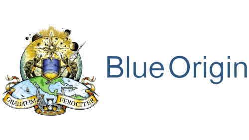
The company’s logos are distinguished by their originality. Each symbol encapsulates the mission of Blue Origin. Colors and elements mark the steps toward the goal. Unique developments, launches, and rocket tests – all this can be seen in the letters and drawings. The emblems point to well-considered decisions, global scale, and unhurriedness in work. The central image is a detailed crest in the style of the 16th and 17th centuries, which represents the process of space exploration step by step. The choice is original, like the company that aims to invent reusable rockets.
What is Blue Origin?
It’s a space company founded by the creator of Amazon, which is engaged in the development and assembly of rockets, rocket engines of the BE series, launch vehicles, and orbital stations, participates in the Artemis program for landing on the Moon, and sends satellites into orbit.
2000 – 2004
The first emblem was a simple blue inscription, where each word began with a capital letter. The name talks about Earth. For everyone who looks at the planet from space, it seems to be covered in a blue haze. The view is associated with the atmosphere and many seas and oceans. The company’s products will represent Earth in the Solar system and beyond. For extraterrestrial civilizations, Blue Origin’s products are original developments from the Blue Planet.
The name also speaks to the aspiration to preserve the beauty and extraordinary color of the Earth, which is gradually turning grey due to harmful industries. The founders of Blue Origin dreamed of bringing Earth to a point where harmful industries would be moved beyond the planet’s limits. Then, its beauty and health would be restored and preserved for future generations.
Therefore, the Blue Origin logo is very ambitious. It was conceived with a look to the future and faith in its abilities.
The blue color also indicates progress and new inventions. Initially, the company aimed to develop technologies to make space travel more financially accessible. Now, it sees its mission in the creation of reusable rockets.
2004 – 2007
In the early years, almost no one knew about the project. Only in 2004 did preparations for the Charon tests begin – a new vertical takeoff and landing platform. Bezos changed the company’s logo as the startup experiment began to take on real features.
The emblem received a futuristic symbol – a schematic image of a rocket secured on a platform. The structure stretched upwards, indicating the development of a vertical landing.
The symbol elements and the name’s words received different shades: the rocket and ‘Origin’ – a semi-transparent lilac, and the platform and ‘Blue’ – a dark blue. Part of the equipment remained on Earth. The saturation of the color conveyed firmness, reality, and clear visibility. The rocket, however, soared upwards and disappeared, dissolving in the sky. The semi-transparency of the shades spoke of flight.
2007 – 2015
By 2007, a launch pad had been built, and the Goddard rocket had been sent into space. Successful trials were reflected in the new emblem, which differs from all other Blue Origin logos. The old style, deep detail work tells people’s perception of space evolution. The shape of the crest speaks of a sign passed down from century to century.
At the center of the composition is a radiant sun. In the background, a large and several smaller planets revolve around it. The sky and its celestial bodies have always been attractive to humans. Special attention was paid to the Sun, which gives life through its warmth and light.
In the foreground are two tortoises, standing on a globe, looking at the Sun, and reaching out to it with their paws. The animals are used as a symbol of slow, gradual progress. The choice of tortoises is very symbolic. These slow creatures were the first to fly around the moon aboard a spacecraft. This happened in 1968.
According to one explanation, the image of the tortoise is taken from Aesop’s fable about the race between it and the hare. The tortoise won, arriving first at the finish line. The story reflects the thought: it’s better to go slow but sure.
The tortoise is a symbol of wisdom and longevity. The process of conquering space is long. It began with the invention of the telescope and continues to this day. And the animal conveys the gradualness of the process.
The remaining images confirm and supplement this theory. When the first telescope appeared, 16th-century ships were floating on the globe’s surface. A rocket, reflecting modern times, has taken off from the side of the Earth.
At the base of the image are hourglasses and wings, symbolizing the passage of time. Nearby, on heraldic ribbons, a Latin phrase is placed: Gradatim Ferociter, telling about a steady, gradual movement forward, step by step.
2015 – today
In 2015, Blue Origin began developing a launch vehicle to bring heavy loads into orbit. This new stage was reflected in the emblem with even, tall, bright blue letters. The elements hinted at the result of the work – the New Glenn rocket, which was the largest of all the company’s ships.
Bright glyphs embody a breakthrough, a bright idea that will facilitate the delivery of parcels into space.
Another well-known symbol of the company is the blue feather.
- The symbol is associated with lightness. It hints at weightlessness, where even very heavy objects float in space like a feather.
- The element of wings talks about flights, striving upward to the stars. People used to look at birds and dream of flying. The company’s developments offer the freedom to break away from the Earth.
- A Feather and Ink is a writer’s set from past centuries. The choice of theme concerns the company, leaving a mark on the pages of history.
The symbol is located right in the center of the launch pad, where rocket launches occur.
Font and Colors
Ultra-blue color is associated with technologies and inventions. Space flights accompany the best developments in robotics, computers, and materials. Bright elements hint at science fiction. The future of the planet is behind Blue Origin. People are gradually moving to the exploration of space, and the company is on the front lines. Its main mission is to make life and work outside the Earth a reality. The company has many projects aimed at the future. Their delivery is planned for years ahead:
- The heavyweight New Glenn rocket
- The Vulcan Centaur carrier
- The BE-7 engine for flights to other planets
The font of the inscription is reminiscent of Din Condensed Demi Bold. Capital letters point to the scale, global mission, and flights to far distances. Smooth and sleek glyphs hint at the streamlined hull of rockets. Each tall element embodies a spaceship. The technique speaks of vertical takeoff and landing, which allows for the reuse of the first stage of carriers. The invention was an important step toward realizing the Blue Origin mission.
FAQ
Why is Blue Origin’s logo a feather?
The feather in this aerospace company’s logo symbolizes the perfection of flight. Jeff Bezos chose it because it demonstrates the elegance and efficiency of bird flight, which people have admired for centuries. The feather symbolizes freedom, as birds represent limitless possibilities and the ability to overcome difficulties.
Bezos believes that the feather symbolizes freedom, exploration, mobility, and progress, which are key to this company’s mission. Freedom in this context means exploring space and possibly living on other planets. The feather logo combines these ideas into a simple symbol.
What is the meaning of Blue Origin?
The name of this company is rich in meaning, combining the uniqueness of the Earth with its goals in space. The word “blue” refers to Earth, known as the blue planet, due to its vast expanse of water visible from space. It ties this company’s mission to Earth, showing its foundation in Earth technology and its goal to reach beyond our planet.
“Origin” implies a beginning. For the company, this marks the beginning of a new stage in space travel, which aims to make space flights regular and affordable.
What is the mascot of Blue Origin?
The aerospace company’s mascot is a turtle, taken from Aesop’s fable of the Tortoise and the Hare. This mascot represents the company’s cautious and steady approach to space exploration, which involves consistency and persistence rather than speed. The turtle symbolizes their strategy of methodically developing space technology and infrastructure.
The company’s motto, “Gradatim Ferociter,” which translates from Latin as “Step by step, fiercely,” reflects this approach. Jeff Bezos, the company’s founder, talks about the importance of such a sustainable approach to space development. He believes that incremental progress, like the turtle method, is the key to achieving long-term goals in space exploration.
Why did Jeff Bezos name Blue Origin?
Jeff Bezos named this aerospace company to show the importance of the Earth, our “blue planet.” The title suggests that all space exploration begins on Earth and should help in its conservation. Bezos envisions humanity continue exploring space while ensuring Earth remains a safe and prosperous home. This is consistent with his interest in expanding human life beyond Earth and improving our ability to support life on our planet.
