


 Blue Sky Studios Logo PNG
The Blue Sky Studios logo is fun and jumping. The emblem is full of childhood, movement, and animation, representing the studio as the best producer of beloved children’s cartoons and the creator of fascinating special effects.
The logo features “Blue Sky Studios” in a simple yet bold typeface, illustrating the studio’s straightforward approach to delivering captivating animated stories. The word “Blue” is usually depicted in a striking shade of blue, reflecting the studio’s name and commitment to creativity and imagination. Blue is often associated with the sky and endless possibilities.
The “Sky Studios” portion of the logo is typically rendered in a contrasting color, such as black or white, to maintain the clarity and legibility of the brand name.
Some logo versions feature an emblem featuring a leaf encapsulated in a sphere. This iconic imagery is a nod to the studio’s first short film, Bunny, which won an Academy Award and featured a memorable butterfly scene. The sphere can also symbolize the world or the universe, possibly referencing the global reach and impact of the studio’s productions.
The Blue Sky Studios emblem symbolizes the brand’s innovative spirit and dedication to creating captivating, world-class animated entertainment. Bold typography and evocative imagery communicate the studio’s strength and creative vision, making it instantly recognizable in the animation industry.
Blue Sky Studios was founded on February 22, 1987, by Chris Wedge, Michael Ferraro, Carl Ludwig, Alison Brown, David Brown, and Eugene Troubetzkoy. All six had worked at Mathematical Applications Group, or MAGI, a visual-effects company involved in Disney’s Tron in 1982. After MAGI closed, the team continued independently and built Blue Sky around computer animation.
The studio’s main technical asset was its own CGI Studio software. Troubetzkoy and Ludwig adapted ray-tracing methods to simulate realistic lighting, giving Blue Sky a tool that set it apart from many competitors. Early business was difficult after the 1987 market crash. Still, the studio later won advertising clients such as Bell Atlantic, Rayovac, Gillette, and Braun.
In 1997, most of Blue Sky was acquired by VIFX, the visual-effects arm of 20th Century Fox. The combined Blue Sky/VIFX worked on films including Alien Resurrection, Mouse Hunt, Star Trek: Insurrection, and Fight Club. In 1999, Fox sold VIFX to Rhythm & Hues, while Blue Sky stayed with Fox. The same year, Chris Wedge’s short Bunny won the Oscar for Best Animated Short Film.
That success led to feature animation. Ice Age was released in 2002 and earned about $383 million worldwide, launching Blue Sky’s main franchise and placing it beside Pixar and DreamWorks Animation. Later films included Robots, Horton Hears a Who!, Rio, Epic, Ferdinand, and Spies in Disguise. Disney acquired Fox assets in 2019, including Blue Sky. On February 9, 2021, Disney announced the studio’s closure, and its final workday came on April 10, 2021.
Meaning and History
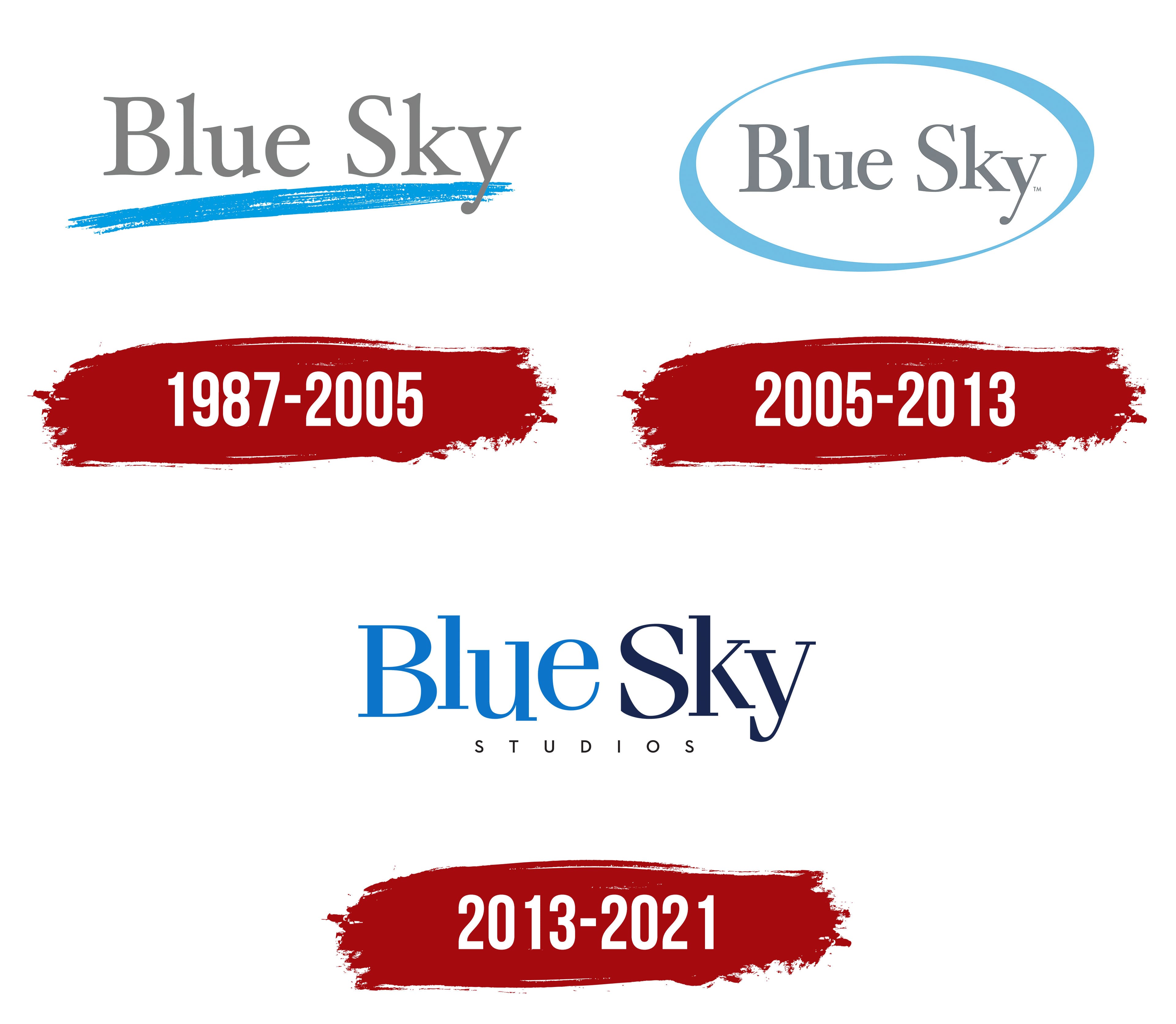
The studio’s logos are diverse, but each reflects the company’s name and conveys the themes of childhood, fantasy, and lightness. Rebrandings are related to new owners and changes in Blue Sky’s direction. The logos trace the transformation from a small amateur studio into the third-most significant animation division of 20th Century Fox.
What is Blue Sky Studios?
An animation studio that gave the world hits like “Ice Age” and “Rio,” as well as all their parts, founded in the late 80s by director John Wedge. For most of its history, it belonged to 20th Century Fox and worked in advertising and special effects.
1987 – 2005
The first emblem is natural and resembles the name underlined with blue chalk. The composition conveys the idea of special effects, transforming ordinary lines into frames at the animator’s will.
The studio’s founders invented a mechanism that automatically added light effects to the frame. To do this, complex studies of the passage of light through water and ice were necessary. In honor of these first experiments and achievements, the blue stripe of the logo appeared.
The composition also tells the story of the company’s first client, who helped it establish itself and begin operations after the stock market crash in America. The commercial concerned the customer’s logo flying over the ocean. The hint of this composition lies in the blue line of the Blue Sky emblem.
The upward rise of the line speaks of a fast start, the rise of the studio to the top. In its first years of work, Blue Sky shot 200 animated commercials. Then, it released Bunny, a short film of its production, which won an Oscar in 1998.
2005 – 2013
The idea of selling the division due to 20th Century Fox’s financial problems was abandoned after The Ice Age received Oscar nominations. Instead, the studio was transformed, moved to a new headquarters, and updated its logo. The emblem change coincided with the release of the second animated film, Robots, in 2005. After its creation, it became clear that the studio would actively engage in animation.
The new logo was a gray inscription of “Blue Sky” in a blue oval with lines of varying thicknesses. This approach showed that the division received protection, recognition, and awards. The oval symbolizes harmony, and the cloud carries the studio to its peak.
The gray and blue shades reflect the colors of the sky. The clouds suddenly dissipated, revealing an ordinary, seemingly “gray” studio working on special effects, and the blue sky peeked through, offering new perspectives and opportunities.
The blue line is like a mark on the ice from skates, the imprint of a whirlwind that sweeps the studio into the future.
2013 – 2021
The company finally focused on producing cartoons, which is reflected in the new logo. In the studio, they settled on the name without additional elements. The letters of the words are positioned at different heights and seem to be bouncing, indicating a child audience.
Each part of the name is executed in its color. Blue is in blue, and Sky is in navy. The direct analogy of color and word speaks of simplicity and childlike immediacy.
The emblem first used the addition of “Studios” to underscore the division’s animation direction, the transition from shooting individual movie elements to full-length films.
Font and Colors
The choice of blue tones resonates with the color palette of the company’s main franchise, Ice Age. The colors ice and sky blue are associated with the beauty of nature, the flight of imagination, and travel.
The font is reminiscent of ITC Fenice Pro Regular. Angular letters with serifs hint at the main mascot of the studio, the saber-toothed squirrel Scrat, with whom every part of the story about Manny began. Delicate dancing letters indicate the studio’s famous special effects.