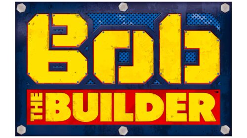
The Bob the Builder logo is serious, bright, and technical. At the sight of the sign, there is no doubt that this is an emblem for animation on a construction theme. Large element sizes are prototypes of large metal machines.
Bob the Builder: Brand overview
| Founded: | 1999 |
| Founder: | Keith Chapman |
| Headquarters: | United Kingdom |
Bob the Builder is a British franchise based on an animated puppet series for preschoolers. About 400 ten-minute episodes have been filmed, which were shown in 100 countries in different languages. Based on the series, a feature film was shot in 2000, and about 5 million books were sold and 2.5 million cassettes.
Meaning and History
The cartoon hit the screens at the end of 1998. The emblem was developed in the spring of 1999, which is related to the growing popularity of the show and the decision to turn it into a long series. The main elements of the logo were chosen in theme and corresponded to the content of the series and its audience. Major rebranding is associated with significant changes in the series’ fate: updating shooting techniques and the arrival of new owners.
What is Bob the Builder?
A popular children’s series about a builder named Bob and his team of machinery developed by producer Keith Chapman. It premiered in 1998 and continues to be filmed. It was broadcast on well-known channels such as BBC One, Channel 5, Nickelodeon, and Universal Kids.
1999 – 2010
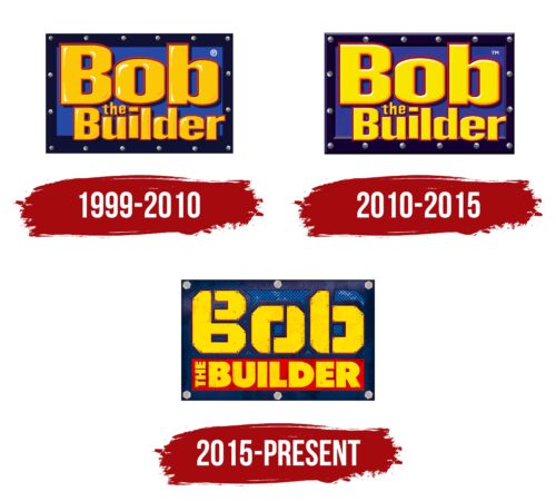
The logo featured a metallic dark blue frame with rivets. Inside it, there’s a blue sheet with an inscription from orange volumetric letters with a thin red outline.
The volume hints at the use of puppet characters. The orange color is associated with construction machinery in England and orange construction helmets.
The screws and metal resonate with repair work signs. They hint at tools, machinery, and the labor of workers.
The overall image of the logo indicates powerful, large machines with considerable strength. The bright colors and cartoon letters signify a show for children.
2010 – 2015
Starting in 2010, the filming style of the series changed. Until 2009, the stop-motion principle was applied, where frames were photographed, slightly altering the position of the characters to create a motion effect. In 2010, they switched to CGI (computer graphics). The new stage in the series’ life was reflected in the logo update.
The logo received brighter yellow letters with an even more vibrant color. This approach showcased the perfect movements and appearance of the characters thanks to the computer—saturated tones. Light motifs hint at the ease of computer animation control, easing the animator’s labor.
2015 – today
In 2011, the series was sold to new owners – Mattel. In 2014, they signed a contract with Milkshake! for the broadcasting of the updated series from 2015. This was followed by a logo update.
The emblem significantly transformed to show the change in the appearance of the characters, their voices, and the action’s location – Bob’s team moved to a metropolis. The new logo was executed on a ventilation grill, edged on the sides with an iron edge with screws. In the middle, the word Bob was crafted from individual sheets of metal on rivets. Now, the emblem truly conveyed the construction theme and the participation in the series of animated construction equipment, which in America is yellow.
The ending, the Builder, was placed in a red rectangle – the prototype of a plaque. The red speaks of incidents, dangers, and difficulties that the characters encounter in each episode.
Font and Colors
The primary colors of the logo are blue, yellow, and red. Bright shades elevate the mood and set a childlike tone.
- Blue – a shade of logic and technology. Indicates the education of children. Solving serious tasks that require coordinated and thoughtful actions.
- Red – a bright color is speaking of attentiveness, danger, and the need to concentrate. Points to the sudden appearance of extraordinary situations that the characters handle.
- Yellow – a shade of joy and fun. It reflects the good mood, kindness, and friendliness of the characters. The color is in harmony with Bob’s helmet and the coloring of construction machines.
The logo’s font is original. Stylized as pieces of metal specifically for the series. The letter elements resemble Scoop’s loader bucket, Roley’s roller, and Lofty’s crane arrow – Bob’s main helpers.
Bob the Builder color codes
| Golden Yellow | Hex color: | #ffe200 |
|---|---|---|
| RGB: | 255 226 0 | |
| CMYK: | 0 11 100 0 | |
| Pantone: | PMS 108 C |
| Racing Red | Hex color: | #de0000 |
|---|---|---|
| RGB: | 222 0 0 | |
| CMYK: | 0 100 100 13 | |
| Pantone: | PMS Bright Red C |
| Medium Sapphire | Hex color: | #0159b0 |
|---|---|---|
| RGB: | 1 89 176 | |
| CMYK: | 99 49 0 31 | |
| Pantone: | PMS 2935 C |
| Space Cadet | Hex color: | #1d2956 |
|---|---|---|
| RGB: | 29 41 86 | |
| CMYK: | 66 52 0 66 | |
| Pantone: | PMS 655 C |
