Bombardier: Brand overview
Bombardier Inc., a Canadian multinational corporation in the transportation and aerospace industries, has been an established company in Montreal, Quebec, since its creation in 1942.
Founder Joseph-Armand Bombardier has turned the company into a global player in the transportation industry.
The company produced the humble snowmobile in its early days but had much bigger plans. In 1967, the brand introduced the world’s first mass-produced jet airliner, the Canadair CL-415, changing the transportation industry.
Over time, the brand expanded its product portfolio to include a variety of transportation solutions such as trains, subways, streetcars, airplanes, and helicopters. The company has also expanded its global reach by distributing its products internationally.
Today, the brand is a global transportation leader with a presence in 50 countries and over 65,000 employees. From the densely populated streets of Tokyo to the isolated mountainous regions of Peru, the brand’s products play an important role in connecting people and places worldwide.
In 1942, Joseph-Armand Bombardier undertook a bold venture, creating a company to become a world leader in the transportation sector.
1959, the brand significantly changed winter transportation by introducing the Ski-Doo, the world’s first mass-produced snowmobile.
1967, the brand revolutionized air transportation by introducing the Canadair CL-415, the world’s first mass-produced jet airliner.
In 1974, the brand revolutionized the airline industry with the Canadair Challenger 600, the world’s first regional jet airliner.
In 1986, the brand changed the familiar dynamics of travel by introducing the first high-speed LRC train.
In 1993, the brand launched the world’s first subway train, the MBTA’s Orange Line, revolutionizing public transportation.
2005, the brand transformed urban transportation by introducing the Flexity Outlook, the world’s first streetcar.
In 2017, the brand took another historic step by launching the e-Series, the world’s first commercial electric airplane.
Meaning and History
What is Bombardier?
It is a Canadian multinational company known for contributing to the transportation industry, particularly in the aerospace and rail sectors. The company manufactures various products, including business jets, commercial aircraft, and rail transportation equipment such as trains and trams.
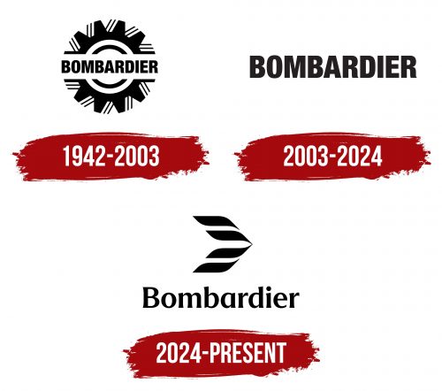
1942 – 2003
2003 – 2024
The “Bombardier” logo serves two purposes: it identifies the company and honors its founder’s last name. The logo uses a simple, bold sans-serif font with all capital letters. These letters have uniform thickness and are stretched vertically, giving them a sleek look without appearing too heavy. The logo’s primary color is black, which conveys a professional and businesslike approach.
The tall capital letters in the logo resemble small skyscrapers, symbolizing growth, ambition, and progress. This architectural design aligns with the company’s forward-thinking vision. The color black adds a sense of formality and readiness to face any challenge, enhancing the logo’s authoritative and professional appearance.
The vertical elongation of the letters suggests upward movement, reinforcing ideas of progress and development. The consistent stroke thickness ensures the logo remains clear and impactful.
2024 – today
The Bombardier logo reflects the company’s commitment to innovation and historical legacy. The design is inspired by Learjet’s legacy, which is evident in the aircraft’s silhouette breaking the sound barrier. This symbolizes Bombardier’s innovative spirit and achievements in aviation.
The logo’s visual elements include dynamic wind strokes over the aircraft, nodding to the Learjet brand. This reflects precision in manufacturing and a customer-focused experience, creating a sense of hospitality and trust.
The wordmark uses the Trust 3A Bold typeface, designed by MCKL. It differs from the previous logo by moving away from the all-caps style. The logo now features proper noun capitalization with a more grounded “d” and a single-story “a,” giving it a more modern and friendly appearance.
The logomark replaces the previous gear symbol. The new symbol represents a plane, an arrow, or a feather, emphasizing lightness, speed, and goal orientation. This design element also ties into the company’s history when Bombardier actively expanded its innovative aviation projects and strengthened its position in the international market.


