


![]() Boomerang Logo PNG
Boomerang Logo PNG
The visually heavy Boomerang logo speaks of the TV channel’s weight on television. To convey the children’s content, the emblem’s designers used asymmetry, which, in this case, is associated with cheerful chaos and confusion. The combination of sharp and rounded corners creates an interesting contrast, designed to attract young viewers’ attention.
Boomerang grew out of major media deals that gave Turner Broadcasting a deep archive of animation. In 1986, Ted Turner briefly bought Metro-Goldwyn-Mayer and kept its classic cartoon library after reselling the studio. In 1991, Turner acquired Hanna-Barbera Productions, adding The Flintstones, Yogi Bear, Scooby-Doo, and many other television cartoons to material from Warner Bros., MGM, and Popeye shorts.
On October 1, 1992, Turner launched Cartoon Network, the first 24-hour U.S. cable channel devoted to animation. On December 8, 1992, Boomerang appeared there as a weekend block for cartoons from the 1950s, 1960s, and 1970s. The name referred to both the return of old cartoons and baby boomers who had grown up with them.
The retro format later became too large for a limited block. On April 1, 2000, Turner launched Boomerang as a separate cable channel, while the Cartoon Network block continued until October 3, 2004. The brand expanded into the United Kingdom and Ireland on May 27, 2000, and then into Latin America in 2001. While Nickelodeon and Disney Channel focused on new projects, Boomerang relied on archive programming.
By the late 2000s, Boomerang began adding Cartoon Network reruns. On February 4, 2014, Turner announced a new advertising model and global expansion. A new branding system appeared in October 2014. It reached the U.S. on January 19, 2015, alongside original content such as Wabbit (later New Looney Tunes), Be Cool, Scooby-Doo!, and Bunnicula. On April 11, 2017, Boomerang launched a subscription streaming service with more than 5,000 titles from Hanna-Barbera and Warner Bros.
Meaning and History
![]()
The logo appeared eight years after the cartoon block’s introduction, when Boomerang became a separate channel. In the future, the emblem changed only once to modernize it.
What is Boomerang?
A 24-hour Warner Bros. old classic cartoon channel that began broadcasting in 2000.
2000 – 2015
![]()
The visual sign was developed by the art studio Primal Screen. Preparations began even before the channel’s announcement, as the emblem was shown immediately on the opening day (April 1).
The logo was a stylized Boomerang inscription. The first letter was different from the rest and looked like a children’s toy. The stars extending from its lower edge created a feeling of speed and “whistling” of a flying boomerang. The rest of the inscription writhed behind him like a kite’s tail. At the same time, the letters gradually increased from the end of the inscription toward the beginning, creating the effect of the flying structure approaching the observer.
The name is connected to the peculiarity of the Boomerang: when flying off, it returns to its launcher, just as the channel brought viewers back to the past. Cartoons, released on the screen and forgotten, regained life and delighted a new generation of Americans. The channel’s motto, “everything comes back to you,” was perfectly harmonious with the logo.
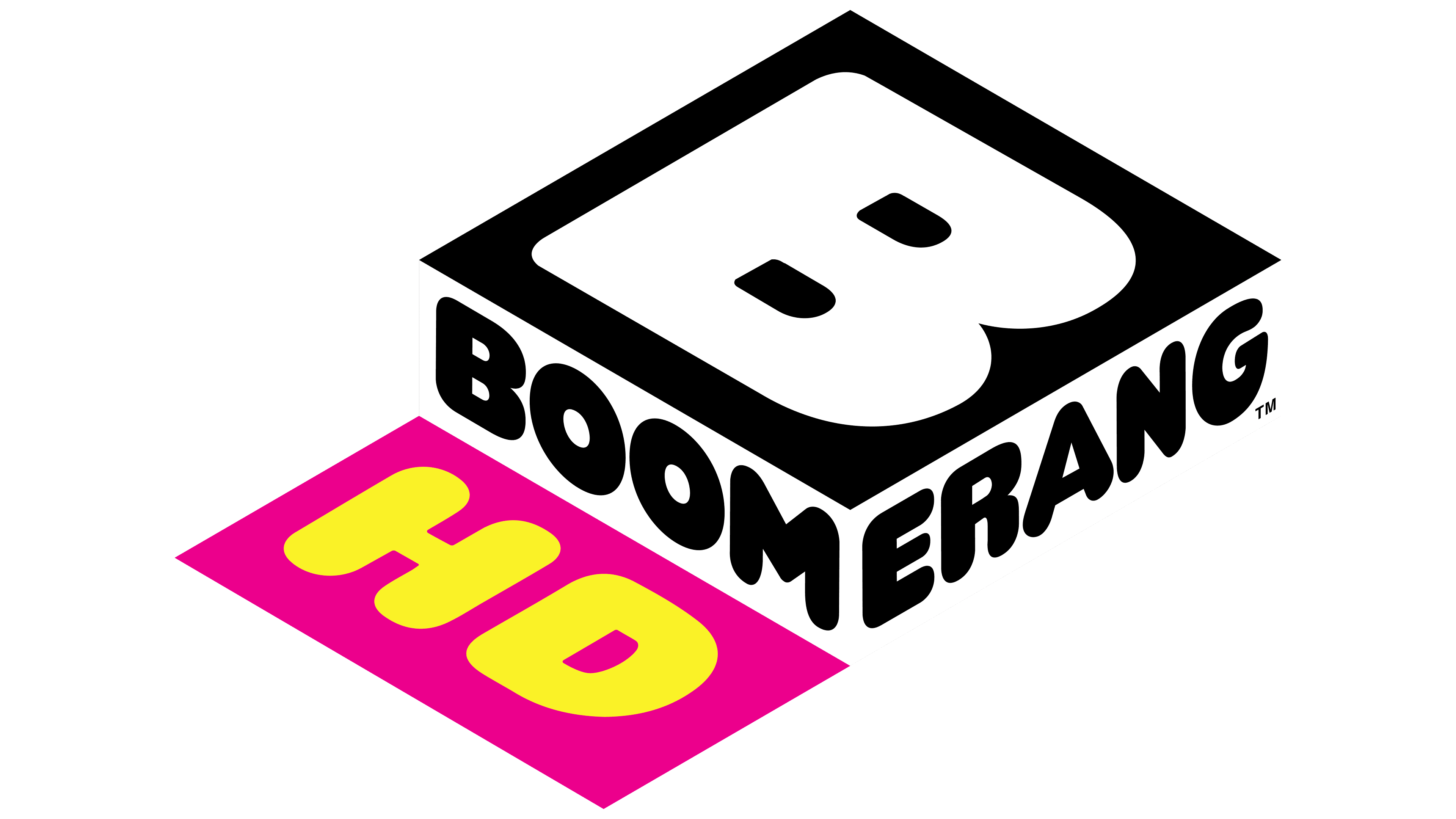
2015 – today
![]()
The company decided to rebrand, modernize the channel, and develop a web application. The new logo was introduced on January 19, 2015. The owners did not change traditions and again turned to the design company Primal Screen Art & Graft Typography to develop a visual sign.
They completely changed the logo’s concept, presenting it as a three-dimensional rectangle. Above, on a black background, there is a giant white letter B, and at the ends of the figure, turned toward the observer by one of its corners, on a white background, there is the channel’s name, divided into two parts: “Boom” and “erang.”
The composition matches most of the logos of TV channels and reminds us:
- A button on the computer keyboard indicates movement in step with the times and the web version’s appearance.
- TV remote control button.
- TV screen.
- A box that holds old valuables, such as old favorite cartoons.
The word pieces on the two sides of the rectangle convey the message. “Boom” translates as “Boom,” something very popular and in demand. And “erang” is an era and part of the ending “ing,” denoting that what happened in the past is happening now and will happen in the future. Separation predicts unfading popularity for the channel. Right now is the era of Boomerangs, and this is unchanged.
Font and Colors
Primary logo colors:
- Blue – used in the first emblem. The color of childhood: blue-screen TV, dreams, and cartoons.
- Black and white – gamma of the second visual sign. Referring to the past. And although cartoons from the 50s were already produced in color, the tapes from the 30s-80s seem so far away that they are associated with black-and-white TVs.
The font of the inscription is a rounded, cartoonish style. Similar to Corkboard Slanted JNL.