Everything is so well-coordinated and accurate in the company’s work that its growth and development have continued for many years. Boots logo is an example of beauty and elegance. The smooth symbols of the emblem calm and instill trust in the buyer.
Boots: Brand overview
| Founded: | 1849 |
| Founder: | John Boot |
| Headquarters: | Beeston, Nottinghamshire, England, United Kingdom |
| Website: | boots.com |
Boots is a large British company with a 170-year history, operating in several areas:
- Development and wholesale supply of medicines
- Pharmacies
- Stores of cosmetic and hygiene products
- Home goods
It has 2,500 outlets throughout the United Kingdom. Branches have been opened in Europe, Thailand, and Indonesia. In addition to producing its medicines, Boots contracts manufacturers products from other companies. Since 2014 it has been part of the U.S. corporation Walgreens Boots Alliance.
Meaning and History
Initially, it seems that the company’s name does not fit its profile at all. The fact is that the name is associated not with boots but with the founder of pharmacies – the pharmacist Boot (Boot), who opened the first stall in 1849. His heirs registered the company and gave it a name in 1883. After the death of Boot’s grandson, the company changed owners, gradually expanding the scope of activities from drugs to shoes, toys, and spare parts. In 2006 it merged with Alliance UniChem. In 2014 it was taken over by Walgreens, becoming its subsidiary. Today the main divisions of Boots are Boots The Chemists (pharmacies), Halfords (auto parts), Do It All (home products), Boots Opticians (optics), Boots Contract Manufacturing (contract manufacturing), Boots Healthcare International (over-the-counter drugs), Boots Properties (shopping centers).
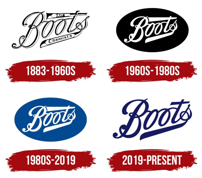
Despite several revisions, the company’s overall visual mark is very constant. The main lettering, style, and slant have been the same for 150 years. The main adjustments were in the background and color composition.
What is Boots?
A British company that sells medicines, personal care and cosmetics, and medical services, founded in 1849. Belongs to the U.S. corporation Walgreens Boots Alliance. Sales are 6.3 billion dollars.
1883 – 1960
The exact time of the logo is unknown. When the company was registered in ’83, it already existed. We chose an ornate ancient font with an unusual shape of three of five letters for visual representation:
- The crossbar at the letter T widened and lengthened backward, reminiscent of the name of a mixture sticking out from under a cork. In a special frame resembling the labels of chemical reagents, it was inscribed part of the company’s name: the prefix the.
- The S’s end was also an elongated ribbon, curling backward and underlining the word Boots. In it was placed the word Chemists. Thus the logo conveyed the whole name of the company: Boots the Chemists.
- One of the letters, O, is inscribed in the shape of a loop.
The elongated and widened stripes from the T and S had different shapes. The upper one remotely resembled a patient listening tube, and the lower one a spatula or scalpel. The company offered potions and powders for cures. Pharmacies were located in poor neighborhoods and, for many locals, were the only “healer.” Hence the use of medical paraphernalia.
Because of the letters intertwining, the name resembled a curly plant, corresponding to the phyto products sold in the apothecary.
Special shadows on the letters made them look pointed and voluminous as if they were forged of metal. The monograms were part of the graphics of the time and a feature of the brand. Displaying the name in this aristocratic style, it was quite in line with the two baronial titles of Booth’s son.
The two stripes bounded the name above and below, creating a “road,” and the writing of the word obliquely indicated the striving for heights. The composition showed a smooth way up to the future, growth, and development.
1960 – 1980
In 1956 the grandson of the company founder and head of the business, Baron John Booth, passed away. After his death, Boots reoriented itself and started developing medicines. In particular, thanks to Boots, the well-known worldwide analgesic and antipyretic ibuprofen saw the light. It was developed by the company’s pharmacists in 1961 and awarded with The Queen’s Awards for Enterprise.
Due to the new direction and new owners (Booth’s assistant J.P. Savage took the helm), some changes were made to the logo. The name was placed on an oval black background. The logo now looked more like a sign nailed at the entrance to a business. The white color of the inscription was associated with white chemical powders and reagents. The contrast of white and black was an indication of the sickness and recovery that comes from Boots’ medicines. As a symbol of the pill, the oval shape of the logo was quite reflective of the new line of business.
The volumetric lettering disappeared. The words “the Chemists” were taken out from the ribbons of letters T and S as the company changed its name to Boots Company Limited. The top ribbon was extended almost to the capital letter, and now the edge of the T seemed to be hiding under the B. This further increased the association with the road the name was taking forward.
1980 – 2019
Boots expanded aggressively, acquiring companies in various areas and pharmacy chains in other countries. Four divisions were opened to manage various offshoots and subsidiaries. In 1985, the parent company was renamed The Boots Company PLC.
One of the “non-medical” enterprises which were invested in was the sale of goods for infants and small children in large shopping centers. This kind of business change necessitated a logo upgrade.
To get closer to the new little customer’s black background was replaced by a pleasant blue shade. This made the logo brighter and more joyful, which is more in line with children’s themes. The new visual sign suited other destinations as well.
2019 – today
By 2019, Boots was in the wholesale drug business, selling shoes, drugs, hygiene products, and providing medical services. There were seven operating divisions. In 2018, Sebastian James took over as president and managing director. The emergence of a new head and updated policies led to a change in the visual sign.
The emblem’s background was removed, and all attention was focused on the lettering, which has acquired a stylish dark blue color, corresponding to a solid and reliable corporation. The crossbar of the T was shortened, leaving only the bottom band. This made the logo less massive. The lettering retained the upward rise. The underlining became a symbol of reliance on the past, while the upward motion demonstrates the aspiration for the future.
Font and Colors
The main colors used for the visual sign are black, blue, navy blue, and white.
Black is a sign of the company’s stability, a symbol of powerful developments, which saw the light thanks to Boots scientists and a hint of diseases that the company’s drugs help to cure.
- Blue is the color of childhood, the sky. It symbolized the spread and development of the company, the sale of children’s products.
- White was the color of health, chemical reagents, and drugs the company offered. It was also a sign of renovation, new beginnings.
- Dark blue – is a sign of great experience, stability, and large scale. It is supposed to inspire confidence and calmness.
The company logo was originally handwritten. Therefore, it does not have a modern font corresponding to it—the greatest affinity with Neville Regular and Almibar Swash 1.
Boots color codes
| Midnight Blue | Hex color: | #151a61 |
|---|---|---|
| RGB: | 21 26 97 | |
| CMYK: | 78 73 0 62 | |
| Pantone: | PMS 2755 C |
