


![]() Borderlands Logo PNG
Borderlands Logo PNG
The Borderlands logo reflects the atmosphere of the gaming universe it represents. Its aggressive lines and contrasting colors emphasize the dynamism and adrenaline typical of a role-playing shooter. The emblem symbolizes exciting adventures, fierce battles, and an uncompromising survival spirit.
Borderlands began at Gearbox Software, a Texas studio founded in 1999 by Randy Pitchford and other game industry veterans. Before building its own franchise, Gearbox worked on ports and expansions for outside projects, including Half-Life content for Valve. Development of Borderlands started around 2005 as a realistic post-apocalyptic shooter. Still, the direction changed late in production when artist Stella Chung proposed a cel-shaded comic-book look.
The first Borderlands was released in October 2009 for PlayStation 3, Xbox 360, and PC, with 2K Games as publisher. Its main idea was a hybrid of first-person shooting, role-playing progression, four-player co-op, and procedural weapon generation. The game could produce millions of gun variants, making loot collection a core part of play. Gearbox later called the format a “looter shooter,” linking it to Diablo’s reward loop.
Borderlands 2 arrived in 2012 and became the most complete early version of the formula. Gearbox strengthened the story, expanded the world of Pandora, and introduced Handsome Jack, a corporate villain whose sarcasm and personal motives gave the campaign a stronger center. In 2014, 2K Australia worked with Gearbox on Borderlands: The Pre-Sequel, set on Pandora’s moon and built around Jack’s earlier transformation.
The universe moved into another format with Borderlands: The Telltale Series, released from 2014 to 2016 by Telltale Games, shifting attention from combat to dialogue and story. Borderlands 3 launched in September 2019 as a timed PC exclusive on the Epic Games Store, which angered part of the Steam audience. Even so, it became the fastest-selling release in 2K Games history.
Meaning and History
![]()
Each game in the Borderlands series has its own logo. Typically, these are inscriptions executed in bold, sans-serif fonts and positioned diagonally. They are connected by the same typography and a similar golden gradient, making the letters voluminous. The luxurious shine seems to promise treasures that, according to legend, can be found in the vault. After all, this is the players’ task: to defeat all opponents to find the coveted cache.
What is Borderlands?
Borderlands is a franchise based on a series of computer games. These are first-person shooters with RPG elements. The action takes place on the planet Pandora, where there are supposedly caches of treasures and alien technologies. Players must find the legendary vault, complete missions, fight bandits, and oppose local monsters. Comics and novels have been created based on the Borderlands storyline, and in 2021, filming began for a movie of the same name.
2009
![]()
In 2009, the first part of the shooter named Borderlands was released. This word is used in the logo that adorned the game’s cover. Its right side is lifted upwards, creating the impression that the inscription is moving swiftly. This way, the designers conveyed the dynamics of the sci-fi world, where something is always happening. The letters are colored in gold with a gradient, but unevenly: some areas are covered with dark stripes and spots. Semi-transparent gray shadows add depth to the emblem.
2012
![]()
In 2012, a sequel to the game, Borderlands 2, was released. Its logo looks the same as the first part’s, but here a large number of “2” s follow the word. The designers had to slightly reduce the spacing between letters to accommodate the additional element. The inscription still has a yellow gradient and appears aged due to the dark spots.
2014
![]()
The emblem for the third shooter, Borderlands: The Pre-Sequel, contains its title, split into two levels. There is no colon, but there is an exclamation mark long enough to be opposite both lines simultaneously. The article is smaller than the other words. The diagonal placement of the inscription conveys the atmosphere of action and adventure, as the game’s plot is built on these elements. The gold gradient is just as strikingly bright as in previous cases and slightly aged.
2019
![]()
The fourth part of the series was published in 2019 and received the “BORDERLANDS 3” logo. The designers added wide side parts to the letters to achieve a pronounced three-dimensional effect. They maintained the emblem’s diagonal placement, bold uppercase font, and rich golden palette.
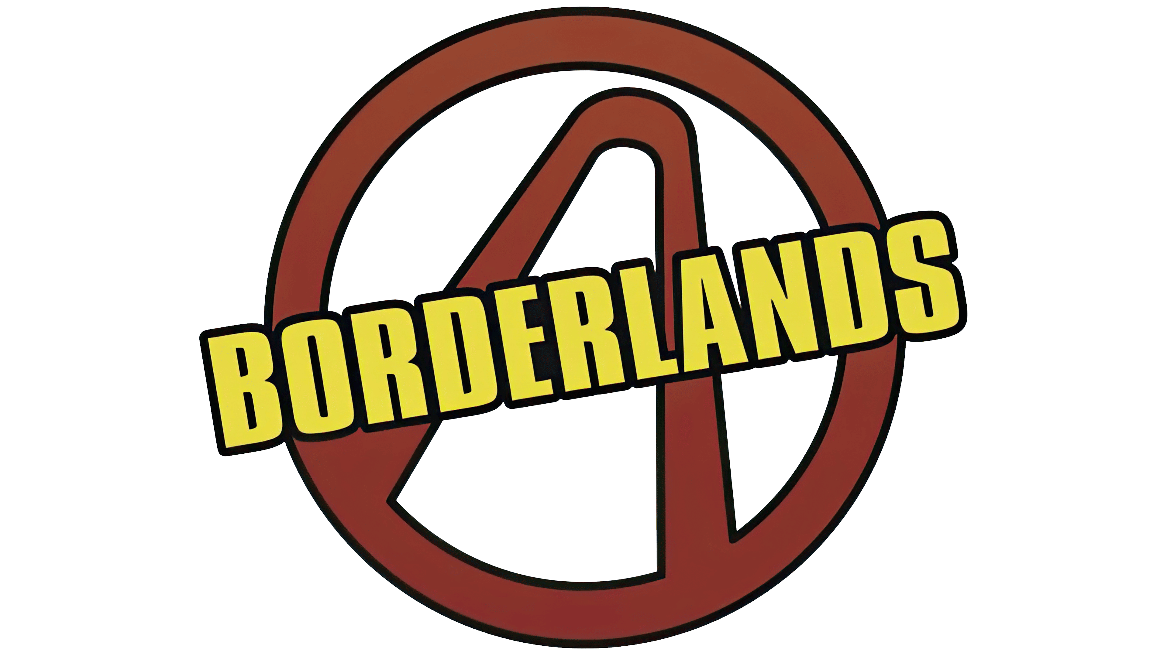
Symbol
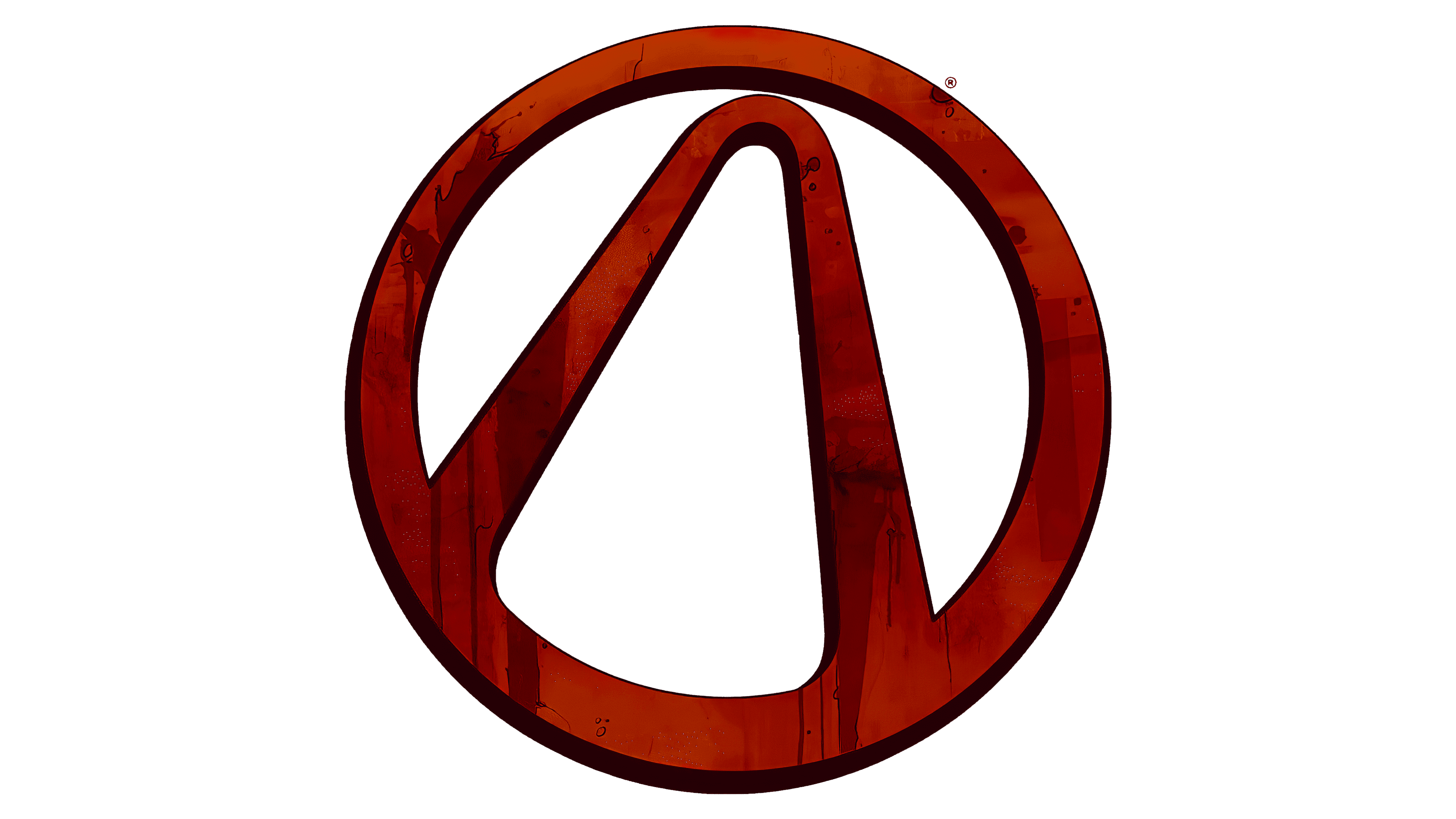
There is a graphic symbol uniting all the games in the franchise, the Vault Symbol. It looks like a ring with an inverted letter “V” with a rounded corner placed inside. Some believe it’s the uppercase lambda in a circle, a reference to the Half-Life emblem. Other theories suggest the curved arch represents the entrance to the vault, rumored to hide treasures.
In one version, the logo is colored in several shades of brown. The pattern mimics the texture of wood. The dark outline, drawn along the edge, has an uneven thickness, which gives the image a three-dimensional appearance.
This symbol frequently appears in the Borderlands world. For example, it can be seen on bandits’ masks or in graffiti. Some players specifically look for such places to earn additional Badass Points. Fans even get tattoos of the Vault Symbol, pleasantly surprising its creator, Randy Pitchford.
Font and Colors
A bold, sans-serif font with distinctive elongated letters is used in most franchise logos. It closely resembles Compacta Bold by Fred Lambert.
A recognizable feature of the inscription is the gold gradient. This color is associated with the immeasurable treasures that, according to seekers, should lie in the vault. Shadows and darkening give the emblem an antique feel. As for the Borderlands symbol, it can have different designs, but the brown version, styled like wood, is the most widespread.