Enjoying the taste of bars is enjoying life. The confectionery company put this concept into its identity, so the Bounty logo was relaxing. Everything in it relaxes—not only the shape but also the color of the letters, reminiscent of coconut pulp.
Bounty: Brand overview
Bounty is a brand that specializes in the production of coconut chocolate. It was launched in 1951 by Mars. Today, it is considered one of the world’s most popular chocolate bar brands. The company distributes its products in more than 170 countries on all continents of the Earth. Bars are available in two variations, namely, with the taste of milk or dark chocolate. For buyers to immediately associate with coconut, all commercials are filmed against a tropical island backdrop. The same element is actively used in the bar packaging. Also, a cult tool for brand promotion is its slogan, “The Taste of Paradise.”
In 1951, Mars, Incorporated launched a chocolate bar called Bounty in the UK and Canada. Instantly winning hearts with its exotic coconut flavor wrapped in smooth chocolate, it was named “Bounty” to symbolize its rich coconut filling. It promised a taste of paradise with every bite.
Soon, Bounty’s appeal reached the United States, where its tropical theme, complete with palm trees and beaches, became a hit by 1958. Over the years, especially during the 1960s and 1970s, Bounty became more than just a chocolate bar; it became a tropical escape symbol, famously named the “Taste of Paradise.”
In the 1980s, Mars innovated with a dark chocolate version of Bounty, diversifying its appeal. The brand didn’t stop there; it grew through the 1990s and 2000s, reaching new markets in Europe and Asia and experimenting with sizes and flavors, including mini bars and limited editions.
Acknowledging the growing trend towards health and wellness, Mars introduced Bounty Protein 2020, a high-protein, lower-sugar version aimed at those leading active lifestyles. This shows that even classic treats can adapt to contemporary health trends.
Today, Bounty is a beloved confectionery icon in over 70 countries. Its combination of coconut and chocolate still wins over people of all ages, proving its timeless appeal.
Bounty’s journey from a new treat to a global favorite demonstrates its unique flavor, savvy marketing, and ability to adapt to changing tastes. With a strong heritage and a loyal following, Bounty is set to remain a top choice, embodying tropical indulgence in the candy world.
Meaning and History
Bounty’s logo has changed several times throughout its existence on the market. The word inscription is based on elements of the company’s main ingredient, coconut.
What is Bounty?
First of all, this is delicious coconut chocolate, which can be purchased in most supermarkets globally. Adequate price and quality ingredients only add to the popularity of Bounty products.
1951 – 1991
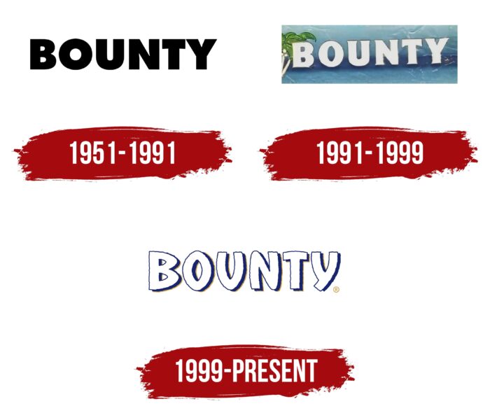
The first bars of coconut chocolate under the Bounty brand were released in 1951. It was then that the original version of the logo appeared. It was based on a simple word inscription, made in a classic bold font using black capital letters. The thick lines in the letters allowed customers to read and see the brand name from afar easily. At the same time, it seemed to many experts that this logo style would be more suitable for a large company and not for a brand that produces chocolate bars with coconut. Despite this, it was relevant for 40 years, and thanks to him, the brand’s visual recognition was high.
1991 – 1999
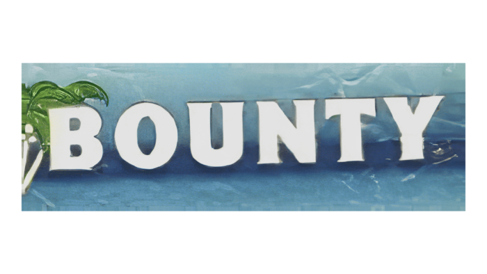
However, in 1991, the company made the logo brighter to associate with the target audience with a tropical island and a coconut palm. Using bold white letters in a classic sans-serif made the name intuitively similar to coconut flakes. This wordmark looked perfect against the background of the candy bar packaging, where the first “B” was directly under the palm trees, and the rest of the name was depicted under the blue sky.
1999 – today
The last major redesign of the logo took place in 1999. The company tried to make the verbal inscription even more like coconut flakes from chocolate bars. The brand name is written in a unique and stylish font using bold white letters with unusual curves in all characters. Using a dark blue shadow creates a sense of three-dimensionality in the image.
Font and Colors
Сompany used classic fonts in the first two versions, where all the letters in the name were capitalized and made in the same style. In that case. The current variation looks unique and modern, attracting attention even from people unfamiliar with the corporation’s products.
The logo’s color palette consists of a white word inscription depicted on a blue background on the packaging. The buyer of Bounty products is associated with coconut flakes and a tropical island.
FAQ
Is Bounty Chocolate Israeli?
Bounty is a chocolate bar filled with coconut and covered in milk chocolate made by Mars, Incorporated. Thanks to Franklin Clarence Mars, Mars started in the United States in 1911 and has grown into a big company that makes many different candies and snacks worldwide.
Bounty came out in the 1950s and stood out because it mixed coconut with chocolate in a way not many other candies did then—people in many countries, not just the Middle East, like Bounty. However, Bounty isn’t made in Israel. Mars makes it in different places worldwide so that people everywhere can enjoy it. Mars is a big, private company that sells its products, including Bounty, globally.
So, even though people in Israel and other places enjoy eating Bounty, it’s not from Israel. Mars, the company that makes Bounty, is based in the US but has reached customers worldwide, ensuring chocolate fans in various countries, Israel included, can get their hands on a Bounty bar.
Who is bounty made by?
Bounty is a chocolate bar made by Mars, Incorporated. It’s filled with coconut and covered in milk chocolate. It was first sold in 1951 in the UK and Canada. People like it because it mixes coconut with chocolate, slightly different from other chocolate bars.
Mars, the company that makes Bounty, is a big name in the food world. They don’t just make chocolates; they also make pet food and other food. Mars started in the US and has grown to sell its products worldwide. They’re known for creating new and interesting products, like Bounty.
It was new for Mars and chocolate lovers when Bounty was first made. It stood out because of its coconut filling and chocolate outside, making it popular with those wanting something different.
In short, Mars, Incorporated makes Bounty. They are known for their quality and innovation. Bounty has been a favorite since the 1950s because it’s different from most chocolates, with its coconut and chocolate mix.
Does Bounty have nuts?
Bounty chocolate bars are known for their coconut filling and chocolate coating. They don’t use nuts as a main ingredient, but there’s a chance they might have tiny amounts of nuts, including peanuts. This is because they’re made in places that also work with nut products, so some nuts could accidentally get into the Bounty bars. This is important for people allergic to nuts because even a little bit could cause an allergic reaction.
The places where Bounty bars are made also deal with gluten and dairy products. So, people with allergies to these should also be careful when eating Bounty bars.
In short, Bounty bars don’t purposely contain nuts, but because of where they’re made, they might contain small amounts of nuts, gluten, or dairy. If you’re allergic to these, you should know there’s a risk of cross-contamination.
What is the meaning of the Bounty Logo?
The Bounty logo is smartly designed to show what the chocolate bar is about—coconut. It’s designed to look big, white, and fluffy, just like coconut pulp, which gives the Bounty its special taste. The letters in the logo have wavy edges that look like the rough texture of coconut.
The logo means more than just coconut, though. The word “Bounty” suggests kindness and nature’s rich gifts. This isn’t by chance. It reflects what the brand stands for, offering a delicious treat that feels like a generous gift.
So, the Bounty logo isn’t just a symbol for the brand. It tells a story about the chocolate’s main ingredient, coconut, and the brand’s promise to be like a gift from nature. The design helps communicate what Bounty is about to those who enjoy it.
What does the logo symbolize, Bounty Logo?
The Bounty logo perfectly captures the tropical and luxurious feel of the chocolate bar. It’s all about the joy of eating Bounty, with every detail, from the background to the font, aiming to highlight this feeling. The design pays special tribute to coconut, Bounty’s main ingredient, making it feel like you can almost taste and smell it just by looking at the logo.
The letters themselves are designed to bring coconut to mind. They’re colored white, just like the inside of a coconut, and have a texture that resembles a coconut’s fibrous inside. The edges are jagged, making them look like they’re made of tiny coconut flakes, adding a sense of lightness and fluffiness to the logo.
These design choices mean the Bounty logo is more than just a way to recognize the brand. It represents what eating a Bounty bar is about a slice of tropical heaven. The logo promises a special coconut treat in every bar, making it a key part of why people love Bounty.
Why is bounty named Bounty?
The chocolate bar Bounty got its name because it’s all about the rich taste of coconut, which reminds people of a tropical paradise. This idea comes from some New Zealand islands full of coconut palms. The name “Bounty” reflects the abundance of coconuts on these islands and how generously they are used in the candy.
These islands got their name from the Bounty ship led by Captain William Bligh. This bit of history adds an adventurous feel to the Bounty chocolate bar, linking it to exploration and discovery.
The word “bounty” also means generous, which fits the chocolate bar perfectly. It’s packed with coconut, making it a rich, flavorful treat. This generosity is also captured in the Bounty logo, which ties together the tropical coconut theme and the adventurous story of Captain Bligh’s ship.
In short, the name “Bounty” is not just a brand. It tells you about the chocolate bar’s delicious, tropical coconut flavor and its spirit of adventure and generosity.
What brand is a bounty?
Bounty is a well-known chocolate brand famous for its coconut-filled bars covered in milk or dark chocolate. The Bounty logo reflects this unique tropical taste. It’s not just another chocolate bar; Bounty combines the deep taste of chocolate with the exotic twist of coconut, offering something truly different.
Mars, Incorporated, a big name in the candy world, launched Bounty in 1951 in the UK and Canada. Thanks to its tropical chocolate flavor, it has won fans worldwide. Mars is known for making some of the most popular sweets and snacks, and Bounty is one of its standout products.
What makes Bounty special is how it stands out from other chocolates. Thanks to being part of Mars, it’s known for its unique flavor and high quality. This company is about innovation and ensuring customers love what they eat.
In short, Bounty is more than just a candy bar. It signifies Mars, Incorporated’s commitment to making fun, tasty treats. With its combination of chocolate and coconut, Bounty remains a favorite for many.
Who invented the bounty?
Mars, Incorporated was the company that started making the Bounty chocolate bar, known for its coconut filling covered in chocolate. But the idea of a coconut chocolate bar was not new. It goes back to 1936 when Peter Paul created Mounds, a similar coconut bar. This bar laid the foundation for this kind of candy. Later, in 1948, Hershey’s came out with Almond Joy, which was like Mounds but added almonds and was covered in milk chocolate.
When Mars began making Bounty, they took the coconut chocolate idea and made it theirs. They launched Bounty with a new name, look, and logo, making it stand out from Mounds and Almond Joy.
Mars’s changes to Bounty, like its name and design, helped make the brand unique. Even though the idea of a coconut chocolate bar wasn’t new, Bounty became a popular treat worldwide. Mars’s ability to innovate and brand Bounty shows how they’ve managed to stay ahead in the candy market, making Bounty a favorite for many.
