Since its inception in 1897, Jell-O has been an American dessert favorite, permeating pop culture and family gatherings with its distinctive “jiggly fun.” After a period of decline since its peak in the 1960s, Jell-O has taken a brave step to restore its famed status with a refreshing rebrand, its first in over a decade.
Created under the umbrella of Kraft Heinz, Jell-O’s novel visual identity is a delightful nod to the generations who have relished this unique gelatin dessert. The makeover embraces Jell-O’s illustrious past while launching into an exciting, promising future. The goal is not just a facelift but a reinvigoration of the charm that once propelled Jell-O into one of the most iconic movie scenes ever.
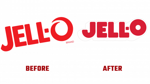
The revamped logo Jell-O, now adorned with robust, neat letters and an oversized ‘O,’ brings a playful contemporary vibe to the brand. The design leans towards a retro 3D appearance, especially pronounced in the ‘O,’ and even features a pronounced drop shadow, borrowing a page from recent soft drink rebranding trends. Switching to illustrations from photographs on the packaging amplifies the overall “sensorial” retro allure.
Jell-O’s transformative rebranding celebrates its revolutionary culinary heritage. In its heyday, Jell-O turned an upscale dessert into an everyday delight. It even became an innovative addition to savory salads in the 1930s. By reconnecting with this rich history and embracing kitsch nostalgia, the rebranding ensures Jell-O will catch the eye of supermarket shelves once again.
A closer look at the logo reveals significant shifts, including chunky letters and a misaligned ‘O,’ all departing from the previous design’s thin spiral ‘O.’ This fresh approach aligns Jell-O with vibrant retro trends and revamps its image, shifting away from associations with medicinal or hygiene products.
A subtle but savvy update is the change from the ‘sugar-free’ label to the more in-vogue ‘zero sugar,’ reflecting the modern lexicon.
Jell-O’s brand refreshment arrives at a critical juncture, following a decline not only due to changing tastes and rivals but also links to less appetizing contexts like institutional meals. The renewed identity aims for harmony, amplifying Jell-O’s esteemed legacy while navigating it towards a more joyful, carefree path.
It’s still early to ascertain if this rebranding will revitalize Jell-O, but it’s an ambitious attempt to regain some of the brand’s earlier splendor. The rebrand embraces the nostalgia of yesteryears while aligning with contemporary preferences. By marrying the traditional with the trendy, Jell-O aspires to reclaim its position as an endearing constant in America’s gastronomic scene. The success of this renewal will unfold with time, but there’s no doubt that it signifies a momentous chapter in Jell-O’s continuous evolution.


