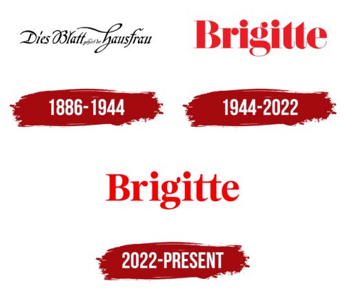
The Brigitte logo, with its refined typography and timeless appeal, carries a symbolic meaning that aligns with the brand’s identity and values.
The logo features the name “Brigitte” in a sophisticated and elegant typeface. The choice of typography communicates the magazine’s dedication to quality and professionalism. The clean lines and classic design evoke a sense of timelessness, reflecting the magazine’s longstanding presence and reputation.
The logo’s simplicity suggests clarity and authenticity, emphasizing the magazine’s commitment to providing trustworthy and insightful content. It reflects Brigitte’s role as a reliable source of inspiration, information, and guidance for its readers.
The absence of any additional graphic elements in the logo underscores the magazine’s focus on its core purpose: to celebrate and empower women through its content. The minimalistic approach allows the brand’s name to take center stage, reinforcing its recognition and establishing a strong visual identity.
The color palette used in the logo also contributes to its meaning. The classic combination of black and white represents elegance, sophistication, and timelessness. These colors further emphasize the magazine’s commitment to providing content that is relevant and enduring.
The Brigitte emblem symbolizes the brand’s commitment to quality, authenticity, and empowerment. It represents a longstanding presence in the industry, a dedication to timeless content, and a focus on providing reliable and valuable information to its readers.
Brigitte: Brand overview
| Founded: | 1886 |
| Founder: | Gruner + Jahr |
| Headquarters: | Hamburg, Germany |
| Website: | brigitte.de |
In the vibrant world of women’s magazines, Brigitte made its debut in Germany in the mid-twentieth century. Born out of a merger of several different publications, this brand set out to create a magazine that was more than just a collection of articles. It aimed to be a trusted friend and guide to its readers.
Brigitte’s content straddled a variety of topics that resonated with its audience. It wasn’t just about fashion and beauty, though these elements were certainly present. The magazine also delved into serious topics such as health, politics, and personal finance. It offered inspirational narratives and features on art and culture, thus serving as a comprehensive resource for its readers.
Understanding the evolving tastes of its audience, the brand was not afraid to innovate and adapt. One of its significant transformations was its decision to do away with professional models in 2010. Instead, it started featuring women of various shapes, sizes, and ages, a move that was lauded for promoting a more inclusive and realistic portrayal of beauty.
The brand’s commitment to serving its readers extended beyond its print magazine. As the digital age dawned, it launched an online platform, creating a space for its community to engage with the brand and each other. The website offered everything from the print magazine, and more – readers could interact with the brand, participate in discussions, and access digital-exclusive content.
Meaning and History
The brand identity of Brigitte revolves around its commitment to celebrating the multifaceted aspects of womanhood. With a focus on lifestyle, fashion, beauty, and personal development, the magazine seeks to empower women by offering a diverse range of content that reflects their interests, aspirations, and challenges.
Brigitte’s logo, featuring the magazine’s name in a refined, elegant typeface, reflects the brand’s sophistication and timeless appeal. The typography embodies a sense of class and professionalism, aligning with the magazine’s reputation as a trusted authority in women’s lifestyles.
The magazine’s brand identity is also conveyed through its content, which emphasizes authenticity, inclusivity, and positivity. Brigitte strives to provide practical advice, insightful stories, and diverse perspectives that resonate with women from different walks of life. It aims to inspire self-confidence, promote self-expression, and foster a sense of community among its readers.
Brigitte’s brand identity is enhanced by its commitment to social responsibility. The magazine often features articles addressing social issues, championing causes, and promoting sustainability. This further strengthens its connection with readers who value making a positive impact on the world.
Brigitte represents a brand that celebrates and empowers women through its content and engagement. Its brand identity showcases sophistication, inclusivity, and a commitment to delivering meaningful and inspiring content. With its rich history and unwavering dedication to its readers, Brigitte continues to be a trusted companion for women seeking inspiration, guidance, and connection.
What is Brigitte?
Brigitte is a renowned women’s magazine that originated in Germany and has since gained international recognition. Established in 1954, Brigitte has been a trusted source of inspiration, information, and empowerment for women across generations.
1886 – 1944
1944 – 2022
2022 – today
Brigitte color codes
| Red | Hex color: | #f40000 |
|---|---|---|
| RGB: | 244 0 0 | |
| CMYK: | 0 100 100 4 | |
| Pantone: | PMS 172 C |


