 British Regional Airlines Logo PNG
British Regional Airlines: Brand overview
In 1996, a regional company was established by Michael Bishop, a well-known British entrepreneur and aviation enthusiast. He became the Chairman, with Terry Liddiard as the Managing Director. They started with a clear goal: to improve regional air travel across Britain.
They launched their first flights in 1997 from Manchester Airport. It chose modern Embraer EMB 145 jets, designed to carry 50 passengers, which suited regional travel perfectly. They quickly began serving more cities, adding bases in Belfast City and Southampton in 1998 and Cardiff and Inverness in 1999. This expansion helped meet the growing demand for regional flights. During this time, they introduced a loyalty program to keep passengers returning.
By 2000, the company had grown significantly, flying over one million passengers. They expanded further by opening new bases in Edinburgh and Glasgow, emphasizing their commitment to Scotland.
2001 brought challenges due to global events, yet the airline managed to keep operating by adjusting its strategies.
In 2002, financial difficulties became too severe, and she had to cease operations. Its routes and aircraft were transferred to other airlines, helping to continue the services it had started. Although it only lasted a few years, it significantly impacted regional communications in the UK. Traveling between different parts of the country has become easier and more accessible.
Meaning and History
What is British Regional Airlines?
It is a British regional airline based at Manchester Airport. It offers regular passenger services to destinations across the UK and select European locations. The company operates a fleet of turboprop and regional jet aircraft, such as the ATR 72 and Embraer ERJ 145, optimized for efficient service on short and medium routes.
1996 – 2002
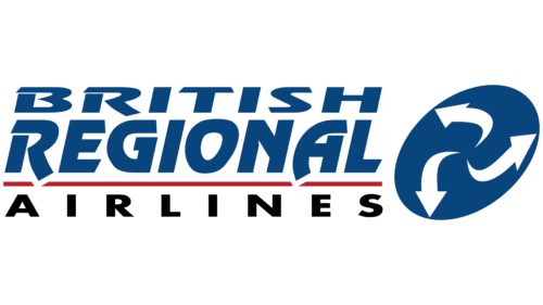
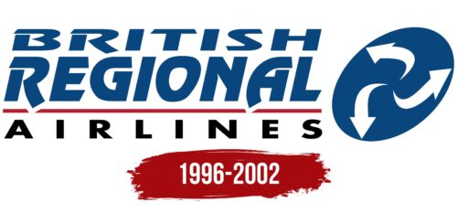
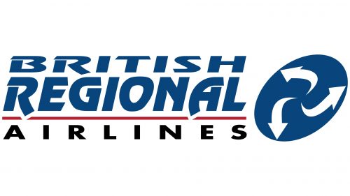
The phrase “BRITISH REGIONAL” consists of large blue letters with unique cutouts, protrusions, and notches. In contrast, the word “AIRLINES,” located below the red line, is written in a hard black sans serif font. The logo is complemented by a blue ellipse, within which three white arrows are depicted. These arrows point from the center to the edges and symbolize the company’s global reach by managing many flights.
The use of blue and red in the logo potentially emphasizes the Britishness of the brand. The different fonts for the words “BRITISH REGIONAL” and “AIRLINES” create a visual separation, emphasizing the importance of the company’s regional and aviation aspects. The three arrows within the ellipse indicate a global presence and imply the different destinations or routes the airline serves, making it a multi-faceted travel solution.


