


![]() Brooklyn Dodgers Logo PNG
Brooklyn Dodgers Logo PNG
In the context of American baseball history, the Brooklyn Dodgers logo reflects Brooklyn’s long-standing sports traditions and the pride of the local fan community. It symbolizes fighting spirit, strength, and the pursuit of victory, emphasizing the players’ ambition and determination. The emblem is associated with team unity because solidarity helps overcome difficulties.
The Brooklyn Dodgers began in 1883, when a professional baseball team was founded in Brooklyn for the Interstate League. Brooklyn was still an independent city then, before joining New York in 1898. The club entered the National League in 1890 and won the championship in its first season, giving local fans an early reason to treat the team as part of the borough’s identity.
For decades, the team moved through several nicknames, including Grays, Atlantics, Bridegrooms, Grooms, Superbas, and Robins. The Bridegrooms name came after several players married in 1888, while Trolley Dodgers reflected Brooklyn streets crowded with streetcars. Dodgers appeared on uniforms in 1932. From 1913, Ebbets Field in Crown Heights became the team’s home and a major gathering place for Brooklyn baseball culture.
In 1947, general manager Branch Rickey signed Jackie Robinson. On April 15, Robinson became the first Black player in modern Major League Baseball. He faced threats, insults, and segregation, yet won Rookie of the Year and helped Brooklyn reach the World Series, making the club part of a national civil rights story.
During the 1940s and 1950s, the Dodgers became one of the strongest National League teams. However, the New York Yankees repeatedly blocked them in the World Series. Brooklyn finally beat the Yankees in 1955. In 1957, owner Walter O’Malley announced the move to Los Angeles after stadium talks failed. The final Ebbets Field game was played on September 24, 1957, and in 1958 the club became the Los Angeles Dodgers.
Meaning and History
![]()
The earlier Brooklyn Dodgers logo reflected the team’s connection to its hometown because it contained the first letter of its name. Although the franchise had many different nicknames, the baseball players proudly wore the ornate “B” decorated with sharp spikes on their uniforms. Later, the symbol turned green and lost its original retro charm because designers changed the font to a bold grotesque with cut corners.
In 1938, Larry MacPhail became the club’s general manager. At the same time, an emblem with the full “Dodgers” inscription was created. Many think this nickname is related to baseball concepts, such as stealing bases. In reality, it comes from another unofficial team name: Trolley Dodgers. Fans humorously played on Brooklyn residents’ ability to dodge deadly trolleys. A few years later, a ball swiftly flying upwards was added to the word. This logo remained after the team’s move to Los Angeles and has undergone many redesigns, changing its shapes and colors.
What is the Brooklyn Dodgers?
The Brooklyn Dodgers were a baseball team that preceded the Los Angeles Dodgers. They emerged in 1883 and were long known under various unofficial nicknames. The Dodgers’ name was officially adopted in 1932 and used until the move in 1957. The club participated in the American Association before joining the National League.
1911
![]()
From 1911 to 1912, the baseball club was known as the Brooklyn Trolley Dodgers. The emblem of that period features a blue letter “B” that appears menacing because of its sharp serifs, which resemble curved horns. The vertical parts of the sign are decorated with five spikes. The “B” is centered in a white diamond, and the geometric figure is set within a blue frame. The border consists of thin stripes with crossed ends and stylistically echoes the glyph’s retro design.
1912 – 1913
![]()
In 1912, the team’s nickname was shortened to Brooklyn Dodgers. This had almost no effect on the logo because the “B” represents the city’s unchanging name. The symbol’s design remained old-fashioned. It features characteristic pointed protrusions that express aggression, one of the most important qualities in sports. The corners of the diamond became solid, making it shape-wise similar to a baseball field with bases.
1932 – 1936
![]()
In 1932, the name Brooklyn Dodgers became official and started being used on the players’ uniforms. However, it did not become part of the emblem. The blue “B” remained the club’s main identification mark. Its font is similar to Bruce Double Pica but differs in its expressive, sharp protrusions on both sides. The vertical part of the letter is adorned with a large triangular cut-out.
1937
![]()
A bold font with trimmed corners, typical of many sports logos, replaced the old-fashioned design. Due to the lack of curves, the internal letter spaces look like two hexagons of different sizes. The team’s traditional blue color was replaced with emerald, associated with confidence, stability, and focus.
1938 – 1944
![]()
In 1938, two significant events occurred in the history of the baseball team. First, Larry MacPhail became its general manager. Second, the word “Dodgers” appeared on the logo for the first time. The handwritten inscription is underscored by a widening ribbon that stretches from the last letter “s” and threads through the loop of “g.” The right side of the emblem is raised at an angle of about 45 degrees, symbolizing the aspiration for success. The dark blue color is a tribute to the heritage of the old club.
1945 – 1957
![]()
After the update, the word mark was complemented by a red-and-white ball swiftly flying upwards. The ball’s direction of movement is indicated by numerous speed lines depicted behind it. To accommodate the ball, designers had to reduce the angle of the inscription’s ascent. The letters became thinner and more elegant but remained blue.
Font and Colors
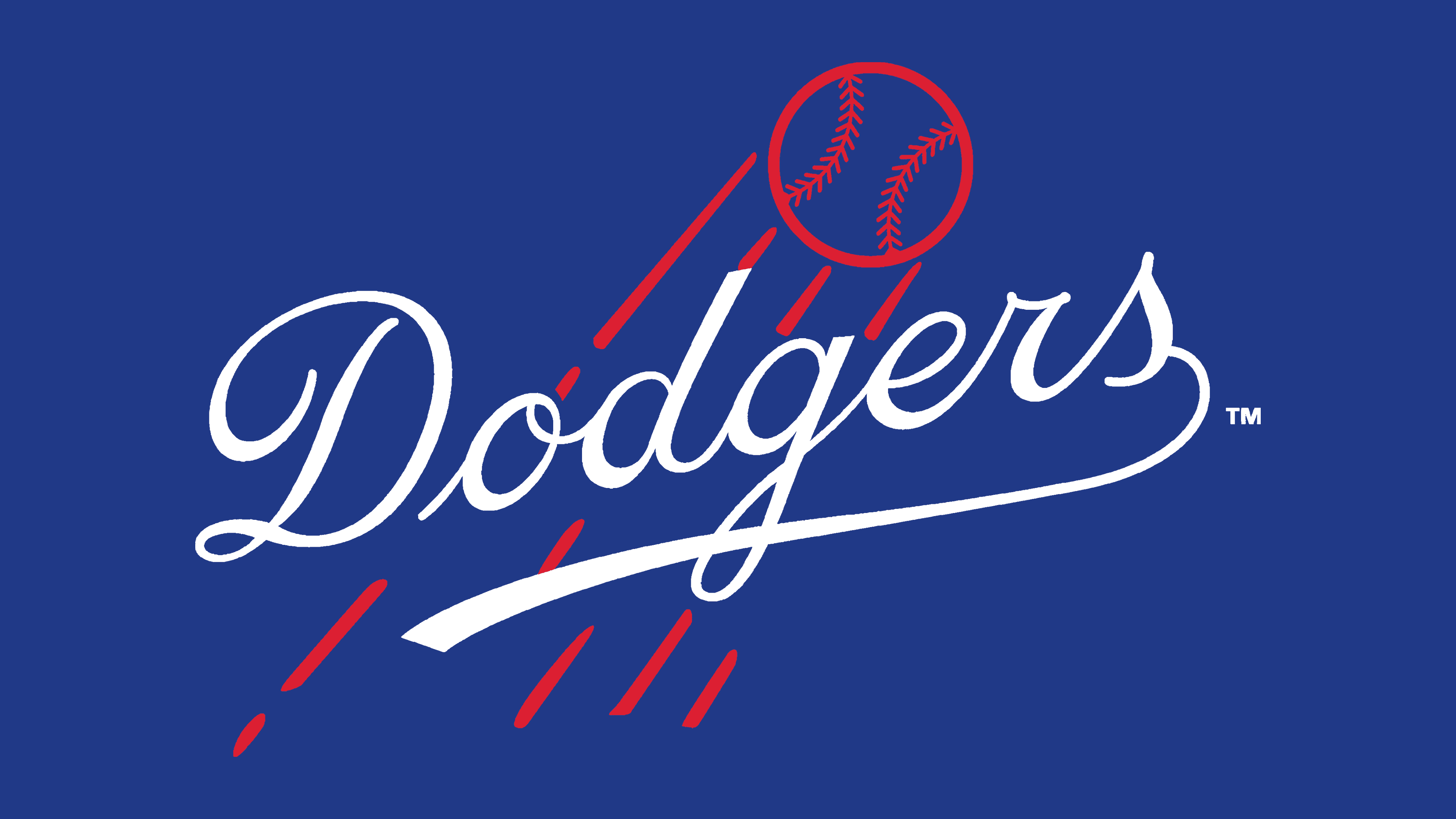
Before moving to Los Angeles, the Brooklyn Dodgers used a logo with a handwritten inscription that imitates calligraphy. The letters are thin and neat, with rounded strokes.
The combination of azure, red, and white matches the team’s brand colors, making the emblem recognizable. The most important shade in the brand’s palette is Dodger blue. Officially, it has the code #1E90FF, but the baseball uniforms are colored in a darker variant: #005A9C.