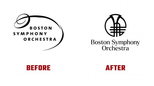
The Boston Symphony Orchestra (BSO), established in 1881, has introduced a new brand identity. This change, designed by Colossus, aims to make classical music more accessible and appealing to modern audiences and shed traditional perceptions of the genre as elitist.
This redesign reflects the BSO’s commitment to community engagement and its varied programming, which includes the Boston Pops Fireworks Spectacular, free concerts throughout Greater Boston, and international tours. The new visual identity is intended to connect better with people of all ages and levels of classical music knowledge.
The new design draws inspiration from the architecture of the BSO’s main venues: Symphony Hall in Boston, The Hatch Shell on the Charles River, and The Koussevitzky Music Shed at Tanglewood. Designers at Colossus developed a unique geometric system based on these structures’ distinct forms and contours, which underpins the new identity.
Historically, BSO logos have ranged from Victorian-era engravings to a corporate style in the 1990s. The new logos feature a unified circular form and consistent line width, signaling a move towards warmth and approachability.
The previous logo included an ornate “O” with a sprawling swoosh, set in a spaced-out sans serif font, which lacked alignment and clarity. The new logo moves from this style towards more straightforward and bold iconography. It features a trumpet-like instrument, referencing traditional elements like cherubs playing trumpets found in earlier logos. While this icon is well-executed with a reflective shine that adds depth, it could be further refined better to represent the orchestra’s full range of offerings.
Each sub-brand within the BSO, such as Boston Pops and Tanglewood, now has its unique circular icon, maintaining distinct identities while staying connected to the overall brand. The Symphony Hall icon is less dynamic but maintains an elegant simplicity.
The typography used across the BSO entities employs Ellen Luff’s Larken, which complements the new visual identity, particularly fitting with Boston Pops. However, it slightly contrasts with the main logo, which lacks the rounded-cap endings in other designs. The Aeonik font is used in broader applications, creating a visual contrast and adding diversity to the visual system.
The new branding strategy employs dynamic layouts that abstractly represent the performance spaces, creating a vibrant and flexible system suitable for various applications. This redesign refreshes the BSO’s image and strengthens its connection with audiences, reinforcing its status as a leading classical music institution that is both historic and vibrantly contemporary.


