The BT logo is simple, accessible, and easy. It presents the corporation as logically structured, its services as accessible, and its products as easy to use. The emblem evokes a sense of harmony and confidence.
BT: Brand overview
| Founded: | 1 October 1969 |
| Headquarters: | London, England, UK |
| Website: | bt.com |
BT is a British corporation providing communication, security, cloud computing, and consulting services for private and corporate clients. The giant’s revenue is about $30 billion. It includes several subsidiaries worldwide, employing 100,000 employees.
Meaning and History
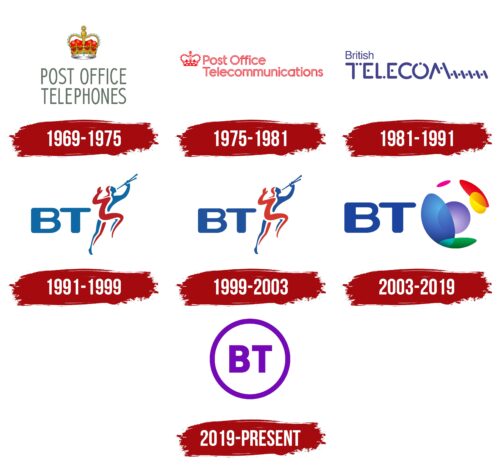
The company’s logos have undergone a long transformation process, linked to changes in the corporation’s names and the arrival of new owners. Each symbol reflected the enterprise’s scale. Its operations are in England, Scotland, and then worldwide. The expansion of the list of services and the addition of internet technologies were also reflected in the emblems. The transformations led to the idea of simplification, reduction, and ease. Therefore, the letters BT, appearing once instead of long words, remained in the logo for a long time, and all additional elements were reduced to a thin circular strip.
What is BT?
It’s an English telecommunications concern. The headquarters is located in an 18-story building at One Braham in London. BT also owns ten different complexes throughout the UK (BT Riverside Tower, Baynard House, Adastral Park, etc.).
1969 – 1975
In 1969, Post Office Telecommunications was established as a division of the General Post Office. Originally it was called Post Office Telephones, as it managed telephone services.
The division’s logo is executed in a strict official style. At the top, there was the British crown. The Post Office was founded by King Charles II of England in 1660, and from that moment on, the post office’s work has been under the patronage of the crown.
The service name is written in uppercase, refined gray letters. It gives the impression that the viewer is looking up from the bottom. The technique showed the scale of the enterprise and coverage at the country level. Thin glyphs hinted at telephone wires, indicating delicacy and respect for user secrets.
The logo conveyed the exclusive rights of the service to provide services—the possibility of international conversations.
1975 – 1981
By 1975, the service’s name changed to Post Office Telecommunications. The digital platform System X appeared. Users had the opportunity to communicate with all corners of the world. The name change was marked by rebranding.
The emblem is done in red, highlighting the company’s patriotism and its state affiliation. The royal crown is placed before the text to indicate that the interests of the state come first. Next comes the name in two levels. Each letter consists of a red outline, hollow inside. This technique shows data transmission in the form of waves through cables.
1981 – 1991
In 1981, the General Post Office was split into two companies: Post Office and British Telecom. The latter became the name of the former division, Post Office Telecommunications.
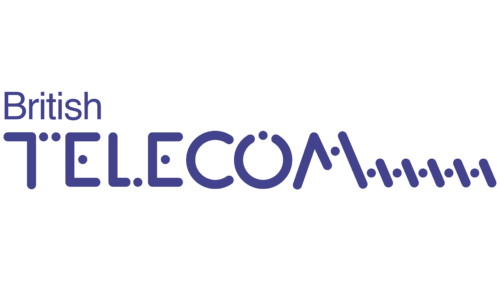
The new emblem is a blue inscription in which parts of the letters are replaced with dots, followed by a series of dots and lines. The technique, presumably, conveys the idea of digital communication with zeros and ones in computer code. It points to the process of packet data sending. It seems that each letter gradually dissolves, turning into separate elements, and is transmitted through the air to the message-receiving point.
1991 – 1999
In 1991, the remaining 50% of the company’s shares owned by the state were sold to investors, and the name was shortened to BT. After the transition to private hands, the company’s scope of activities rapidly expanded, including telephone, internet, and mobile communication.
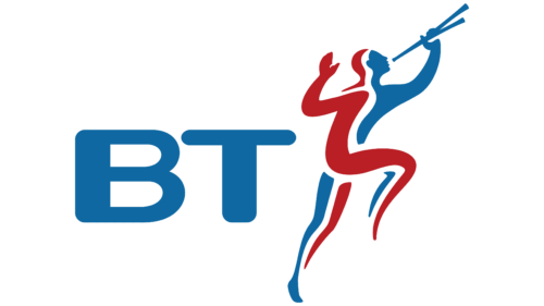
BT introduced a new logo, named the Piper Logo. Wolff Olins designed it. It depicts a piper dressed in a red and blue suit. The musician has two pipes in his hand, which he is playing. The image is taken from the past of the post office. Workers with musical instruments played the role of heralds. They signaled the opening or closing of branches and the approach of postal vessels and carriages.
The choice of colors is associated with the flags of England (red) and Scotland (blue). These shades have become the main ones in the company’s history. The two colors also personified two segments of the company’s work – private and corporate.
The dynamic pose of the herald indicates a move forward, a desire for new technologies.
1999 – 2003
In 1999, BT became the owner of the Irish telecommunications company Ocean, extending its influence to two countries. Minor logo modifications marked this maturation and expansion.
The structure of the emblem remained the same. The novelty was in the shift from the blue color to a darker shade to underscore solidity.
2003 – 2019
Due to accumulated debts, the company underwent a makeover and restructuring, changing its name to BT Group. Several subsidiary enterprises were purchased in different countries, and analytics and cybersecurity services were added to the regular offerings.
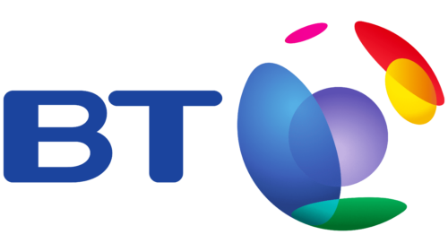
The new logo presented the company as a global corporation. It was named Connected World and created by the same designer who designed the 1991 logo.
Following the company’s name in the emblem, a prototype of the Earth was placed. Being hollow and transparent, it symbolized connection through the airspace. Multicolored circles were placed on the globe’s surface, intersecting with each other. Each circle represented one of the BT Group companies, from which a wave signal spread. The overlaying signals demonstrated user connections with each other.
The circles also indicated the company’s diverse services: broadband internet, mobile internet, cybersecurity, cloud telephony, cloud computing, and consulting.
The BT letters also grew larger, demonstrating global reach.
2019 – today
In late 2018, BT underwent another restructuring, consolidating many of its subdivisions into two companies: BT Enterprise and BT Consumer. The conglomerate’s visual symbol also embraced minimalism. Its designer was Paul Franklin.
The modern logo consists of a white circle with a purple outline, inside of which are the purple letters BT. The circle conveys:
- Unification and centralization.
- Worldwide presence.
- Air space through which wireless signals are transmitted.
The lack of unnecessary details testifies to the ease of using the provider’s services.
Font and Colors
Blue, red, and purple form the foundation of BT’s logos. Starting with red colors, indicating the English crown and the patronage of the ruling house, the company moved to blue symbols, speaking of technological progress in communications. Purple is the result of synthesizing the previous two. It is a logical continuation of the theme of unification and simplification.
- Red – urgency, speed, premium service level.
- Blue – communications, computer technologies.
- Purple – development, realization of its mission, influence on people.
The letters of the inscription are smooth with sharp angles and match many fonts. Their simplicity highlights the availability of the company’s services in various parts of the world. The thin lines symbolize wires.
BT color codes
| Grape | Hex color: | #7508b7 |
|---|---|---|
| RGB: | 117 8 133 | |
| CMYK: | 36 96 0 28 | |
| Pantone: | PMS 2592 C |
