


![]()
The Budapest International Film Festival (BIFF) has launched a new visual identity designed by Studio Stoki, showcasing its goal to make its mark on the European cinema scene. The updated branding embraces a modern look while staying connected to the region’s rich artistic heritage. Supported by Warner Bros. Discovery, Erste Group, and Bortarsasag, the festival occurred at Corvin Cinema in Budapest from October to November 2024.
The new identity’s heart is a bold, typographic design built around the acronym “BIFF.” The letters are crafted in a geometric typeface with rounded edges, balancing structure, and flow. A standout detail is the customization of specific letters. The “B” features subtle design cues inspired by film reels or projection screens, using interior rectangular shapes to add depth. The “F” characters are elongated and narrow, creating a distinctive rhythm that adds personality. This gives the logo a fresh, contemporary vibe while staying rooted in cinematic storytelling.
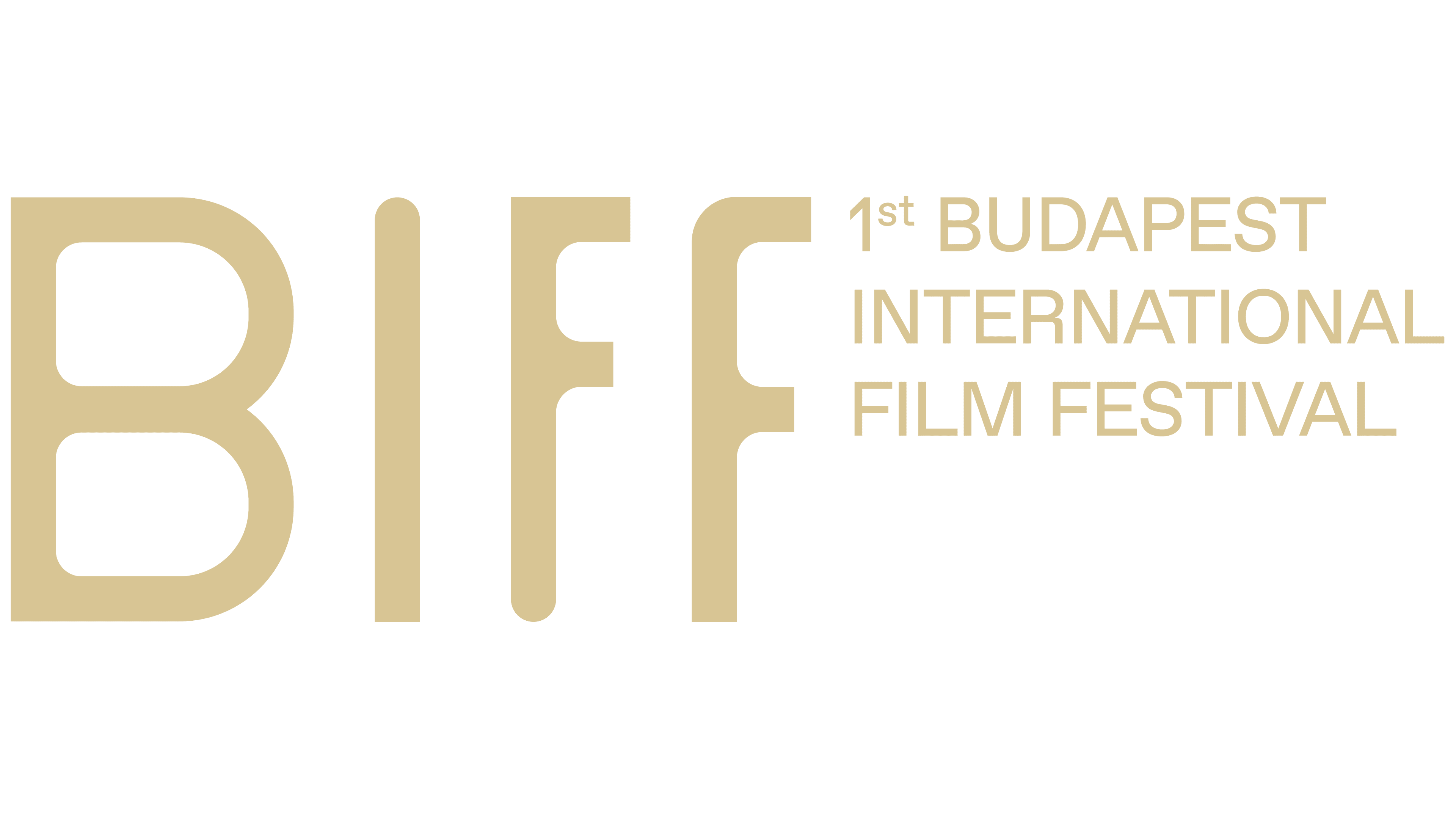
Next to the acronym, the full name—”1st Budapest International Film Festival”—is displayed in a clean, sans-serif font. The layout is horizontal and structured, reinforcing the festival’s global reach. Using uppercase letters for “BUDAPEST INTERNATIONAL FILM FESTIVAL” adds a formal touch and ensures strong visibility across different mediums.
A deep, saturated blue is chosen for its connections to creativity, professionalism, and cultural depth. Shade moves away from retro aesthetics while maintaining a bold, sophisticated presence. Paired with crisp white lettering, the blue background enhances contrast for clear, impactful visuals.

The festival’s branding extends beyond the logo, creating a unified look across all materials. Graphic elements inspired by the logo’s structure appear in promotional content, digital assets, and signage. The mix of sharp angles and smooth curves mirrors the dynamic nature of contemporary filmmaking, with a subtle nod to traditional Eastern European poster design.
The redesign features a flexible typographic system. The primary logo uses a customized version of the SUD typeface, giving it a unique edge with unconventional spacing and character details. For secondary text, Manrope, a versatile sans-serif font, ensures clarity and readability across different platforms.
BIFF’s new identity, which focuses on bold typography, a striking color palette, and subtle references to cinema, reflects its ambition to become a standout event in the global film community.