Founded in 2015, the aquaculture firm Bue unveiled a comprehensive rebranding initiative highlighting its commitment to becoming a pioneer in land-based salmon production. Operating a prototype facility in Bulandet, Askvoll, Bue has its headquarters in Florø and additional offices in Leirvik, Hyllestad, and Bergen. It currently produces 1,400 tons of post-smolt and edible fish annually. The company plans to build a new facility on Lutelandet and expand its site at Bulandet to reach its long-term production goal of 50-60,000 tons annually.
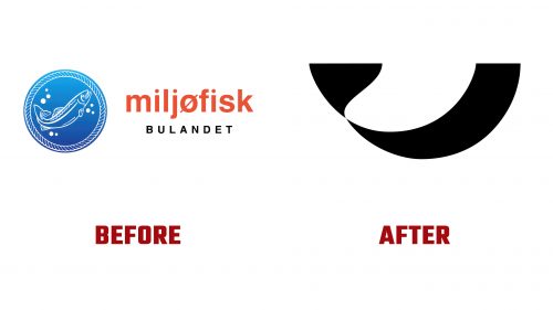
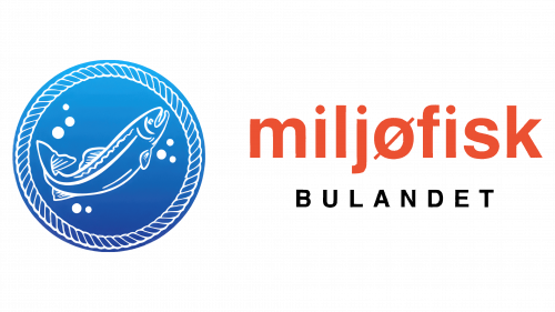
The former logo was intricate and cluttered with elements like a rope, bubbles, and a clipart-style salmon, which communicated the company’s focus on fish but lacked cohesion. The typeface was inconsistent, with varied cases, irregular spacing, and a mix of red and black colors. Recognizing the need for a more unified and contemporary identity, the company has introduced a new logo and branding that better represents its mission and core values.
The new logo features a simple, abstract image of a salmon. This design emphasizes elegance and simplicity, removing the previous logo’s intricate and sometimes sloppy appearance. Despite its abstract nature, the new image effectively captures the essence of a fish, particularly the streamlined and fluid form of a salmon. The simplicity of the design makes it adaptable and instantly recognizable, essential for successful branding. Although this may be subjective, the proportions—especially the tail size—lean slightly toward a whale-like appearance, enhancing its distinct character.
Accompanying the new symbol is a wordmark set in NN Nouvelle Grotesk, a typeface known for its crisp lines and contemporary appeal. The minimalist emblem and simple, elegant font create a visually appealing, well-balanced, harmonious brand. This new wordmark is designed to ensure Readability and brand recognition across various applications, making it functional and aesthetically pleasing.
Beyond the logo and wordmark, the rebranding adopts an overarching design language inspired by Scandinavian minimalism. All brand communications, from print materials to digital interfaces, utilize clean typography and elegant layouts. The color scheme for the new logo features cool tones that evoke the serene waves of the Norwegian coast, where the company operates.
A pattern inspired by water currents is a noteworthy addition to the brand’s visual elements. This design is subtly integrated into various applications, giving the branding a lively and natural feel. It acts as a visual metaphor for the currents that shape the salmon’s habitat and reinforces the company’s connection to aquatic ecosystems.
One of the most notable elements of the rebranding is the packaging for the company’s salmon products. The luxurious design elevates the product to the status of fine caviar. Premium materials and meticulous design elements, including a sophisticated presentation box, communicate a sense of exclusivity and elegance. This approach aligns with the firm’s commitment to sustainability and high quality, ensuring that its salmon products are delicious and presented in a way that complements their exceptional flavor and texture.
The new tagline, “Current made,” encapsulates the brand’s philosophy. It alludes to the company’s innovative and progressive strategy while implying that the natural currents in their environment shape the fish. This slogan and the entire rebranding initiative position the firm as a company inspired by contemporary innovation while remaining deeply rooted in tradition.
Bue’s rebranding campaign, which unites its visual identity with its mission to excel in sustainable and superior salmon farming, is a significant step forward for the company. The sophistication and minimalism of the new logo, along with the cohesive branding elements, reflect Bue’s commitment to quality and its forward-looking vision for the aquaculture industry. As Bue expands and innovates, its redesigned brand identity will be crucial in enhancing its market visibility and strengthening its connections with stakeholders and customers.


