The Bulgaria Air logo showcases the airline’s role as an ambassador of Bulgarian culture, linking the country to Europe and the wider world. It features elements representing the natural beauty of Bulgaria and its dynamic future in global connectivity. The emblem highlights a stylized Bulgarian rose, a national symbol, which symbolizes the airline’s commitment to service and hospitality—traits deeply rooted in the country’s identity. The design fosters a sense of national pride, emphasizing the airline’s importance in enhancing Bulgaria’s recognition internationally and supporting its tourism and business sectors.
Bulgaria Air: Brand overview
Bulgaria’s national flagship carrier, Bulgaria Air, or “Bulgaria Air” in its native Bulgarian language, has served the country with pride and dedication since its inception. Headquartered in the heart of Sofia at Sofia Airport, the airline is an integral part of the country’s bustling capital.
Bulgaria Air emerged in 2002 after the unsuccessful bankruptcy of the previous national carrier, Balkan Bulgarian Airlines. This new face in the aviation industry took to the skies with a fleet of nine aircraft and initially focused on European and Middle Eastern transportation.
As of 2021, the lion’s share of Bulgaria Air’s fleet consists of Airbus A319 and A320 aircraft. The airline flies to impressive European destinations such as Barcelona, Berlin, Brussels, Frankfurt, Frankfurt, London, Madrid, Paris, Rome, and more.
Meaning and History
What is Bulgaria Air?
Bulgaria’s national airline, based in Sofia, operates flights connecting Bulgaria to Europe, the Middle East, and Russia destinations. Known for its reliable service, it offers various classes of service, including economy and business, focusing on passenger comfort and convenience. The airline’s modern fleet of aircraft and a wide range of onboard amenities are designed to ensure a pleasant travel experience.
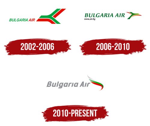
2002 – 2006
Founded in 2002 following the bankruptcy of its predecessor, Balkan Bulgaria Airlines, Bulgaria Air embarked on rejuvenating Bulgarian national aviation. The company introduced a logo that symbolizes a new era in Bulgarian aviation’s history, emphasizing modernity, dynamism, and national identity. This logo reflects the airline’s renewed vision and commitment to innovation and expanding its international presence.
The logo’s central element is a stylized image of an airplane tail that resembles a road fork, symbolizing routes that open new horizons and opportunities for passengers. This image invites travel and discovery and represents dynamism and forward movement. A thin white line running through the figure adds airiness and lightness, emphasizing the safety and comfort of flights.
The logo incorporates the national colors of Bulgaria: red, green, and white, which reflect the company’s national identity and express pride in the country and its cultural heritage. The logo’s inscription matches this color scheme and style, ensuring cohesion and recognizability. The capital letters in the company’s name highlight its status as the national carrier. The slant of the characters to the right reinforces the sense of movement and speed, suggesting the direction of the airplane’s flight.
The Bulgaria Air logo embodies a call to travel, discover new places, and create memorable experiences. It is a vibrant symbol of the company’s dynamic development and openness.
2006 – 2010
2006, following the privatization process, Bulgaria Air underwent a subtle redesign of its logo, keeping the three primary colors that symbolize Bulgaria’s national heritage and cultural traditions. These changes highlighted a new stage in the company’s development while maintaining the brand’s recognizability and national identity.
In the updated design, red and green elements were overlaid to create the image of an airplane’s front part heading toward a destination. This visual approach enhances the sense of dynamism and speed and symbolically reflects the airline’s ambitions and focus on continuous development and expanding horizons. The tail part of the airplane is represented by the green “Bulgaria Air” inscription in large font, emphasizing the company’s stability and growth.
Privatization provided Bulgaria Air with new opportunities for expansion and modernization. Simultaneously, the airline remains a proud national carrier, as shown using colors that symbolize the country’s forests, fields, and mountains—elements from the national flag’s design. These elements strengthen the brand’s connection to Bulgaria and add a sense of natural beauty and eco-friendliness to the logo design.
The logo includes the company’s website address as part of a new marketing strategy. This feature enables passengers to easily find information and book tickets online, reflecting the airline’s dedication to innovation and improving the customer experience in the digital age.
2010 – today
Bulgaria Air’s logo features a wing, establishing its aviation identity. The wing has three “feathers” in the colors of the Bulgarian flag: white, green, and red. The company’s name appears silver beside the wing, with side strokes creating a three-dimensional effect. The thin, elegant lines of the text add a sense of lightness, complemented by small notches at the ends of the letters.
The use of national colors in the wing design highlights Bulgarian heritage. The three-dimensional text and side strokes give the logo a modern, professional look. The sleek and graceful lines convey reliability and elegance, helping the logo stand out and resonate with national and international audiences.
The logo reflects Bulgaria Air’s national pride, excellence, and technological advancement values. Combining these design elements ensures the logo is visually appealing and meaningful, representing the airline’s dedication to high standards in the aviation industry.
