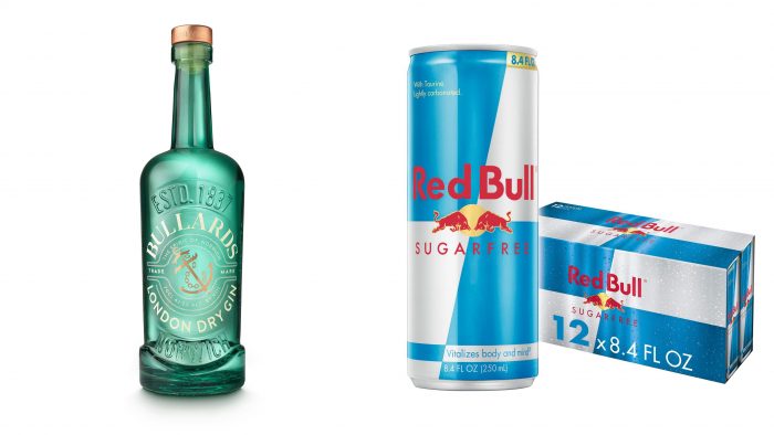
The oldest British producer of alcoholic beverages, Bullards, has introduced a new line of gin, whose trademark has caused a dispute with the famous producer of Red Bull. Bullards was founded back in 1837, which played a role in settlement of the conflict, creating significant difficulties. Considering that such a significant “age” of the company may become a reason for ignoring the claims from the young manufacturer, the company applied for registration of the beverage trademark in the UK Intellectual Property Office. The conflict was the use of the separate spelling of the Bull ards brand in the emblem, which, according to Red Bull, could cause confusion between products made by different manufacturers. “Bull” – as the main logo element of two different brands, can mislead the consumer when buying a product. Red Bull does not manufacture alcoholic beverages, and Bullards does not manufacture energy drinks and beverages of this non-alcoholic group. But the similarity of the names of trademarks can lead to a loss of positions and incidents when a buyer buys a drink of the wrong type.
The TM Bullards emblem, developed for the new gin line, should be applied on the front side of the bottle. It has a round shape and is placed between the engravings on the bottle. Upper – an indication of the date of foundation of the company. Lower – NORWICH. Under the upper engraving on the emblem itself, in the inner space of the circle along its circumference in the inner space, the text name of the company – Bullards is applied in white font. It covers the upper sector up to almost half. In this case, the integrity of the performance of the name is an important point. However, its location along the contour of the circle allows you to “see” 2 words in the inscription, which was one of the reasons for the conflict. In the lower half of the interior space of the emblem, the name of the specific drink from the gin range that is bottled in this bottle is applied. At the same time, the fonts of the name of the brand and the drink differ in their style. For the drink, a less bold version was used, which also differs in the shape of the letters, which visually separates these texts according to their semantic purpose.
To enhance the effect of text splitting, there are two semicircular shapes between the inscriptions, in which additional text is applied in small print. They partially frame the accent element of the entire composition – a golden ship’s anchor with elements of an anchor chain. This symbol is a tribute to the traditions and historical roots of the brand, which has been used since the time of its creation. At that time, the company was engaged in producing beer and delivered wines and various alcoholic beverages on ships. The sale took place in port pubs; the main consumers of their product were sailors.


