


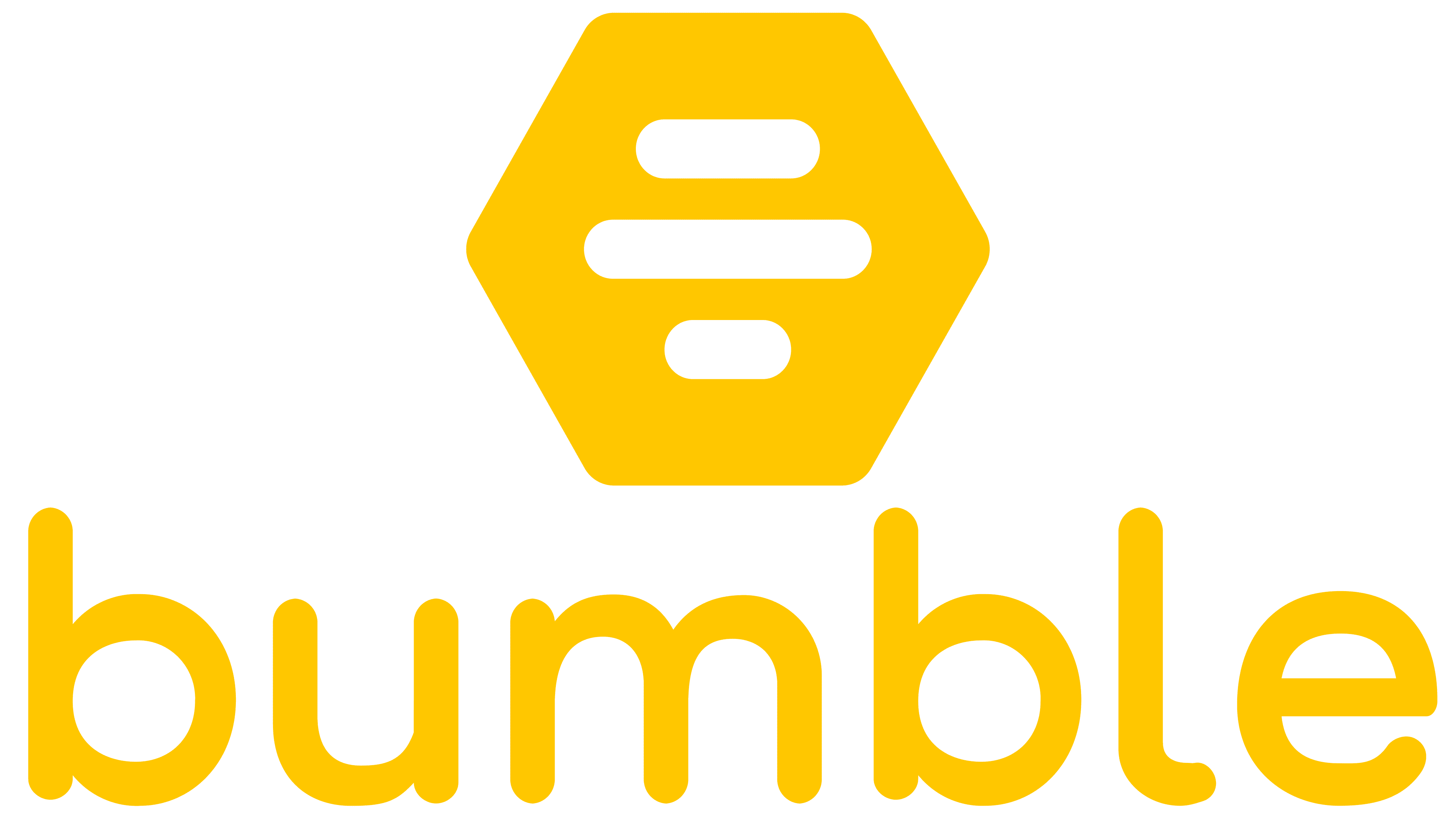
![]() Bumble Logo PNG
Bumble Logo PNG
Versatility is the main meaning of the dating service’s sign. “Be bold, show all your facets,” the Bumble logo encourages. The emblem’s symbols indicate correspondence and the search for a person with whom you will be suited, as two parts of one whole.
Bumble was launched in 2014 by Whitney Wolfe Herd, a co-founder and former VP of marketing at Tinder. She left the company after disputes and legal issues, aiming to rethink interaction patterns in online dating and reduce unsolicited messages.
The project was developed with Andrey Andreev, founder of Badoo, who invested $10 million and provided infrastructure, securing a controlling stake. Bumble introduced a rule that requires women to initiate conversations in heterosexual matches. The app launched in December 2014 and exceeded one million users within its first year.
In 2016, Bumble added BFF, extending the platform into friendship-based connections. In 2017, Bumble Bizz introduced a professional networking layer. The same year, the company rejected a $450 million acquisition offer from Match Group, owner of Tinder. In 2018, Bumble Fund was created to invest in startups founded by women. In 2019, Andreev sold MagicLab, which included Bumble and Badoo, to Blackstone Group. After the deal, Wolfe Herd became CEO of the combined business.
In 2020, the platform expanded video and virtual dating tools during the pandemic. On February 11, 2021, Bumble went public on NASDAQ, marking a rare case of a dating platform led by a female founder going public. By 2023, Bumble operated in over 150 countries with tens of millions of users. The company continued to expand features, moderation systems, and regional adaptations while competing with services such as Tinder and Badoo in a saturated market.
Meaning and History
![]()
Bumble bills itself as a secure dating app, which is why it has over 55 million users. The most active and largest market in New York: about 40% of the people who have installed the program live in Manhattan.
The online service’s name and logo reflect a play on words. After all, “bumble” refers to the communication process, and “bumble-bee” is a bee-like insect. Having established such an associative relationship, the developers made a hexagonal honeycomb cell as an emblem. A single version is used only as a social media icon or an app icon in the App Store. In all other cases, the image should be next to the “bumble” inscription, most often above it.
What is Bumble?
This is the company’s name, founded by American Whitney Wolfe Herd, and its flagship product is an Internet dating application. Bumble is positioned as Tinder’s main competitor, its “feminist” alternative. The mobile program was launched in 2014 with the support of Andrey Andreev, the creator of the social network Badoo.
This logo appears on advertising materials, adorns souvenirs, and is widely distributed online. It became even more popular in 2018 when Bumble Trading Inc. placed its symbol on the Los Angeles Clippers basketball team uniform. According to the contract terms, she pledged to pay about $ 20 million by the end of 2021.
Whitney Wolfe Herd explained the decision, saying that the NBA franchise supports gender diversity among players. In her opinion, the Bumble icon on the Clipper’s shape could symbolize empowerment.
A little later, the logo appeared in another unusual place: in a New York cafe called Bumble Brew. The dating app has begun to expand into the restaurant business as the two are interconnected. The social network offers users a safe place for meetings, events, and parties. It is a cozy coffee house for friendly gatherings by day, and at night, a wine bar with a romantic atmosphere.
2014 – 2018
![]()
2018 – 2024
![]()
2024 – today
![]()
The Bumble logo is recognizable thanks to its bright yellow color. It’s a warm, positive color associated with friendliness and kindness. It evokes associations with bees and hives, which makes sense since the brand name comes from the word “bumblebee.” The yellow color perfectly conveys this idea, symbolizing energy, teamwork, and communication, exactly what the app’s concept is built on.
The new symbol to the left of the name resembles four horizontal lines arranged in a honeycomb pattern. This is a fitting choice, as honeycombs are associated with community, collaboration, and natural harmony and order. This symbol points to building connections and relationships within the platform in the company context. The honeycomb is a metaphor for the network, where each person is an important element.
The font used for the name is soft and rounded, without sharp edges. This creates a feeling of friendliness and simplicity, making the logo approachable and welcoming. The absence of sharp corners emphasizes that interactions within the app should be easy and pleasant without unnecessary tension.
The platform’s core idea was to create a safe, convenient space for dating where women have greater control. The logo perfectly aligns with this philosophy: bright, positive, simple, and clear. The company didn’t attempt to overcomplicate its identity; instead, it focused on friendliness and openness, reflected in this design.
This new approach was revolutionary for the online dating industry at the time, and this bright, cheerful logo embodied the company’s core values: safety, openness, and positive interaction.
Font and Colors
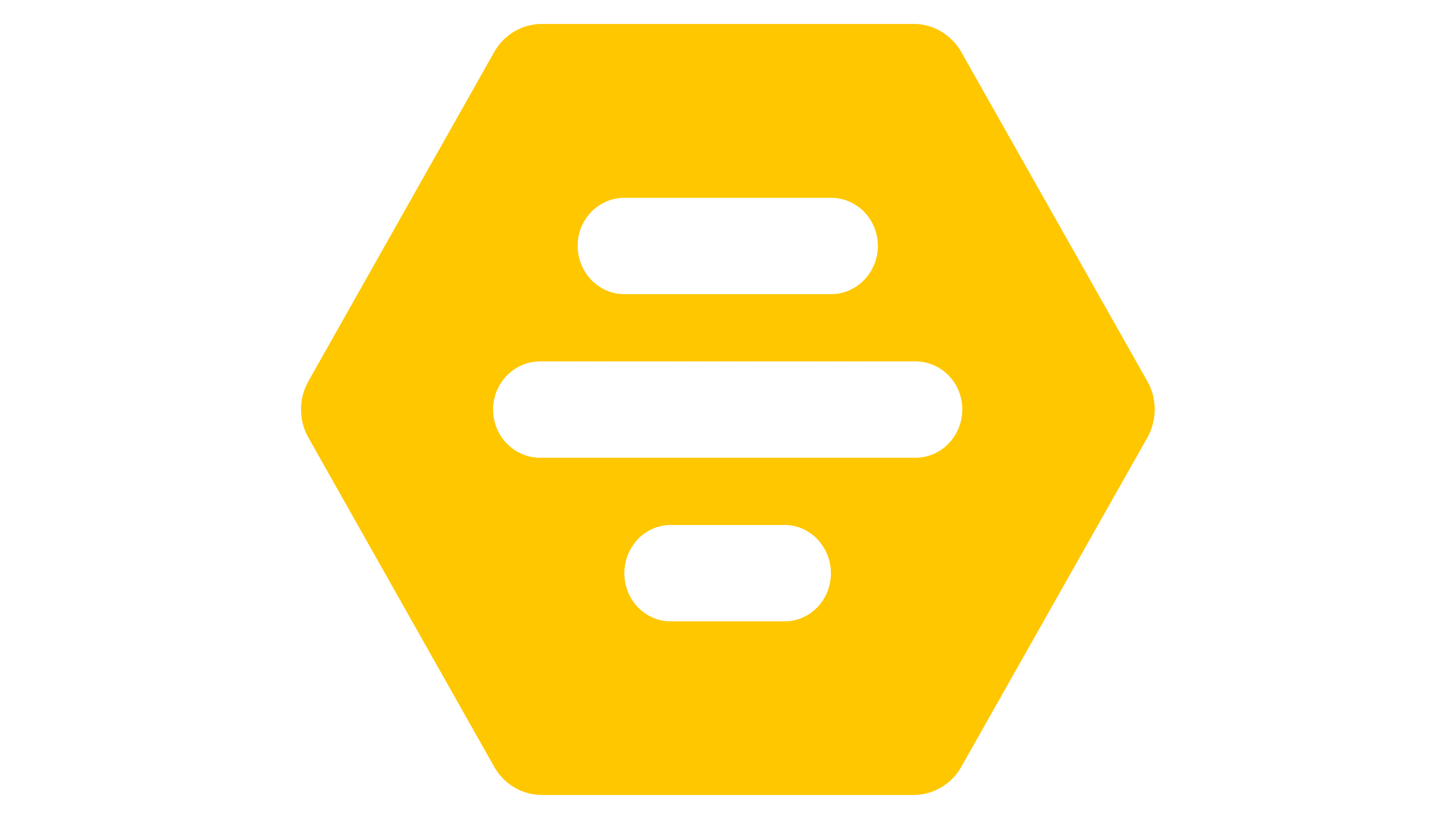
The basic symbol of Bumble is a hexagonal honeycomb with rounded edges. It has a heterogeneous structure: inside the geometric figure are six lines of different lengths. The bands, lined up in ascending and descending order, resemble a graphic representation of sound waves. Such associations are not accidental because the application is intended for user communication.
The designers used a special font for the wordmark, based on Galano Grotesque. The original typeface was released in 2015 by the German typographic studio René Bieder. Bumble developers changed it slightly but kept the traditional glyph shapes characteristic of other geometric sans-serifs, such as Avenir, Avant-Garde, and Futura. The uniform line thickness and rounded corners give the letters harmonious proportions.
The main color of the logo and lettering is Bumble Yellow (#FFC629), while the company prefers yellow as the background for Bumble Black (#1D252C). It is also acceptable for the black logo to be on a white (#FFFFFF) rectangle or vice versa, white on black. All color options are spelled out in the brand design guide.
FAQ
What is Bumble’s slogan?
The slogan is “The Home Of Make The First Move™.” This slogan highlights the brand’s unique approach to online dating and social networking. The brand stands out by empowering women to make the first move in starting conversations. This creates a more balanced and respectful interaction between users.
It encourages women to take control of their dating lives, promoting confidence and equality. This approach aligns with a brand’s mission to challenge traditional gender norms and build a more progressive and inclusive online community.
Why did Bumble change its logo?
The brand changed its logo as part of a broader update to its visual identity, which includes a new color palette, typography, and custom illustrations. The goal was to create a more modern, playful, and intuitive user experience that reflects Bumble’s unique approach to online dating and social networking.
The new visual identity aims to make the platform more appealing and user-friendly. By updating its logo and design, the brand seeks to better align with its mission of empowering women and fostering meaningful connections.
Does Bumble have Emojis?
Yes, Bumble has emojis you can use to react to users’ photos and profile prompts. If you don’t have first-move privileges, you can still use these emojis to show interest. Your reaction will only be visible to the other users after they swipe right, comment, or react to your profile.
This feature makes the platform more interactive and engaging. It allows you to express interest and connect even if you can’t start the conversation. Using emojis adds a playful touch to interactions, helping to break the ice and show your personality.
What does the symbol mean on Bumble?
The app uses symbols to represent different features and options:
- A checkmark in a blue circle means the user’s profile is verified. This assures other users that the profile is authentic.
- The Bumble Spotlight icon is a four-pointed star in a yellow circle. This feature boosts profile visibility, making it more likely to be seen by others.
- The Bumble Boost subscription button is a white lightning bolt on a mint background. It allows users to purchase Bumble Boost, which offers features like seeing who swiped right, extending matches, and rematching with expired connections.
These symbols make the app user-friendly by clearly showing the different features and options to enhance the dating experience.
What is the font of the Bumble logo?
The logo uses a modified version of the Galano Grotesque font, developed by the German company René Bieder. This typeface is known for its clean, geometric lines and modern look. The designers adapted the logo letters to retain their strict geometric form while giving them a unique, recognizable appearance.
These modifications help create a distinctive and cohesive brand image. The font’s precise and straightforward design conveys simplicity, reliability, and modernity, key aspects of Bumble’s identity. The clean lines and balanced proportions make the logo easily readable and visually appealing.
This adapted font ensures that Bumble’s logo stands out in the competitive landscape of social networking and dating apps.
What does the Bumble logo mean?
The logo resembles a honeycomb, symbolizing the app’s purpose and community values. This design shows that Bumble is a place for people to “buzz,” or connect and communicate with like-minded and interesting individuals.
The honeycomb shape is visually appealing and carries deeper meanings. In nature, a honeycomb represents structure and teamwork. The hexagonal pattern suggests efficiency and harmony, reinforcing the app’s commitment to creating a user-friendly, balanced experience.