Looking at the Burlington logo, it becomes clear that the brand’s stores are not just a place to shop. These establishments are full of comfort and love, both for their work and for their customers. The emblem promises each visitor an attentive attitude and pleasant purchases.
Burlington: Brand overview
| Founded: | 1972 |
| Founder: | Monroe Milstein |
| Headquarters: | Burlington, New Jersey, U.S. |
| Website: | burlington.com |
Meaning and History
The journey from factory to clothing department stores took Burlington over 100 years. It began in 1923, right in the middle of a cornfield, when a young Spencer Love convinced the Burlington Chamber of Commerce to sponsor the construction of a factory in their town. In 1972, the factory premises were bought by the Milstein family of Jewish immigrants who traded in clothing (Love’s Burlington Industries had by then greatly expanded and no longer needed the space). Placing merchandise in the large hall put the Milsteins’ business on a wide footing. Wholesale and retail sales of coats and jackets grew into a wide range of clothing and an entire chain of stores. By 1983 Burlington Coat Factory Warehouse Corporation had 31 outlets; in 2013, it had 503.
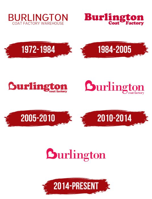
Despite four updates to the visual sign, it always contained only text, and only shades of red and white were used for the design.
What is Burlington?
It is a major American department store chain with a presence in 40 states. It offers clothing and footwear for the whole family and bedding, toys, baby products, and haberdashery. It opened 740 stores, bringing in about $6 billion in revenue.
1972 – 1984
The first emblem was simple and straightforward. It included a large factory name: Burlington. And below that information about what the company offered: Coat Factory Warehouse.
The burgundy color of the name showed the new owners’ pride in such a substantial acquisition. After all, they were now a major enterprise. As a vintage color, the hue pointed to the store in the historic building and the Milsteins’ substantial business history (Monroe’s father started the wholesale trade in 1923).
The slim and stark letters hinted at the sale of outer business clothing and at the fact that the company displayed clothes in simple spaces, without salon trimmings. This policy extended to the firm’s future stores, allowing for lower prices on merchandise.
1984 – 2005
In 1983 the company’s stock began to be traded on the stock exchange, and Burlington Coat Factory Warehouse Corporation had its first shareholders. The influx of capital allowed the firm to grow further. By 1984 there were 31 retail stores, and by 2003 there were 335. Burlington was actively adding a variety of brands to its assortment, moving away from coats and offering good discounts. The new pretensions were reflected in an updated logo.
The company was no longer associated with a warehouse; it had a lot of rooms, so the word “warehouse” was removed from the logo, leaving only Coat Factory. The austere letters turned into rounded ones with graceful curls and got a fresher, bright crimson color. They reflected the range of fashionable and smart clothes for the whole family. The thickness of the letters also increased, which was a hint of growth and expansion.
2005 – 2010
The company is being prepared for sale. In 2006 it changed ownership to Bain Capital Partners, an investment company. The new buyer transformed Burlington into Burlington Coat Factory Holdings, making it the parent holding for all other offshoots (Baby Depot, MJM). With the creation of the Burlington “family” of companies, the theme of love and togetherness became central to the logo of this period.
The heart appears in the name – a symbol of love, family ties, and the benevolent attitude of the stores to their customers. The first letter of the word, B, slanted backward, is stylized under the sign. The capitalized position of the heart shows that love and friendliness are at the forefront of the company. As part of its new policy, Burlington began fundraising in 2006 to sew coats for those in need.
The rich red color of the lettering also conveys the emotion of love. It is a sign of blood and blood ties. It shows that Burlington cares about the whole family, delivers the best to customers, and offers the right products at low prices.
The Coat Factory lettering is no longer accentuated. It has been made much smaller in size and placed at the bottom right, after the loop of the letter G.
2010 – 2014
The main change for this period was replacing the bright red hue with a fuchsia color and the bold serif font with a more subtle one. This made the emblem more fashionable, as did the firm’s range itself. The holding adds more and more brands and stores to its “piggy bank. Among them is Cohoes Fashions.
2014 – today
In 2013, the new holding company put its stock up for sale and began a partnership with shareholders. This entailed expanding the scope of the company and rebranding. Burlington’s main message today is embracing difference.
All of the company’s customers are very diverse, differing in views, skin color, beliefs, and lifestyles. The company welcomes diversity and tries to cater to all tastes. The idea of benevolence, tolerance, and caring is reflected in the logo by the lighter color of the inscription. And the support for diversity is expressed by the fact that the inscription “coat factory” was removed from the logo, allowing the company to leave history behind and start a new stage of development. After all, Burlington has long offered customers much more.
Font and Colors
Different shades of red have been used for the visual sign.
- Burgundy is the color of greatness, strength, elegance, resilience, and the ability to achieve one’s desires (Monroe’s wife saved 75,000 from her salary at the library. That was only enough for a down payment. The value of the factory was 675,000. However, the Milstein’s wanted their business so badly that they took the risk).
- Bright crimson – individuality, developing one’s style, forming a new assortment.
- Amaranth red – the color of love, life, caring, family, department store, charity.
- Fuchsia – determination, cheerfulness, happiness, moving forward.
Burlington found his perfect font. That is why it did not change in the last logo editions. Bodoni is a subtle serif font. It corresponds to a company with a rich history of offering fashionable things.
Burlington color codes
| Amaranth | Hex color: | #ed1053 |
|---|---|---|
| RGB: | 237 16 83 | |
| CMYK: | 0 93 65 7 | |
| Pantone: | PMS 192 C |
