The brand of chocolate bars uses the discreet Butterfinger logo, but thanks to it, its products are also very popular. The company has focused on the quality of the product rather than on the marketing strategy. That’s probably why the logo changes incredibly often: it has to match the bars’ taste.
Butterfinger: Brand overview
Butterfinger is an American company that specializes in chocolate bars. Founded in 1923 in the United States, it has spread worldwide. The brand’s products are sold in more than 100 countries worldwide. In 2018, the Ferrero Corporation bought the rights to use Butterfinger.
In the 1920s, Otto Schnering started the Curtiss Candy Company in Chicago and created Butterfinger. He was creative and made a unique candy bar that was different because it was crispy and flaky. The name “Butterfinger” came from a slang term for someone clumsy, which fit the candy’s crumbly texture well.
Butterfinger became popular quickly. It was first marketed as a fancy, healthy snack. It got even more famous when it was featured on “The Popeye Radio Show” in the 1930s. This helped more people know about it and like it.
During World War II, they had to stop making Butterfinger because they couldn’t get the ingredients. But after the war, it became popular again. Over the years, how they advertised Butterfinger changed to stay fun and interesting. The slogan “Nobody better lay a finger on my Butterfinger!” is one of the most famous and shows how much people loved it.
In the 1990s, Nestlé bought Butterfinger, and then Ferrero bought it in 2018. Ferrero made some changes in 2019, such as improving the recipe and packaging. They also eliminated artificial ingredients to make it more natural.
Meaning and History
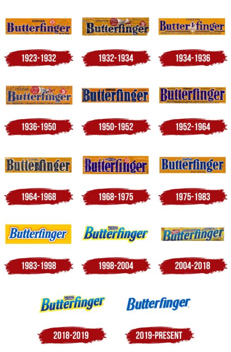
It is conditionally possible to divide the history of the Butterfinger brand into stages before and after the sale of the rights to Nestle to Ferrero. For the entire period of the company’s operation on the market, there have been 13 logo updates. Each brought new elements.
What is Butterfinger?
It is a world-famous company, one of the leaders in the production of chocolate bars, which are sold more than 10 million daily.
1923 – 1932
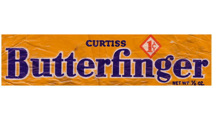
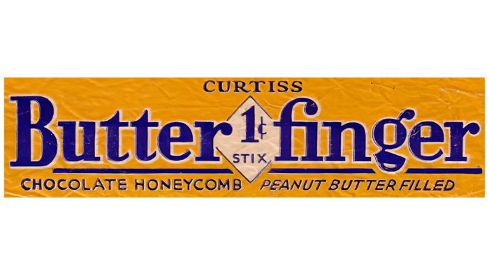
The first version of the logo was introduced in 1923 and lasted nine years. It consisted of the brand name in blue letters on an orange background. The classic bold font was taken as the basis. Their feature was white outlines that highlighted the inscription. An additional element of the logo is the inscription “Curtiss,” located above the brand name.
1932 – 1934
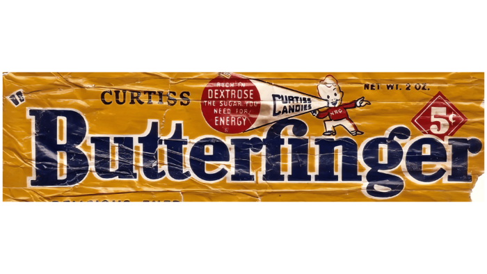
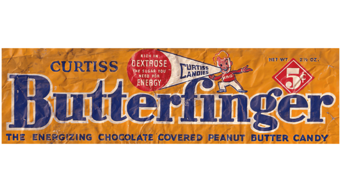
The first redesign took place in 1932. The writing style of the word inscription remained identical, except that all the letters in the word “Butterfinger” were made wider. The background in the form of an orange rectangle was preserved, but at the same time, its upper part was occupied by the image of a boy. He was wearing a red shirt and was holding a loudspeaker in his hands. This instrument was inscribed with “Curtiss Candies.” The loudspeaker also featured the company’s slogan in white letters on a red background.
1934 – 1936
Two years later, the decision was made to delete the image. The verbal name “Butterfinger” has also changed. We are discussing a font that has changed to a more elegant one. Each letter had a barely noticeable white outline. Interestingly, there was an element with the price “1c” between the two parts of the brand name, located inside the white diamond.
1936 – 1950
The verbal inscription, including the white outline, remained identical to the previous version. Also, as part of this update, it was decided to return the image with the boy. At the same time, the rhombus with the price tag was moved to the right side and was located above the letter “e.” At this stage, the price was “5 cents”. She was depicted in bold white letters inside a red diamond with a small white and red outline.
1950 – 1952
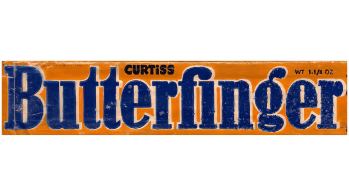
This redesign resulted in a more minimalist look for the company logo. The bold serif font looked similar to the previous versions, but the characters were narrower. The background, in the form of a yellow rectangle, remained unchanged.
1952 – 1964
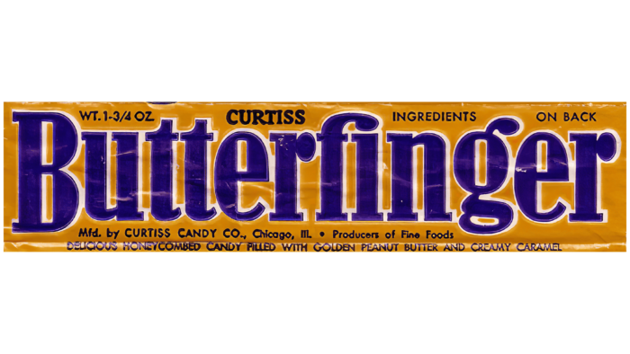
At this stage, special attention was paid to changing the color palette. The blue color of the wordmark has become darker but, at the same time, brighter compared to previous versions. The background, in turn, has become lighter and more attractive to buyers of the company’s products.
1964 – 1968
The inscriptions on the company logo have become significantly lighter than previous versions. Even though they remained blue, the lighter shade of this color gave the impression that they were white. The bright yellow background radiated positive energy, indicating the company’s potential.
1968 – 1975
Thanks to the new redesign, the familiar dark blue color of the title block has returned. At the same time, the font was significantly improved for the first time in a long time. The logo was given elegance and modernity with neatly rounded corners, and the distance between them seemed minimal.
1975 – 1983
In 1975, Butterfinger again changed the color palette of the logo elements. A new shade of yellow, mustard, was chosen for the background. The letters in the word inscription became wider, and there was a gap between them. The contrast of colors between the wordmark and the background made the logo more vibrant and authoritative.
1983 – 1998
The most significant redesign since the logo’s first presentation in 1983 has been completely updated. The background color was still yellow but looked more modern than the previous versions. The word inscription is similar in style to the logo of 1975-1983, but all the letters have become italicized. The color of the name has become brighter and more attractive. There are also two contours—white and orange. Thus, there was a sense of three-dimensionality.
1998 – 2004
In addition to the name “Butterfinger,” other verbal inscriptions appeared for the first time. For example, the traditional Nestle logo was added above it. The name’s font has changed due to fewer rounded corners in the letters. With the help of a blue gradient and yellow outlines, the word “Butterfinger” seemed to be more voluminous. Also, the background in the form of a yellow rectangle became even brighter.
2004 – 2018
A 2004 redesign resulted in a new variant of the title’s location. All letters were raised at an angle from left to right. The “Nestle” logo was on the left side above the “utt” part of the main inscription. Also, you can see a minimal white outline on it, which gives confidence and professionalism to the company.
2018 – 2019
The new logo variation features the same diagonal letters. Despite using a blue gradient as the main color palette, it has become more saturated and different from previous options. In turn, the “Nestle” logo was now above the “er” element in the word “Butterfinger.”
2019 – today
The latest redesign has simplified the logo. The main title was also done with a gradient, but it has become less noticeable. The yellow outline has also been removed. The font has been updated and refined, making the logo look more modern.
A barely noticeable white and blue shadow adds minimal volume to the logo. Today’s version of the logo evokes a sense of reliability and quality. The color palette, which has gone through years and dozens of redesigns, showed the company’s focus on history and tradition.
Font and Colors
The logo’s font was minimally changed. It is a classic bold sans-serif typeface with thick lines and rounded lettering.
The company’s name has always been made only with the help of blue and its shades. This indicates that the company is working in one direction and will not change it. In addition, the blue color looks modern and stylish, especially with its gradient and outlines. Also, the background color remained unchanged, traditionally with various shades of yellow.
FAQ
What are some fun facts about Butterfinger?
Butterfinger has a pretty cool story behind it. First off, its name came from a contest. Back in the day, Curtiss Candy Company let people vote on the name of their new candy bar. They picked “Butterfinger,” a slang term for someone clumsy, because the candy was crispy and easy to break, just like how a clumsy person might drop things.
The company did something out of the ordinary to make Butterfinger more popular. They dropped candy bars from planes over cities, making a big splash and getting everyone excited. Imagine seeing candy fall from the sky! That got people talking and made Butterfinger a big deal.
Then there’s this strange story about crop circles. In 1992, a huge crop circle that looked like a Butterfinger appeared in a wheat field in Kansas. Grabbing people’s attention and getting them curious about Butterfinger was fun.
Butterfinger also became famous because of “The Simpsons.” Bart Simpson, the troublemaker of the show, was in commercials saying, “Nobody better lay a finger on my Butterfinger!” This made the candy bar even more popular and tied it closely to the show.
One of the most mysterious things about Butterfinger is that its original recipe might have been lost in the 1980s. There were some changes in the company, and somehow, they might have lost the exact way to make the original Butterfinger. People have wondered about this for years, but today’s Butterfinger still tastes great and has that unique crunch people love.
All these stories show that Butterfinger is more than just a candy bar. It’s had some wild marketing strategies, a spot in one of the biggest TV shows, and even a bit of mystery. It’s a real part of American culture.
Why is Butterfinger discontinued?
Butterfinger BBs, a twist on the classic Butterfinger bar, were stopped from being made, which upset many fans. The company said on X, what we used to call Twitter, that they stopped making them because not enough people were buying them. The snack world can’t stay around if something doesn’t sell well. Even though many people loved Butterfinger BBs, they weren’t selling enough.
Some fans think there might be more to the story, like concerns about them being a choking risk. Since Butterfinger BBs are small and crunchy, they could be dangerous if not eaten carefully, especially for kids. This has led some to wonder if safety worries, on top of the sales issue, played a part in the decision to stop making them.
Still, the company’s main reason for stopping Butterfinger BBs was their low sales. The candy market is tough, with lots of competition and people always looking for something new. Sometimes, even products people like don’t keep selling well as tastes change and new things come. Butterfinger BB’s end reminds us that many factors go into deciding whether a product stays or goes, including how well it sells and if it’s safe to eat.
Is there peanut butter in Butterfinger?
Yes, Butterfinger has peanut butter in it. The candy bar is famous for its crunchy texture and flavor, which comes from a mix that includes peanut butter. This mix makes the middle of the candy bar crispy and crunchy, tasting both salty and savory. Then, it’s covered with a chocolate coating that’s smooth and sweet, making a great match with the peanut butter inside. People like Butterfinger because of this crunchy peanut butter and smooth chocolate mix. It’s a hit for anyone who enjoys chocolate and peanut butter together.
What is the Butterfinger font?
The Butterfinger font is special and looks like it’s been written by hand. It’s made by Fonthead Design Inc., a company known for creating fonts. This font comes in two styles, making it flexible for different projects. It’s designed to be fun and bold, much like the Butterfinger candy itself. This makes it great for projects that need a bit of creativity and uniqueness. You can use the Butterfinger font in ads, packaging, or online content to make them stand out and grab attention.
What is the meaning of the Butterfinger Logo?
The Butterfinger logo is both an ad and a way to tell customers about the candy. It clearly shows the brand name, telling people what makes this candy special. Sometimes, the logo shares information about who makes the candy and what’s in it, helping customers trust the brand. If the logo includes the company’s slogan, it adds to the candy’s story and connects with people even more.
The logo is on the candy wrapper, acting like a label. This means it’s the first thing people see at Butterfinger, making it a key part of the candy’s look. The logo’s design and where it’s placed on the wrapper share important info and grab people’s attention. This makes the Butterfinger logo a big part of how the brand talks to customers and stands out from other candies.
What does the logo symbolize, the Butterfinger Logo?
The Butterfinger logo is more than just a design on the wrapper; it represents what the candy is all about. It connects with the candy inside the wrapper, making people feel like they’re getting a high-quality, delicious treat. The logo tells people about the candy’s great taste and quality ingredients, making them want to try it.
The logo’s simple design, classic font, and round letters give off a welcoming and friendly feeling. The colorful background makes the logo and the Butterfinger bar pop on store shelves. All these design choices work together to show that Butterfinger is a tasty, high-quality candy you can trust, making you want to grab and taste it.
Why is Butterfinger called Butterfinger?
In the 1920s, Otto Schnering, who created Butterfinger, needed a name for his new chocolate bar. He decided to make it fun by holding a contest. At that time, sports announcers would call players with a bad grip “butter fingers.” Schnering liked the name because it was catchy and reflected the candy’s main ingredient, peanut butter, and its tendency to slip through your fingers due to its shape.
This fun and slightly funny name stuck, and Butterfinger has been called that ever since. The name stands out and tells you a bit about the candy bar, from its peanut butter flavor to its unique shape, all in just one word.
When was Butterfinger invented?
Otto Schnering invented Butterfinger in 1922 and launched it into the market in 1923. The Butterfinger logo was introduced that year, marking the candy bar’s official debut. The candy was unique for its time, with a filling of crunchy caramel and peanut butter, all covered in a thick layer of milk chocolate. This mix of flavors and textures made it stand out, quickly gaining popularity and setting the stage for its enduring success.
What is the Butterfinger slogan?
Butterfinger has used several catchy slogans to highlight what makes their candy bar special. Slogans like “Crispety, crunchy, peanut-buttery!” and “Better butter finger.” focus on its crunchy texture and peanut butter flavor, which make Butterfinger stand out from other candies. Another famous slogan, “Nobody better lay a finger on my Butterfinger!” adds humor by playing on the candy’s name and suggesting it’s too good to share. Then there’s “Dig it!” a fun expression that shows general excitement for the candy. These slogans, mostly used in ads, help Butterfinger connect with people by stressing the candy’s unique taste and fun personality.
