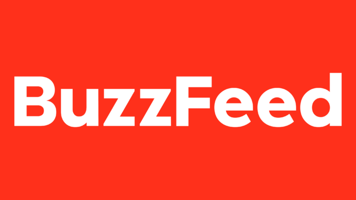
The BuzzFeed logo is the face of a hot news portal worldwide. The symbols represent a large number of areas covered by the publication. The information is always fresh and posted in the wake of current events.
BuzzFeed: Brand overview
| Founded: | November 1, 2006 |
| Founder: | Jonah Peretti, John S. Johnson III |
| Headquarters: | New York City, U.S. |
| Website: | buzzfeed.com |
Meaning and History
Peggy Wang wrote the first story on BuzzFeed in 2006. Since then, it has expanded considerably, with new investors, a new concept, and a new logo virtually indistinguishable from the old. The company became profitable, and despite the high-profile plagiarism scandal in which Benny Johnson was caught, it proved itself as a successful online media. Its web portal has many sections not only for news but also for entertainment content such as day-to-day life, quizzes, and videos.
BuzzFeed’s redesign in 2019 is a marker of its development, showing that it is ready to change and improve but stays within its usual style. The online publication uses a specific font system for headlines and doesn’t deviate from its traditional color scheme. Updating the site was primarily aimed at maximizing its adaptation to mobile devices so that photos, text, and illustrative material would display well on small displays. To the same end, BuzzFeed’s wordmark was made easier to read.
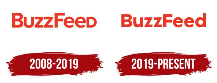
2008 – 2019
The logo adopted at the beginning of the media company contained its name, the red lettering “BUZZFEED.” Judging by the distinctive shape of the “U” and “D,” the letters were capitalized (all but two “e’s”). Despite this, the “B” and “F” stood out for their size, elevated above the line, making the text seem sloppy. The typeface was, at first glance, very simple: a bold grotesque with equal line widths. But there were unusual cuts at the ends of both “e’s,” and the upper horizontal stroke of the “F” was longer than the lower one.
2019 – today
The wordmark was changed as part of a global brand refresh when the news site decided to look like a glossy magazine. BuzzFeed’s in-house staff responsible for the portal’s visual identity was involved in the process.
The structure of the redesigned logo was maintained. The designers only tweaked some of the letters, particularly moving the “U” and “D” to lower case, so they looked harmonious. Both horizontal “F” strokes now have the same length. These changes made it possible to widen the letter spacing, which was necessary to improve the readability of the inscription.
Font and Colors
After the redesign, BuzzFeed’s wordmark has become more standard. The company refused to play with the case of letters and the slight asymmetry, staking on the visual harmony. This way, it tried to express the seriousness of the news published on the site.
The author of the original font used for the logos of the media portal is Mark Simonson. This bold, severe, sans serif typeface was created to cross between Akzidenz Grotesk and Futura. It is now known as Proxima Nova SemiBold (since 2005), and in the past, it was known as Proxima Sans (since 1994). Since mid-2010. Proxima Nova is considered the most common paid font on the Internet, as can be seen on hundreds of websites, including BuzzFeed.
The basic color of the logo has not changed despite design updates. It was red (#EE3322), which should reflect a creative identity and set BuzzFeed apart from other media portals.
BuzzFeed color codes
| Neon Red | Hex color: | #ee3322 |
|---|---|---|
| RGB: | 238 51 34 | |
| CMYK: | 0 79 86 7 | |
| Pantone: | PMS Bright Red C |
