The emblem is aimed at the male audience because the Bwin logo is brutality, steel character, and self-confidence. The sign invites you to make a choice and get honestly earned winnings. There is nothing superfluous on the portal, only a business approach.
Bwin: Brand overview
| Founded: | 1997 |
| Founder: | Bwin.Party Digital Entertainment |
| Headquarters: | Vienna, Austria |
| Website: | bwin.com |
Meaning and History
When this company started, it had only 12 employees to develop the gambling site. They launched it in 1998, taking into account the growing interest in sports betting. The group allowed members to make predictions and bets during sporting events, which greatly fueled the interest of online gamblers. In 2000, the firm was listed on the Austria Stock Exchange and went public. At the time, it was called Betandwin.
A year later, the company bought Gibraltar-based Simon Bold and moved its operations to Gibraltar. This allowed it to enter and gain a foothold in the international market. In 2001, the gambling site launched its first online casino and joined this digital entertainment sphere tightly. In 2003, it launched a gaming platform called Balls of Fire, and in 2004, multiplayer poker.
The digital gambling spokesman then began expanding overseas by acquiring competing services from other countries. In the summer of 2006, it rebranded itself from Betandwin to Bwin. The reason was the expansion of the entertainment business. The old version was no longer suitable for the activities that the company began to offer: casino, soft gaming, poker, and bookmaking. Whereas the old name stood for “complete, descriptive, functional.” In 2007, the site began featuring live streaming of the world’s major sporting events with betting.
In the spring of 2011, Bwin announced a merger with PartyGaming, a representative of the gaming business from Great Britain. The newly formed structure was named “bwin.party” and became the largest online gambling platform. In 2016, it was absorbed by GVC Group but retained the Bwin brand in its portfolio. Due to numerous transitions and transformations, the office has changed its logo several times. It has a total of three variations of the brand identity.
What is Bwin?
Bwin is a virtual online sports betting platform for online casino games and poker tournaments. It was founded in 1997 and existed as Betandwin until 2006. The company is headquartered in Vienna, Austria. Previously, it also had offices in Stockholm and Gibraltar. Now this virtual gaming service belongs to GVC Holdings.
1997 – 2006
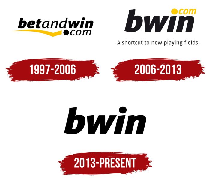
From the opening until the renaming, the company used the logo with the old name. The lettering was arranged horizontally and indicated the domain where the betting site was located. The upper line was occupied by the word “betandwin” in a grotesque lower-case font. It was divided by color into three semantic segments: “bet,” “and,” and “win. The first and last syllables were accented: they consisted of bold letters with wide feet. In the middle of the name, the letters were thin. The inscription was in italics, slanted to the right.
A domain occupied the second row with a large dot in front. It, too, consisted of thin italic characters, and the dot in front of it looked like a ball. It was a direct reference to the sports theme of the resource. In the bottom line was also an image of a curved yellow band. It had no right side, but the left side was full-fledged and started at the sharp end, which resembled an elongated tick. But in fact, it was underlining the constituent parts of the name. Next to “bet,” the line was visible; at “win,” it was overlapped by the word “com,” and under the connecting conjunction “and” went down. All the elements were placed on a white background.
2006 – 2013
After the renaming, the service got a different logo because the rebranding touched the entire identity. The new name was a shortened form of the former name: “b” + “win.” In addition, the platform got its slogan, which the designers incorporated into the logo. They colored it black, typed it in small grotesque, and placed it under the word “bwin .” The italics were preserved, as was the inscription style: all letters are lowercase, wide, and bold. The domain on which the playground was located, the designers made it yellow and placed it at the top so that the dot became part of the bottom letter “i.”
2013 – today
The modern logo of the online gambling site used a minimalistic style – it removed all the elements except for the name. It is still italicized, bold, and lowercase. As before, it has a white space in the background.
Font and Colors
Modifications to the Bwin logo continued throughout the betting company’s existence. But its key principle was recognizability, so the owners wanted to keep it. Despite the brevity of the current version, it is also present: the name of the service is written as it was at the beginning of the launch of the virtual project. These are wide and squat letters with light italics, arranged in lower case.
The lettering in the Bwin logo is in bold type, reminiscent of the symbiosis between two fonts: Insider Black Italic by Characters Font Foundry and Aneba Neue Bold Italic by BORUTTA. Small changes made it possible to get letters with individual designs. The signature palette is sparse: the early versions consisted of a combination of black and yellow, the modern one of black and white.
Bwin color codes
| Black | Hex color: | #000000 |
|---|---|---|
| RGB: | 0 0 0 | |
| CMYK: | 0 0 0 100 | |
| Pantone: | PMS Process Black C |


