The Cagiva logo is an Italian expression multiplied by the incredible speed of motorcycles. Each emblem element seems to be mobile and filled with internal energy. At the same time, they are all interconnected, as if they are parts of one mechanism.
Cagiva: Brand overview
| Founded: | 1950 |
| Founder: | Giovanni Castiglioni |
| Headquarters: | Varese, Italy |
| Website: | cagiva.it |
Cagiva is a brand of Italian motorcycle company of the same name. Since 2008, it has been owned by the American company Harley-Davidson. Headquarters in Varese. The Cagiva logo can be seen on models such as Aletta Rossa, Ala Rossa, Ala Azzurra, Elefant, and Cagiva Freccia.
The history of the famous brand began with the purchase of the Italian branch of the Harley-Davidson plant by wealthy industrial brothers. Using the remaining parts, they launched production, and by 1983 they had developed their models. With them, the company went through a steep rise and fall, eventually returning under the wing of Harley-Davidson in 2008.
Meaning and History
What is Cagiva?
The brand was founded in 1978 by an Italian motorcycle manufacturer. During its heyday, it produced up to 40 thousand motorcycles a year. Its line includes road, sports, tourist models, and scooters.
1978 – 1975
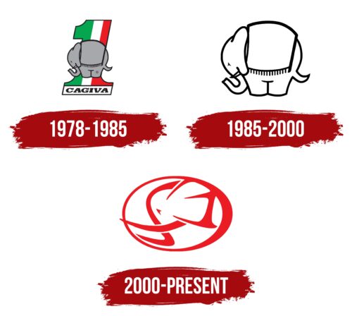
The first logo exemplifies love for one’s homeland, family, and racing.
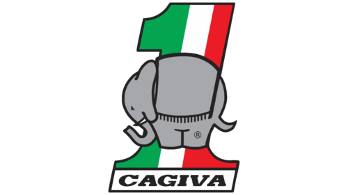
The emblem has a large number 1, reminiscent of the image on the pedestal at the awards presentation. It showed that riders would take first places on the plant’s motorcycles and demonstrated a desire for leadership. Showed that the company’s products will be the best. And the brothers were not mistaken. Seven years later, they were waiting for their first victories at the World Championships (1985,1986).
The number is painted in Italian flag colors as a sign of love for the motherland and indicates the plant’s location.
At the base of the figure is the name Cagiva. Italians treat their parents with great respect, and the Castiglioni brothers are no exception. Having bought the plant, they decided to name it after their father. They took the first two letters of his last name (Castiglioni), the first letter of his name (Giovanni), and the two letters of the name of the city where he lived (Varese). The result was the abbreviation Ca-G-Va.
Directly on the number 1 in the center is the image of an elephant. Starting the development of its models in 1983, the company introduced the Elefant motorcycle – an elephant. It had a powerful engine, large size, and high ground clearance, which made it possible to overcome obstacles on the road, and at the same time, it was easy to control. The model resembled a large animal, the ride on which gives a feeling of power. Later, on its basis, a whole series of tourist bikes were created.
The choice of an elephant as an emblem showed the power of Cagiva, its strength, and its reliability. In the future, it will even resist Japanese brands, the distribution of which led to the bankruptcy of many companies.
1985 – 2000
1985 is the year of victory in motocross. Things are going very well; the company has a lot of orders, and it is the leader in Italy. Therefore, purchasing less successful competitors begins with Ducati, Husqvarna, and Moto Morini. Factories opened abroad. Cagiva becomes a major concern. This led to a change in the logo.
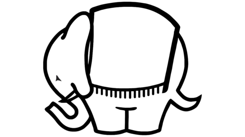
All additional elements were removed, leaving a large image of an elephant. He is the prototype of the company. She is strong, powerful, and firmly on her feet. The motorcycles created by her are reliable and durable. The black color of the logo outline also confirms this.
An animal’s roar is similar to an engine’s roar during a race.
Interestingly, the image is made in the form of a contour and has no coloring. This made it possible to apply the logo on any model without spoiling its color and design.
The image also hints at a rare albino elephant. Cagiva is also unique in its kind and stands out from the rest of the manufacturers.
2000 – today
By the 2000s, product sales were not going very well, and they had to sell previously purchased brands. The Piaggio Group extended a helping hand to the manufacturer by purchasing a 20% stake in the company. Cagiva changed its name to MV Agusta Group, rebranded, and started over.
The latest update has made the company sign very elegant and modern.
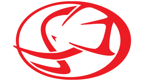
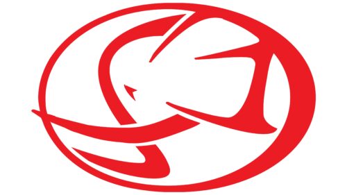
Against an oval background, which demonstrates the streamlining of the models and speed, there are lines forming an elephant’s profile. Their sharpness and, at the same time, smoothness indicate the easy ride and maneuverability of Cagiva motorcycles.
The tilt of the head and the tusks that go beyond the oval echo the image of the driver leaning towards the motorcycle and racing at high speed along the track.
Font and Colors
In the final version, the owners of the company settled on red. It is a symbol of fast driving, passion, and leadership.
There have been no inscriptions in the visual sign since 1985. The owners wanted Cagiva to be associated with an elephant, so its image was central to the logo. The brand was so popular in Italy that no company name was required.
The decision was also successful in terms of maintaining a permanent image of the company, despite the name change.
However, in some variations of the emblem, the inscription Cagiva is added to the bottom of the elephant in serif capital letters. The font resembles italics from CA Coronado.
Cagiva color codes
| Pigment Red | Hex color: | #ec1c24 |
|---|---|---|
| RGB: | 236 28 36 | |
| CMYK: | 0 88 85 7 | |
| Pantone: | PMS Bright Red C |
