


![]() Call of Duty Logo PNG
Call of Duty Logo PNG
The Call of Duty logo is like a series of shots: sonorous, clear, and precise. The emblem reflects a pair of battles. At one end is the user; at the other are his opponents, the characters in the image, stability, and a long history that do not plan to end.
Call of Duty began in 2002, when former 2015, Inc. developers behind Medal of Honor: Allied Assault left Electronic Arts and formed Infinity Ward. Activision gave the new studio $1.5 million for a 30% stake.
The first Call of Duty launched on PC on October 29, 2003. It showed World War II through the eyes of American, British, and Soviet soldiers, with squad-based combat rather than the lone-hero style of Medal of Honor. A day later, Activision bought the rest of Infinity Ward.
Call of Duty 2 arrived in 2005 and became a major Xbox 360 launch title. Activision then brought in Treyarch, which made Call of Duty 3 in 2006. The series changed scale with Call of Duty 4: Modern Warfare in 2007. Infinity Ward moved from World War II to a modern conflict and built multiplayer around progression, perks, and killstreaks. Sales passed 11 million copies.
Modern Warfare 2 launched in 2009, earning $310 million on day one and $550 million in five days. In 2010, Activision fired Jason West and Vince Zampella, triggering lawsuits. They later founded Respawn Entertainment, known for Titanfall and Apex Legends. Modern Warfare 3 followed in 2011, developed by Infinity Ward, Sledgehammer Games, and Raven Software. It reached $1 billion in 16 days. Treyarch’s Black Ops II beat that mark in 15 days.
After futuristic entries drew criticism, Call of Duty: WWII returned to World War II in 2017. Modern Warfare rebooted the franchise in 2019, and Warzone launched in 2020 with 6 million players in its first 24 hours. In 2023, Microsoft completed its $68.7 billion acquisition of Activision Blizzard, bringing Call of Duty under the Xbox Game Studios umbrella.
Meaning and History
![]()
Despite a large number of developers for the franchise, the series still maintained a visual identity. Logos are created centrally and do not change dramatically. The only adjustments relate to the minimum content change in the current release or the next version.
What is Call of Duty?
Call of Duty is a series of military-themed video games published by Activision. It is recognized as the most successful gaming franchise in the United States and has been recognized by the Guinness Book of World Records for its sales volume. The main genre of Call of Duty is a first-person shooter. As the story is based on military conflicts, gamers complete various missions using weapons and vehicles. The games offer both single-player and team modes.
2003 – 2007
![]()
The debut version immediately focused on the game’s title. Indeed, at that time, it was important to the publisher: the novelty needed to be familiar to users and remembered by name. The first icon consists of the original spelling “Call of Duty.” Symbols are smooth, even, straight, and arranged horizontally in one line. The right and left parts are enlarged, and between them is a miniature preposition “of.” The letters are metalized, decorated with a turned edge, shadows, and a 3D effect. The only drawing on them is traced from tracer bullets. “C” and “Y” are longer than the others and are slightly shifted down.
2007 – 2008
![]()
After expanding the platform’s capabilities (the game was adapted for most devices), the developers redesigned the logo. The icon has become much lighter with a gradient transition from emerald green (bottom) to gray (top). The middle of the letters is white. The three-dimensional effect and the shape of the signs have been preserved.
2008 – 2009
![]()
The release of another version of the game led to a redesign of the logo. The designers painted the words in several shades of gray from light ash to dark metallic. We added roughness to them in tracer bullets, but only selectively and to a limited extent. On the sharp edge of the letters, a red-orange line was drawn, reinforced at the bottom. The main texture of the inscription was a haze of dust.
2009 – 2010
![]()
For this version of the shooter, the developers have proposed white symbols with a green outline. They placed the title on a dark gray background as a horizontal rectangle.
2010 – 2011
![]()
2010 was a watershed year for the Call of Duty logo. The authors minimized the colors to black and white by removing the backing. The dark lettering on a light background looked very intimidating, which is what the releasers wanted. The emblem breathed with tension and anticipation of threats. The letters’ edges were chipped and chipped, as from bullets, axes, or cold steel.
2011 – 2012
![]()
A completely different symbolism of off-white characterizes this time. On the words’ surface, traces of redoubt boards, stacked close to each other, seemed to be imprinted. The drawing also resembles a stretched wire protecting the territory from the enemy. “C” and “Y” are now the same length as the rest of the letters. “T” and “Y” are connected at the top. The base color of the emblem is light monochrome.
2012 – 2013
![]()
The game developers have separated the signs and given the words a military bearing, so the signs look strictly geometric. They also swapped white for black and made oblique cuts at “Y” and “A.”
2013 – 2014
![]()
All the letters have chipped edges in this version as if broken off or shot by a ricochet. Uneven edges make some characters appear smaller: “Y,” “T,” and “A.”
2014 – 2015
![]()
The designers restored the letters and added four horizontal white lines, one for each word. As a result, the legs “A,” “L,” “U,” and “T” were crossed out.
2016 – 2017
![]()
The horizontal stripes are gone. The letters are pushed close together. Bevels and sharp points appeared: on the bar “A,” the head “T,” and in the lower part of the “U.”
2017 – 2018
![]()
The developers brought back the 2011-2012 version with the Y and T connected, but instead of white, they used black. All signs have been added with a “shot” and “damaged” design to match the shooter concept’s surface.
2019 – today
![]()
The current logo is presented in a modified color as if shaded by a haze. Pastel black looks interesting on strict symbols. The letter “A” now has a slice on the left side of the connecting bar.
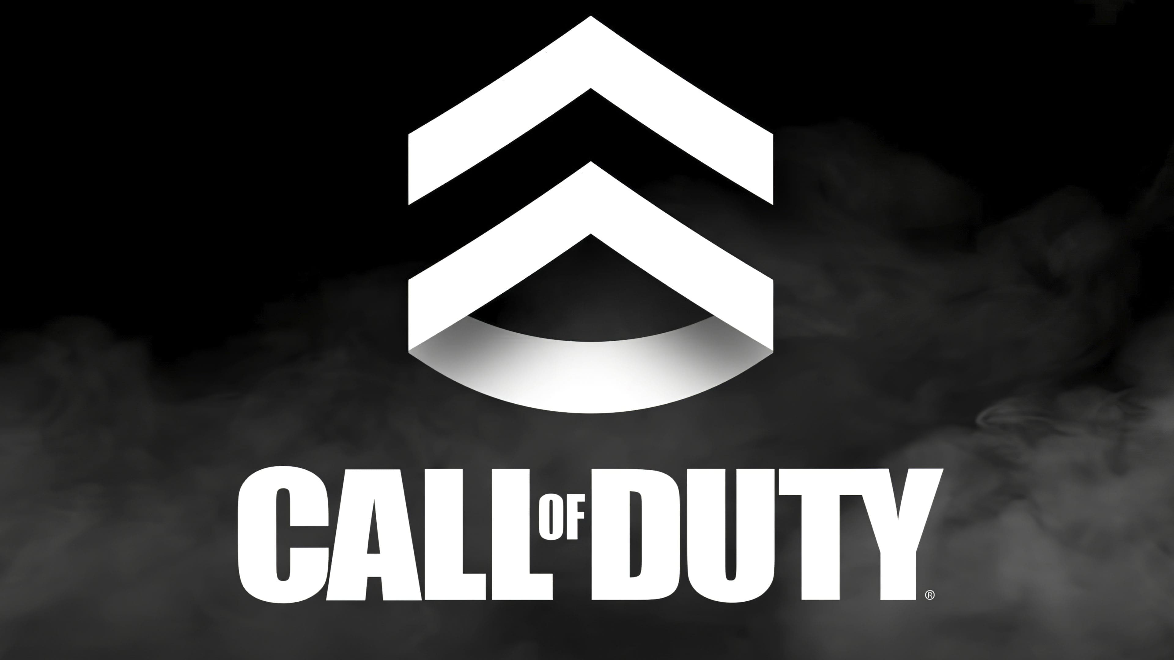
2023 – today
![]()
The new Call of Duty logo design is marked by progressive modernization and carefully considered typography. Without graphic images, the designer emphasized masterful font rework, replacing smoothness and evenness with figured elements. The letters “C,” “A,” “O,” “D,” and “U” have acquired unique beveled corners, adding more facets to the overall composition and hinting at the game series’ continuous development and dynamism.
However, the greatest transformation is seen in the letter “Y”; it has gained a short leg and strictly vertical tops, which increases visual tension and adds character. The bold dot previously adjacent to the “Y” has disappeared, giving the logo even more space and purity. The interesting point is that the “Y” glyph is no longer connected to the neighboring “T,” creating a new harmony and balance in the logo’s visual space.
All letters have become more rectangular, highlighting the brand’s structure and solidity. This transformation testifies to boldness and an innovative approach, embodying Call of Duty’s enduring aspiration for high quality and recognizability in the gaming industry.
Font and Colors
The evolution of the Call of Duty logo is a small tweak to the debut version. The main focus is on the title, which accurately conveys the game’s visual and informational identity. The fixes affected only the letters’ size, the edges’ shape, the intersymbol spacing, small cuts, and color. The changes were constantly changing.
Presumably, Impact Sans Serif typeface was used for the inscription in the emblem. Its author is Geoffrey Lee, who introduced the typeface in 1965. It was released by a plant named Stephenson Blake. The font is also similar to the custom version of Call of Ops Duty. The palette is mostly monochrome. Its spectrum covers black, gray in all shades, off-white, green, and red-orange.