The Calm Air logo captures the airline’s commitment to serving the unique needs of residents in Canada’s northern regions. The emblem reflects the airline’s mission to provide reliable and essential air transportation to areas often inaccessible by other means. It conveys calmness and reliability, crucial qualities given the challenging weather conditions and remote locations served by the company. Designed with elements that evoke feelings of stability and trust, the logo mirrors the serene landscapes and vast open skies of the Canadian North, highlighting the natural beauty of the regions the airline serves.
Calm Air: Brand overview
Calm Air, a regional airline rooted in Thompson, Manitoba, embarked on its journey in 1962. Carl Lawrence Munro founded the company in Lynn Lake to provide charter flights for northern Manitoba communities.
In its early days, this airline operated small aircraft such as the de Havilland Canada DHC-2 Beaver and DHC-3 Otter, perfectly suited for the challenging northern conditions. During the 1970s and 1980s, it began to expand, adding new routes and growing its fleet. The introduction of the Hawker Siddeley 748 turboprop in 1976 marked a significant milestone, increasing passenger capacity and flight range.
The company entered a new phase in 1987 when it became part of the Exchange Income Corporation (EIC). This acquisition provided essential resources for further growth and fleet modernization. Throughout the 1990s and 2000s, it continued to upgrade its aircraft, incorporating ATR 42 and Saab 340 planes, which were well-suited for northern routes.
In 2010, the acquisition of Keewatin Air broadened operations into medical evacuations and charter services. The 2010s saw further fleet enhancements with the addition of several ATR 72 aircraft, boosting capacity on popular routes.
Today, this airline remains a critical component of the transportation infrastructure in Canada’s northern regions, continually evolving to meet the needs of its passengers and communities.
Meaning and History
What is Calm Air?
It is a regional airline based in Thompson, Manitoba, Canada. It flies primarily in the northern regions of Manitoba and Nunavut, providing essential air service to remote communities. Known for its ability to operate in challenging weather conditions, it serves passengers and cargo. The airline’s fleet includes a variety of aircraft types suitable for short and medium-haul routes, providing connectivity and accessibility to residents and businesses in northern Canada.
Old
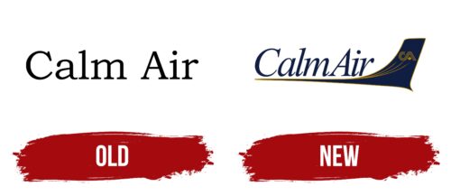
The logo of Calm Air, created in the airline’s early years, reflects the essence of the company’s name—simplicity and tranquility. This design symbol was developed to embody the carrier’s core values and mission: providing reliable and comfortable services and ensuring tranquility and confidence on every flight.
The thin black font used in the logo was chosen deliberately—its sleekness and clarity symbolize the simplicity and accessibility of the company’s services. Each letter, reminiscent of the work of a skilled calligrapher, conveys a sense of confidence and stability. A calligraphy expert infused each line with a personal touch, reflecting Calm Air’s uniqueness as a small yet ambitious carrier aiming to elevate the quality of its services to a new level.
The serifs at the ends of the characters are crafted in the shape of bird wings. This element is not merely decorative—it is deeply symbolic, evoking the freedom of flight and the tranquility vital to passengers during their journey. They depict the readiness for a calm yet assured takeoff and flight, which is the company’s promise to its clients.
New
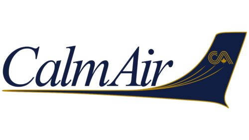
The Canadian airline logo features an airplane keel shape. The wider part faces right, with a narrow line extending from it. The airline’s name is written in a slanted calligraphic font with serifs. The abbreviation “CA” is on the tailplane, with the letters formed by three curved lines. A maple leaf replaces the horizontal bar in the second letter. The logo uses shades of blue and yellow.
Blue represents trust and reliability, while yellow signifies warmth and optimism. The maple leaf highlights the airline’s Canadian origins, adding national pride to the design. This combination of colors and symbols communicates the airline’s values and heritage.
The Calm Air logo combines elegance and national pride with a modern look. The slanted calligraphic font adds sophistication and a sense of movement. The curved lines and the maple leaf within the “CA” abbreviation enhance the visual appeal and uniqueness. The blue and yellow scheme ensures high visibility and creates a pleasing contrast.


