The logo of Canadian North captures the airline’s familiarity with Canada’s northern landscapes, characterized by snowy fields and icy waters. It subtly assures travelers of reliable and warm service, even in Canada’s coldest and most remote parts. The design conveys a sense of care and preparedness, much like a friend with a spare scarf or some hot cocoa ready. It suggests that passengers are in safe and knowledgeable hands, ready to navigate the unique challenges of northern travel.
Canadian North: Brand overview
Canadian North, once known as Bradley Air Services, has been a beacon of innovation and leadership in the airline industry since it first spread its wings in 1989. Based in Kanata, Ontario, Canada, the airline stands out among its global partners as one of the few indigenous Inuit-owned airlines.
Max Ward laid the foundation for Bradley Air Services in 1957. Initially, the company was a charter airline serving isolated mining and exploration sites in Canada’s northern expanses. 1986, the business turned around when Ward sold the company to his employees. In 1990, the Makivik Inuit Corporation of Nunavik, Quebec, acquired a 50% stake in the company, signaling the beginning of a new development phase.
An important milestone in the history of Canadian aviation came in 1998 when Bradley Air Services and First Air, another Inuit airline, merged to create Canadian North. This merger strengthened the airline’s presence in the North and made it a strong player in Arctic transportation.
Today, the airline operates scheduled passenger and cargo service to more than 20 destinations in the Canadian North, using a modern fleet that includes the latest Boeing 737-200 and 737-300 aircraft.
Meaning and History
What is Canadian North?
It is a regional airline based in Canada that serves remote northern regions, including the Northwest Territories, Nunavut, and northern Quebec. The airline operates scheduled passenger flights and cargo and charter services, connecting these remote areas with major cities in southern Canada. The company can operate in extreme weather conditions and provides essential transportation for residents, businesses, and government agencies in the Arctic. The airline’s fleet consists of jet and turboprop aircraft designed to meet the unique challenges of northern aviation.
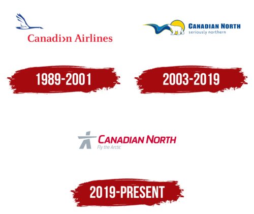
1989 – 2001
Canadian North, operating from 1989 to 2001 as a subsidiary of Canadian Airlines International, adopted the parent company’s logo, rich in symbolism and national spirit. The central element of this emblem was the trumpeter swan, the largest waterfowl in North America, known for its beauty and grace.
The logo depicts the swan’s silhouette in a smooth, tranquil flight, symbolizing grace and elegance. This bird was chosen because it serves as a model for the company’s airplanes, reflecting endurance, reliability, and the ability to make long-distance flights. The visual representation of the swan in flight aligns with the airline’s mission to provide safe and comfortable flights across the vast territories of Canada.
The red “Canadian Airlines” text in the logo has a special highlight: the third letter ‘a’ is stylized to resemble an airplane. This element emphasizes the company’s innovative approach and commitment to technical excellence. The red font symbolizes speed and a passion for travel while referencing the national colors of Canada, underscoring the company’s affiliation with the country.
A blue outline surrounding the swan’s figure adds depth and complexity to the composition. It symbolizes technical excellence and references the cold climate of Canada’s northern regions served by the airline.
2003 – 2019
With the company name change, its emblem was completely transformed, now filled with deep symbols reflecting the northern regions’ uniqueness and cultural heritage. The new logo evokes immediate associations with the endless snowy expanses of the North, bringing a sense of cold, freedom, and pristine nature to the company’s visual identity.
The central elements of the new visual identity include three symbols: the polar bear, the northern lights, and the polar sun. The polar bear in the logo symbolizes strength and resilience, which are associated with the reliability of air transportation. The northern lights add a mystical and colorful touch, highlighting the magic of travel to remote parts of the world. The polar sun, a rare and striking phenomenon, symbolizes the uniqueness and distinction of the services offered by the company. These elements were chosen deliberately, as the company actively targets the Inuit—the indigenous people of northern Canada—for whom these symbols hold deep cultural and historical significance.
The new company slogan, “seriously northern,” placed below the name in cool blue shades, strengthens this connection to the northern territories. The large letters of the slogan harmoniously combine with the blue border around each image, enhancing the brand’s sense of unity and coherence.
This positioning ensures a harmonious and coherent perception of the brand. However, it leads to a significant drawback: elements directly associated with aviation have almost disappeared from the emblem. Only the silhouette of the northern lights, reminiscent of a bird in its curves, remains the sole link to air transportation. This may make immediate recognition of the company as an airline challenging, especially for new customers who may not be familiar with its history and roots.
2019 – today
The Canadian North Airline logo features a gray Inuit figure, symbolizing the indigenous people of northern North America. This abstract figure stands with arms wide open, reflecting the vast northern regions the airline serves.
Next to the figure, the airline’s name appears in a smooth, slightly italicized font. The red color of the letters adds energy and contrast to the gray figure. The geometric shapes of the letters look like they are carved from ice, highlighting the airline’s northern heritage.
The name is displayed in two tiers. The top line uses bold uppercase letters, representing strength and reliability. The bottom line uses a thinner lowercase font, adding a touch of friendliness. This combination ensures the logo is easy to read and impactful.


