In no case should you ignore your visual identity! She is the emblem, logo, sign that is the direct link between the business and the community that uses its benefits. This is especially true for the graphic design platform Canva, which has repeatedly impressed many with its unconventional, but especially verified logos. The company unveiled a logo update this week without much fanfare. The platform was in no hurry to announce this, drawing attention to the new product only a few days later. Most likely, it was a study of how harmoniously the new logo will be inscribed, how quickly it will be noticed or not. Few users showed a positive reaction before the official announcement. Even after the announcement of the logo change, the majority still did not understand what the essence of the changes was. Such an answer can be either a success or, in general, a defeat of a novelty. If ordinary users have not noticed this, then the success is complete. But if critics and connoisseurs of art and professionals are among those who did not notice, this is a defeat.
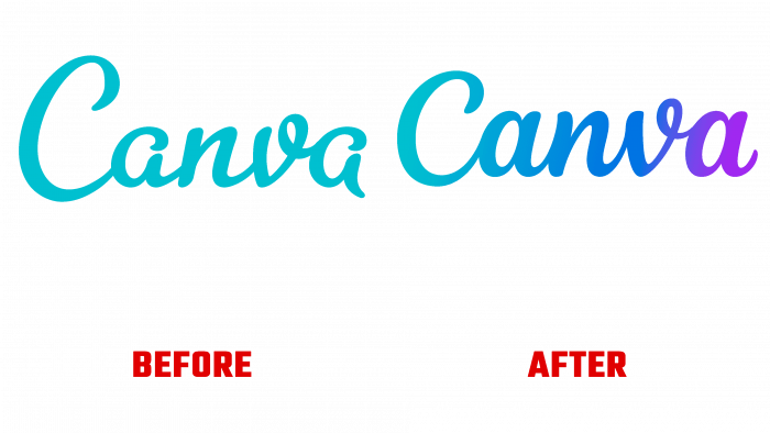
Either way, however, if someone realizes they have the right to pass advice and inquiries about Canva through them, it’s best to go straight to the golden rules of logo design. First of all, the new logo differs from the previous version by a thin typographic edge embedded in the script. As a result, the color palette has expanded to include an even more radiant turquoise that looks harmonious with the brand’s current style. This combination makes the changes invisible, recognizable in advance. At the same time, the logo becomes sleek and modern. It is this professional approach that misleads those who are inattentive enough.
The immediate reason for the changes was the need to make the sign more convenient for use on various platforms – digital and print, on huge advertising boards and tiny buttons. Canva used its template to create its logo, which Rob Clarke, a type designer, designed. He improved the readability of the text and especially the difficult letters “a.” The new logo is the result of 75 iterations. The unique gradient, the version of the movement, is the result of a lot of work to update the visibility. Now it is easy and simple to say – “a small change in handwriting.” But if the “writers” were familiar with the creative work of talent, if he knew how much time this realization cost to be considered “easy and simple,” everything would be perceived differently. But this is exactly what geniuses do – “they simply cut off the unnecessary stone.”


