


![]() Captain Marvel Logo PNG
Captain Marvel Logo PNG
The superhero franchise uses the Captain Marvel logo as its signature on all products related to the 2019 film of the same name. It is an inspirational wordmark that symbolizes courage, pride, and bravery, all the qualities that characterize the savior of the world.
The Marvel Cinematic Universe has added another film in 2019, Captain Marvel. Like all previous films in the series, the film was based on the popular American comic book by Roy Thomas, illustrated by artist Gene Colan, about the superheroine Carol Susan Jane Danvers. Her appearance as a major in the U.S. Air Force occurred in the March 1968 issue of Super-Heroes #13 from Marvel Comics. The idea was to fuse her genes with alien genes, resulting in the heroine gaining superhuman abilities. The picture was the 21st installment in the Marvel Universe series.
Anna Boden and Ryan Fleck, the film’s directors, created the picture based on the comic book’s recycled storyline, which was adapted and tied to the broader history of the Marvel Cinematic Universe by the screenwriters Nicole Pearlman and Meg LeFauve. Starring Samuel L. Jackson, Brie Larson, and popular actors Ben Mendelsohn and Jude Law.
For each series in this world, a unique logo was designed to unite all the films through visual commonality and to highlight the new hero’s uniqueness. The visualization of Captain Marvel’s image, as always, was successful, whereas the film itself received moderate reviews from critics and viewers alike.
Meaning and History
![]()
The idea for the film came to the studio’s management back in 2013. It was then that Luis D’Esposito made public the desire to bring some twist to the traditional characteristics of the main characters. There was a desire to create a hero whose mask would hide a strong, strong-willed woman with superpowers. It was decided to introduce a completely new female character in this world, who would become Captain Marvel. A poll among viewers and fans showed high interest in the idea and the new figure.
To diversify a bit, the familiar style and spirit of the “universe” were changed to develop a new character type. The studio sought to create a film that would tell an interesting and exciting story, appealing in its amusing qualities and, at the same time, in the heroine’s purely human qualities.
Originally set for a spring 2018 release, it was moved twice to 2019. This was due to several important points. The original idea was to bring this heroine into the Avengers: Age of Ultron project back in 2015. They even filmed a few episodes featuring her. But then abandoned the idea, deciding that it would appear in their project to ensure the completeness and integrity of the character’s perception, thereby providing a qualitative, detailed introduction to the new heroine.
The process was set in motion and underwent several script revisions. Moments that were very reminiscent of past issues in their storyline were removed, and the heroine gained compassion and a “big heart.” However, after the release, the expected result did not materialize. Critics and audiences did not appreciate this innovation, expecting only a spectacular continuation of Marvel’s showdown, as in all 20 previous tapes.

But despite this, it was not a fiasco. At the same time, viewers noted the high-quality study of every detail of both the character and the heroine’s costume, the originality of the studio in creating her image, the logo of the series, and the personal sign of the heroine, which provided a visual appeal and memorability among all the signs of Marvel.
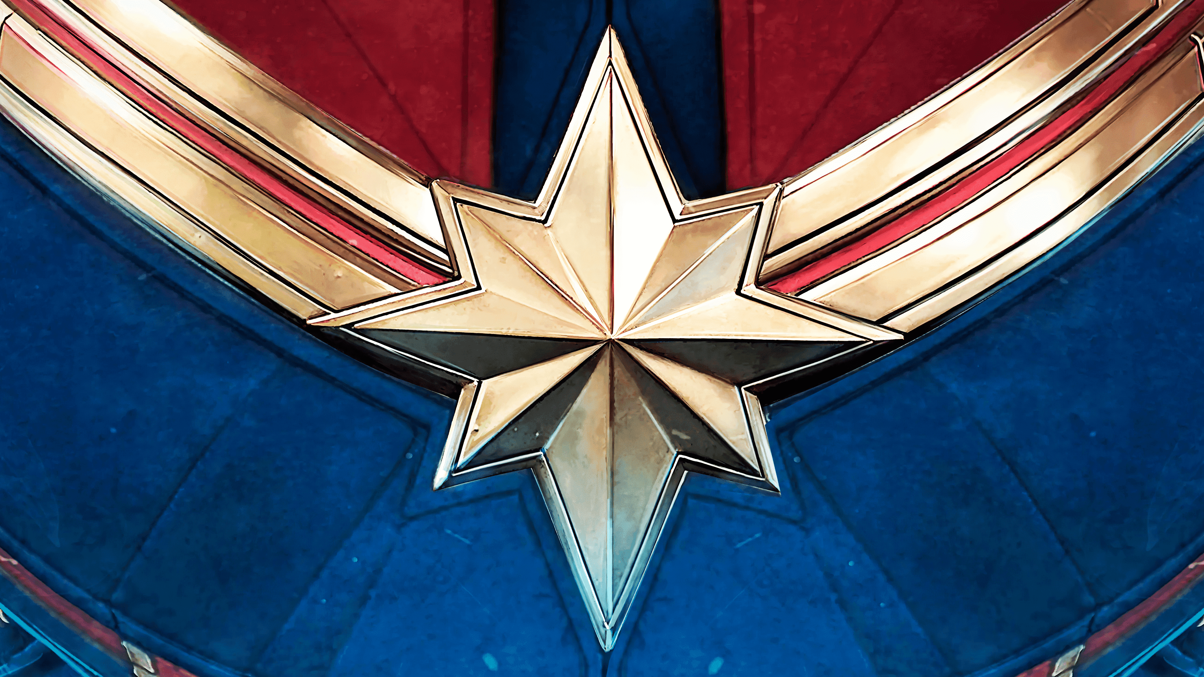
The heroine’s personal logo is in full color and depicts the breast of her costume, featuring the characteristic octogram. It is secured to the chest with two gold strips that run from the shoulders and are joined with a locking joint. The oblong gold eight-pointed star symbolizes striving for the highest goal, the realization of the highest ideal, a symbol of salvation and hope. The upper part of the costume above the star is in a deep red, almost burgundy shade with a black insert in the middle. The lower, visible part is deep blue. Each seam is marked.
In the lower-right corner, the text echoes the series logo. The studio name consists only of the word Marvel, centered above the movie title. The title’s font matches the logo, but it is not in volumetric letters and lacks a gradient. The letters are “flooded” in bright red, almost scarlet, and have a thin gold border.
Font and Colors
The traditional execution of the name “Marvel Studios” in two separate blocks was preserved in the mandatory order adopted in 2016, as the main element linking all the movies of the Marvel universe. The first word of the title is in white capitals in a rectangular bar on a red background. The second word was in a similar font, in black letters on a white background, its borders marked only by upper and lower black lines. In the film’s emblem, these elements are placed above the picture’s title.
The tape’s title is in capital letters and uses a rich gradient color, going from almost black to dark red. The first word of the title is above the second, centered on the latter. The font is twice as small as the second. All letters in the name have a gradient that matches the gold trim, and the black backing adds bulk. Both words are separated by two rays coming from the bright flash or sun in the central part of the composition, the color of which smoothly transitions from pure white through light yellow and yellow to gradient red. The same transition is applied to the rays, creating the visual effect of glitter from the flash.