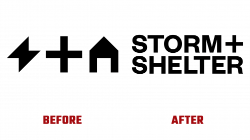
STORM+SHELTER, a Cardiff-based video production agency known for producing impactful video content for businesses, brands, and agencies since 2013, has recently revealed an innovative brand refresh. The new visual identity, conceived by the local design studio, Toward, presents the company’s unique offerings in commercials and content in a fresh light.
The original logo, set in Atipo Foundry’s Geomanist, was functionally apt, but it lacked the distinct elements to make it stand out or be memorable. The revamped logo, however, displayed in Founders Grotesk by Klim Type Foundry, shows a more calculated design approach, with significant attention given to its layout. The aesthetic arrangement of the logo, where the plus sign assists in aligning the shorter “STORM” with “SHELTER,” gives it a refined appeal.
The logo redesign also addresses recent discussions surrounding kerning—the process of adjusting the space between characters in typography. In the reimagined logo, the impeccably kerned “LT” pair in “SHELTER” exemplifies the meticulous attention to detail in the design. Given the simplicity of the logo and the letter count it entails, achieving precision in the minutiae was crucial, and Toward has met this challenge successfully.
The updated STORM+SHELTER logo also features a minimalistic rebus variant, ingeniously compressing the company’s name into two indicative icons. Though initially read as “Thunder and Home” by those unfamiliar with the company, the true spirit of “Storm and Shelter” becomes apparent once the company’s identity is known. Given STORM+SHELTER’s specialized standing, which doesn’t necessitate the logo’s immediate recognition, the reliance on the name adds an endearing uniqueness, especially when viewed on their website or social media handles, amplifying its overall allure.
The design’s simplicity belies its intricate nature. Each component maintains the same width using only 0-, 45-, and 90-degree angles, resulting in a clean horizontal alignment across the center.
The minimalist philosophy extends to the identity system, where the key graphic element is a dynamic plus sign. The sign contracts and expands from the center of the layout, revealing or transitioning content. This detail-oriented design approach ensures that simplicity strikes a chord. The plus sign transitions smoothly from thin to thick, inverting the black-and-white palette as it expands or unveils the content.
Consistency is preserved through Founders Grotesk as the main type family, tastefully complemented by Displaay’s Tobias for a hint of refined serif.
The newly unveiled identity mirrors STORM+SHELTER’s work ethos—sophistication, finesse, and mindfulness—without using flashy or over-the-top graphics. It subtly embodies a punk rock vibe, marking an exciting chapter in the brand’s evolution.


