


![]() Carolina Panthers Logo PNG
Carolina Panthers Logo PNG
From the very beginning, the club’s visual style in North Carolina ensured its attractiveness and recognition among fans. The Carolina Panthers logo symbolizes determination, attack, and forward motion.
The Carolina Panthers are a professional football team located in Charlotte, North Carolina. The franchise was founded by Jerry Richardson, who in 1987 announced his desire to create a new NFL team in Carolina and paid an entrance fee of 206 million. In 1993, the Carolina Panthers became the league’s 29th franchise, and in 1995, they joined the National Football League.
While pondering the team’s name, Jerry Richardson did not organize focus groups or run contests to select the best name. The name was chosen by his son Mark, the current president of the club. He unilaterally approved “Panthers,” a word symbolizing courage, strength, and grace. Jerry Richardson endorsed this idea and even changed his license plate to PNTHRS in 1989.
By the time the Carolina Panthers were announced as the 29th NFL team, they already had their brand style. However, representatives from NFL Properties strongly criticized the black, blue, and silver color scheme Mark chose. They believed that a club named “Panthers” with black team symbolism might attract the attention of street gangs, inevitably tarnishing the franchise’s reputation.
From the late 1980s, when Jerry Richardson first attempted to establish the Carolina Panthers, he was the face of the ownership group, but he wasn’t the only partner. In fact, from 1993 to 2018, the franchise was 48% owned by the Richardson family, with the remaining 52% distributed among 14 investors who also financed the right to create the team. In 2018, billionaire businessman David Tepper became the team’s sole owner. On May 22, 2018, he acquired the franchise for $ 2.3 billion, undoubtedly setting a record.
Meaning and History
![]()
The Carolina Panthers introduced their first logo in 1995 after joining the NFL. Since then, it has been changed only once, as the team owner, Jerry Richardson, was a big traditionalist who opposed any innovations. According to the designers’ concept, the logo’s central element is a black panther. But from a zoological perspective, it’s a black jaguar or leopard, as there is no such species as a black panther. The official mascot of the Carolina Panthers is Sir Purr, an anthropomorphic black panther dressed in the team’s uniform and wearing №00.
Following Jerry Richardson’s tradition, the club’s logos changed infrequently. After the first version was approved in 1995, it happened only once. Whether at Jerry’s insistence or for some other reason, the design remained unchanged. Artists were only allowed to experiment with contours, update minor details, and stick to the old concept. All this led to both emblems being very similar: they differ only in color and the shape of certain elements.
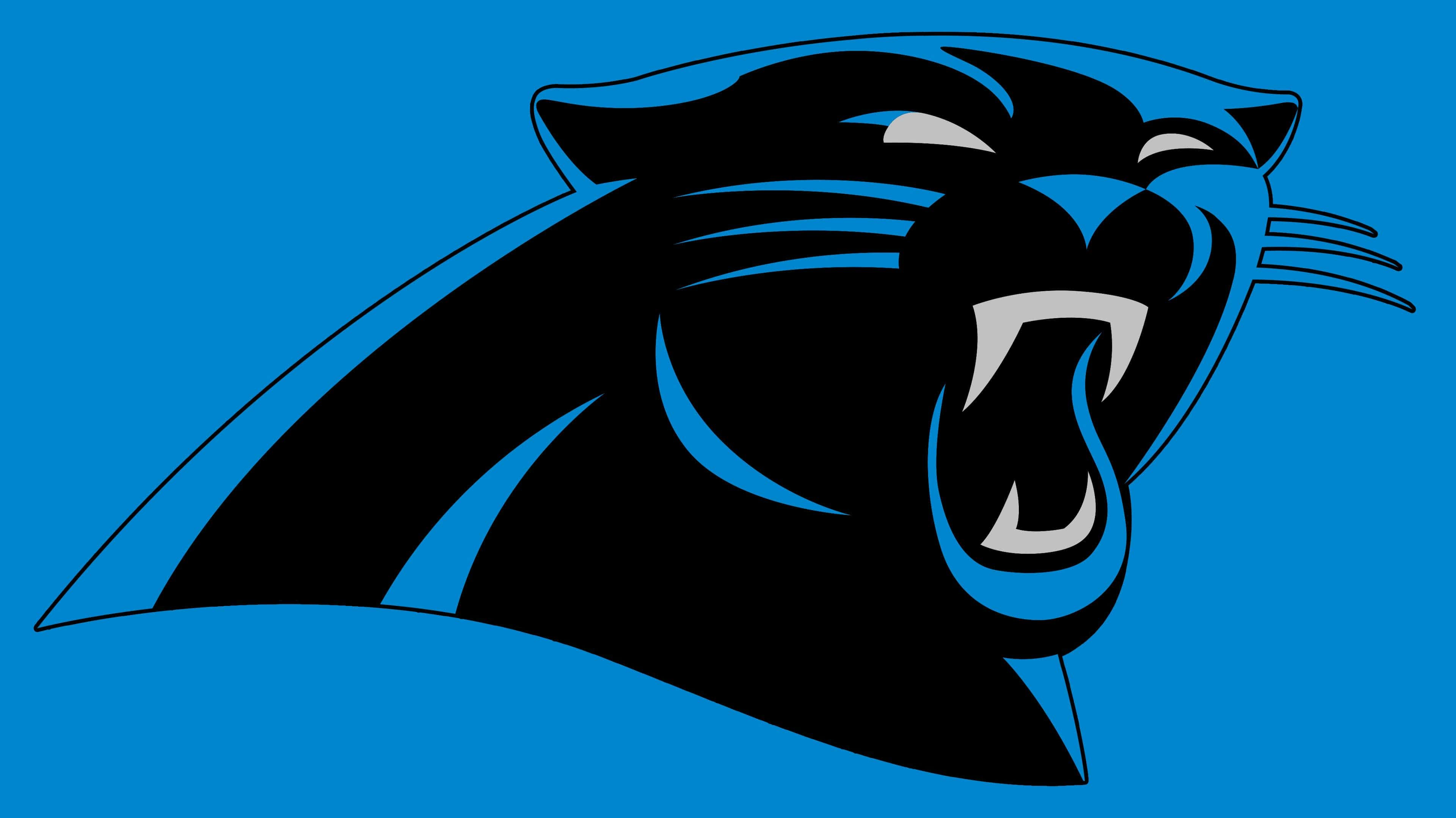
The Carolina Panthers’ emblem features a black panther – the team’s main mascot. The last change was in 2012. Designers then made the whiskers, eyebrows, nose, and inner ear blue, leaving only the eyes and teeth gray. They added new contours and removed the bottom stripe and the thin black outline along the outer edge.
What is Carolina Panthers?
The Carolina Panthers are one of four teams in the NFC South and the 29th franchise in the National Football League. The organization is officially registered as Panther Football, LLC, and is owned by American billionaire David Alan Tepper. The team’s home arena is the Bank of America Stadium.
1995 – 2011
![]()
The first logo was designed in 1995 and remained in use until 2011. It featured a black panther’s profile, outlined in blue and white. Team representatives claimed the logo depicted the combined borders of North and South Carolina. The beast had flattened ears, lowered eyebrows, and a wide-open mouth with sharp fangs. The panther’s face had a threatening expression, symbolizing the team’s readiness for victory.
The drawn black head had silver facial features. The inner silhouette was blue. The silver strokes on a dark background made the image more dynamic, reminiscent of popular visual styles of the 1990s. The logo looked two-dimensional due to its uniform line thickness. Only the whiskers on the right extended beyond its limits.
2012 – today
![]()
In 2012, the Panthers’ marketing team updated the old logo. Since the Panthers have one of the most recognizable logos in the NFL, they aimed to make it as modern as possible without losing the symbol’s dramatic essence. Designers reworked the logo for the digital space, optimizing it for the internet.
This is the same logo, except for slightly different shapes and colors of the eyes and mouth. Designers removed minor details and lowered the boundaries, resulting in smoother contours. The outer black border also disappeared. The blue lines look broken and curved. The eyebrows have arched, and the panther has a more threatening appearance. The logo reflects the team’s determination to hunt its strongest opponents, just like a wild feline predator. It means the Carolina Panthers play on offense, not defense.
The whiskers, nose, and eyebrows change color from silver to blue. The teeth and eyes remain silver. The logo now consists of aquamarine instead of royal blue. Thanks to the updated color palette and sketch, the current version of the logo looks 3D and modern, while still retaining the original concept.
The shapes and proportions have also changed:
- The square jaw has become oval.
- Pointed ears are rounded.
- Straight fangs are curved, and the prominently defined eyebrows are small.
Overall, the drawing looks neater and more modern.
Font and Colors
The black panther head has been the club’s calling card since 1995. It exists in two versions, which share many similarities. For instance, in both, the animal looks aggressive. Among professional football teams, it became fashionable to depict one’s mascot as fearsome to raise morale. The overall style is minimalist: artists didn’t focus on details, opting for a simple head silhouette and giving it volume through contours of varying thickness.
The Carolina Panthers did without inscriptions because their logo speaks for itself. It has become so popular that mentioning the club’s name is no longer necessary. It’s enough to see the black head of a panther with blue stripes and light-gray details to understand whose symbol this is.
By the way, Mark, Jerry Richardson’s son and the current president of the club, chose the original color palette. But initially, NFL Properties staff criticized it: such a combination of shades seemed “gangster” to them and could attract unwanted attention from street criminal groups.