 Cartoon Network Studios Logo PNG
The Cartoon Network Studios logo is toy-like and cartoonish. The emblem speaks about the numerous projects of the film studio in the field of children’s, teenage, and adult animation for daytime and nighttime viewing.
Cartoon Network Studios: Brand overview
| Founded: | October 21, 1994 |
| Founder: | Warner Bros. Discovery |
| Headquarters: | Burbank, California, U.S. |
| Website: | cartoonnetworkstudios.com |
Cartoon Network Studios (CNS) is an American animation studio that produces films and series for the Cartoon Network channel. To its credit, it has 75 series, 26 short series, 19 feature films, and 23 projects that have laid the foundation for various shows and cartoons. It has been owned by Warner Bros. Entertainment through Warner Bros. Animation since 2001 and directly since 2022.
Meaning and History
Despite numerous logo changes, the overall image of the emblem has hardly changed since the studio’s inception. For the owners, it was important to differentiate the television channel and the production department, which throughout history have had similar logos and names. Therefore, special attention was paid to the design of the word Studios. However, rebranding in the visual sign was minor, and in most cases, the appearance of the emblem did not deviate from the chessboard theme.
What is Cartoon Network Studios?
An American animation studio that produces programs for a namesake channel. Known studio animated series include Danny Phantom, Ben 10, The Powerpuff Girls, and Adventure Time. The headquarters is in Burbank.
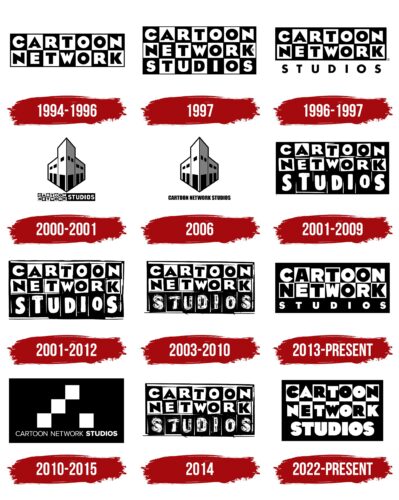
1994 – 1996
The first sign relates to the Hanna-Barbera Cartoons, Inc division – the cable channel Cartoon Network, which has been around since 1992. The studio was added in 1994 and was used to create cartoons and shows for the channel.
The first emblem of the division was common – the name, placed in two levels, each letter of which is placed in black and white squares. The original idea highlighted the sign among other film studio emblems. The company owes the iconic logo, which ensured the brand’s recognizability, to HatmakerPrimal Screen.
The chessboard theme pointed to:
- Cubes. Since CNS deals with children’s content, the name made up of a constructor fits perfectly into the idea.
- Chess and checkers. The channel’s goal is not only entertainment but also education, learning, and cognition. Hence the analogy with intellectual games.
- Frames. The frame-by-frame shooting process was widespread at the time the studio started working.
- Black-and-white cartoons. The channel was originally launched to broadcast the rich video library of the owner Hanna-Barbera – Turner shot before 1948. One of the cult cartoons was the black-and-white Looney Tunes.
- Round-the-clock broadcasting. CN was a cable channel that broadcasts cartoons around the clock. Therefore, the theme of changing day and night was relevant to the logo.
The full glyphs of the letters spoke of a sufficient video library, saturated and interesting programs.
1996 – 1997
In 1996, the parent company Hanna-Barbera Cartoons, Inc. – Turner Broadcasting – merged with Time Warner, and Cartoon Network indirectly got new owners.
To separate itself from this union, the Cartoon Network channel established a studio. Therefore, the first logo was slightly transformed by adding the word Studios. At the same time, the Cartoon Network composition continued to stand out in the emblem, showing that the studio was just part of the brand.
1997
In 1997, the logo was refined, giving the word Studios the same design as the rest of the inscription, which made the emblem harmonious.
2000 – 2001
In 2000, Cartoon Network Studios moved to a new location, where the headquarters are still located. The event is reflected in the appearance of a unique logo depicting the building at 300 N 3rd St.
An angular perspective was chosen for the picture, on which the building looked like a rocket shooting upwards. This technique was used to convey movement, individuality, leadership qualities, and engaging broadcasts.
The inscription was placed in two columns below the drawing. The two-level name Cartoon Network occupied the first column in the second column – Studios. Highlighting the last word showed a focus on filming.
2006
In 2006, there was a collaboration with Williams Street, a subsidiary of Warner Bros. Animators worked for the pilot project Korgoth of Barbaria.
During this period, CNS returned to its logo with the image of the building, changing the caption underneath to the large, identical, black letters Cartoon Network Studios. The change was needed to separate production from the channel and its emblem since the project was not intended to be shown on CN.
The film was not approved for further series creation, the collaboration ended, and the logo was no longer used.
In 2006, the founder of Hanna-Barbera, the company that owned the studio, passed away. Therefore, the change of the logo to the past one also represented a form of mourning.
2001 – 2009
The Hanna-Barbera company was absorbed by Warner Bros. and renamed Warner Bros. Animation.
Cartoon Network, which became the property of Warner Bros along with its parent company, returned to its original logo, but in a special way, highlighted the word Studios, increasing its size and placing it on a completely black background. This approach helped separate the production from the channel as much as possible since the shows can now be used for other Warner Bros channels.
2001 – 2012
Simultaneously with the previous one, a version of the emblem appeared, in which the entire studio name is framed in white, giving the logo a sense of novelty. The two signs existing together indicate the different directions of CNS’s work.
From the 2000s until 2012, inclusive, the studio started filming in an into live-action style, where live people are involved in the scenes. Projects are highlighted in a separate direction. And the white frame emphasizes the freshness of the idea and live shooting. Similar films ended with Incredible Crew, which was released in 2012.
2003 – 2010
In 2003, the series The Grim Adventures of Billy & Mandy, relating to black horror comedy, was released. Its filming lasted until 2007, then several issues, and an Indian version appeared in 2008.
For the series, the studio slightly tweaked the logo. The white word Studios, as if smeared with black paint, emphasized the theme of horror and black humor.
2010 – 2015
In 2010, the channel introduced a new logo and slogan. The studio emblem also underwent an update. For the first time, their images diverged.
The production symbol consisted of a black canvas, on which were four white squares. The squares lined up in a row, trying to rise to the light, but the last one fell down.
Inside the rectangle at the bottom was the white name in thin letters, Cartoon Network, and in bold, Studios.
The falling cube and bold highlighting indicated the film studio was a separate entity. The black canvas is a symbol of darkness before the camera starts and a hint at the popular series Adventure Time, which started airing in 2010. The action in the picture takes place in a post-apocalyptic world.
2014
In 2014, the first mini-series, Over the Garden Wall, debuted, which became the basis for the show. The theme of a dark, mysterious forest and fantastical things within it led to the use of the emblem created for the horror black comedy. In the plot resolution, it becomes clear that the children ended up in the forest after falling into a pond on Halloween, which further justifies using the logo.
2013 – today
For the 20th anniversary of the channel, the logo was changed, rendering the word Studios in small, full, white letters. This approach demonstrated that the studio was dedicated to one genre but had accumulated significant experience in it.
2022 – today
The owning company, Warner Bros., underwent a restructuring and a change of leadership. As a result, CNS was merged with Warner Bros. Animation. The rebranding led to a new logo, in which the word Studios received a large letter size in the same style as the rest of the inscription but completely white. This technique finally focused attention on the theme of video filming and demonstrated the merger with the parent division.
Font and Colors
White and black form the basis of every visual mark of the filming pavilion. The combination points to the theme of film negatives. It aligns with broadcasts for airing at different times of the day, as the CN channel operates 24/7.
- Black – cartoons and movies for teenagers in the style of horror. The leading position as the main studio for the channel.
- White – regular new projects, live-action shoots, funny short films for children.
The inscription’s font is cartoonish, with restless letters leaning in different directions.
Cartoon Network Studios color codes
| Black | Hex color: | #000000 |
|---|---|---|
| RGB: | 0 0 0 | |
| CMYK: | 0 0 0 100 | |
| Pantone: | PMS Process Black C |
