


![]() Castorama Logo PNG
Castorama Logo PNG
The Castorama logo shows that each client has a personal definition of this brand. But in any case, the store is a place where dreams come true. Only positive, joyful feelings are associated with the emblem, as everyone finds “his” purchase.
Christian Dubois began in 1951, selling construction and finishing materials in Lille and northern France. In the late 1960s, a business trip to the United States introduced him to large specialist warehouse stores, where customers could find a wide range of goods in one place. France still relied on small specialized shops for tools, hardware, and building supplies.
On June 13, 1969, Dubois opened the first Central-Castor store in Englos, near Lille. The name referred to the beaver, castor in French, a symbol of building skill and hard work. The 5,000-square-meter store, located inside a shopping center next to an Auchan hypermarket, became France’s first large-format DIY and home improvement store.
The second store opened in 1972, the third in 1973. During the housing boom, the format gained traction among French customers undertaking renovations. By 1989, Castorama had 80 stores in France, while Leroy Merlin grew into its main domestic rival. In the 1990s, Castorama expanded abroad, opening in Milan, Kortrijk, Warsaw, and São Paulo. In 1997, it bought Canada’s Reno-Dépôt, and by that year the brand had 162 stores in six countries.
In 1998, Castorama merged with Brico Dépôt to form Groupe Castorama-Dubois. Kingfisher plc, already the owner of B&Q, completed its £ 3.2 billion takeover of B&Q in May 2002. Kingfisher later closed or sold weaker assets, including German stores, Reno-Dépôt, Belgian operations, Dubois Matériaux, and the Italian business, which was sold to Groupe Adeo in 2009. In 2020, 15 Russian Castorama stores were sold to Maxidom for £73 million, leaving the chain focused mainly on France and Poland.
Meaning and History
![]()
Castorama stores serve millions of individual consumers. They are located in different cities and even in different countries, but they are united by a common concept called Do It Smart, adopted in 2012, and a new visual style. Since then, the hypermarkets have maintained a friendly atmosphere that welcomes newcomers who don’t understand the renovation. Its goal is to enhance the customer experience. To this end, the outlets are combined with demonstration areas where customers can learn about the products and how to use them: for example, learn how to lay tiles under the supervision of a master. It is assumed that most professionals do not go to retail chains to buy everything they need for construction and repair, but instead buy only from wholesalers.
Before the modern concept, Castorama stores operated in a different format. They had bright color zones that divided the entire assortment into categories (do-it-yourself, decoration, home, garden), which were naturally reflected in the logo. Now those colors no longer exist-the Do It Smart ideology calls for the use of warm hues that appeal to consumers. When the company made this decision, it changed several similar emblems.
What is Castorama?
Castorama is a chain of stores that sells home improvement products, including gardening, building materials, and tools. It operates in the DIY segment and competes with market giants such as IKEA and Leroy Merlin. The retailer is headquartered in France. At the same time, the company is owned by the British group Kingfisher plc.
1969 – 2006
![]()
The brand’s history dates back to 1969, when entrepreneur Christian Dubois opened the first DIY store in France. Over time, one outlet expanded into a chain of hypermarkets, which later expanded abroad in the 1990s. And in 2002, Castorama became part of Kingfisher plc of the United Kingdom. Throughout this period, the company used only one logo – a blue rectangle with the yellow word “castorama.” All letters were lowercase, bold, and sans serif.
2006 – 2010
![]()
In 2006, the store space was divided into color-coded blocks into four areas: do-it-yourself, decoration, home, and garden. The original concept was reflected in the logo, where multicolored quadrangles with inscriptions appeared: a purple rectangle with “DÉ CO,” gray with “BRI CO,” orange with “BÂ TI,” light green with “JAR DIN.” Because the figures were vertically elongated, each letter combination was split into two lines. The new elements were lined up one after another to the right of the brand name, which remained unchanged.
2010 – 2014
![]()
In 2010, the slogan “C’est castoche” was added to the logo. The designers placed it at the bottom and aligned it on the right side. And to leave no space on the left, they drew a long horizontal line from the left edge to the first “C.” It was written in sloppy handwriting and colored the same shade of blue as the large rectangle that contained the word “castorama.”
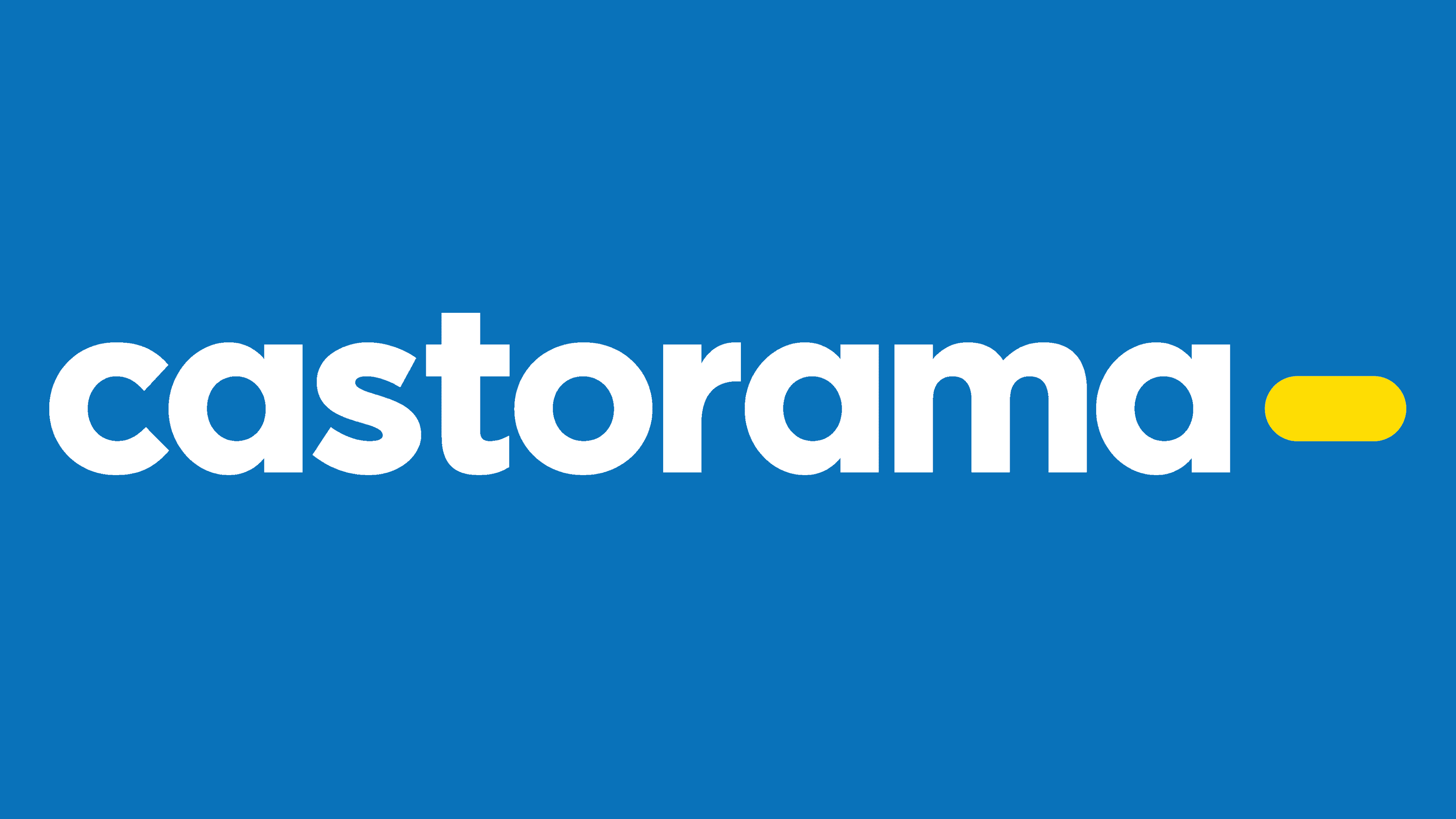
2014 – today
![]()
A couple of years after a minor redesign, the hypermarket chain decided to gamble and completely change the concept. The Carré Noir agency (Publicis Group) helped improve the stores’ interiors and visual identity, while the Royalties served as the inspiration for the Do It Smart strategy. To make the brand’s positioning more coherent, they abandoned the old color codes, which involved separating the four directions, and chose gentle shades of blue and yellow.
The logo’s background is now white, the company name is blue, and yellow is used for an elongated rectangular shape with rounded corners. The last element is located to the right of the inscription, and its length is no longer than the width of a single letter. The font became more readable due to the smooth curves and increased spacing. This trademark was officially adopted in 2014, but it appeared in stores as early as 2012, when the chain began testing the new concept in the Lormont and Villabe communes.
Font and Colors
According to Jean-Philippe Chavatte, one of the heads of the Carré Noir agency, the mysterious yellow figure symbolizes the connection between the brand and the consumer. It connects the problem and its solution, the tool, and the action it is intended for. That is to say, it is a fairly abstract element that finds its full meaning when used on store shelves.
The current Castorama font is visually similar to Pontiac Black by La Goupil Paris, though they differ in several significant ways. It is a low-contrast geometric grotesque with a bold typeface. All letters are lowercase to make the lettering look friendlier and inspire confidence in customers seeking simple answers to complex questions.
The combination of yellow and blue is reminiscent of the Ikea logo. But the French hypermarket chain is proud of its color scheme and believes it has stronger rights to it than the Swedish brand, since the yellow-and-blue Ikea logo appeared much later, in 1983. Yellow symbolizes vitality and the sun. And when combined with blue, it is associated with low prices and mass-consumption products, an association that arose precisely because of the companies above.