![]() Central Florida Knights Logo (UCF Knights Logo) PNG
Central Florida Knights Logo (UCF Knights Logo) PNG
The modern symbolism of the University of Central Florida’s sports department reflects the organization’s aspiration to keep pace with the times. The concise letter identity of the Central Florida Knights logo focuses attention on the subdivision’s name and affiliation, as well as on clearly defining goals and objectives.
The University of Central Florida’s athletic program began in January 1979, when President Trevor Colbourn pushed for a football team and renamed the university Florida Technological University. Early recruits paid for dorm stays and brought their own gear. The Knights started with minimal funding.
The team moved from Division III to Division II, then reached Division I-AA with playoff appearances in 1990 and 1993. In 1996, UCF entered FBS, becoming the only NCAA program to progress through all four levels.
Under George O’Leary, hired in 2004, UCF gained national attention. The Knights won Conference USA in 2007. In 2013, during their first season in the American Athletic Conference, they beat Baylor in the Fiesta Bowl.
The peak came in 2017–2018. After a 0–12 season in 2015, Scott Frost led a turnaround. In 2017, UCF finished 13–0, defeated Memphis in double overtime, and beat Auburn in the Peach Bowl. The Colley Matrix ranked them first nationally, though the College Football Playoff excluded them.
In 2018, Josh Heupel extended the streak to 25 wins. Quarterback McKenzie Milton suffered a severe injury before the Fiesta Bowl against LSU, and UCF lost 32–40.
Basketball gained attention in 2019 under Johnny Dawkins. UCF defeated VCU and narrowly lost to Duke 76–77 in the NCAA Tournament.
In 2023, UCF joined the Big 12 Conference, marking its shift into the Power Five tier.
Meaning and History
![]()
The visual style of the “Central Florida Knights” university department consists of eight logos. They are divided into two types: early graphic and later textual. This sharp transition was due to design innovations in identity, so the team’s concept, name, and goals were immediately clear to opponents and fans. At the same time, not all emblems are colorful; most feature pastel tones. Among them are dark yellow, olive brown, black, and white. The latter often serves as the background.
What is Central Florida Knights?
Central Florida Knights (more precisely, UCF Knights) is a sports department with 16 student teams from the University of Central Florida. It is located in Orlando, Florida, and competes in the American Athletic Conference, an NCAA Division I (FBS) conference. Starting in 2023, the organization will also be a member of the Sun Belt and Big 12 conferences.
1970 – 1979
![]()
The debut logo depicts knightly armor, a helmet with a lifting visor, and lush feathers. The head in profile is decorated with important attributes of the university: the seal, the image of a winged horse from ancient Greek mythology, the abbreviation FTU (Florida Technological University), and the names of the sports teams, the Knights. Above Pegasus on a dark background is a shining star, and its wings spread out and occupy the entire left side of the round sign. The authors of this variant are an FTU representative and graphic artist, Dorothy Cannon.
1979 – 1985
![]()
When UCF players joined the NCAA Division III, they started playing very well. This gave hope to the fans, who began to assert that such a style would help athletes give a decisive response to anyone, anywhere. Thus, because of the team’s arrogance, the era of Fighting Knights began: a rebranding followed by an emblem redesign. The emblem now features a serious knight on a rearing horse. The focused facial expression and the thrusting spear indicate the rider’s belligerent intent. Below is the name of the sports faculty, and the university’s abbreviation appears on the shield. A thin ring surrounds all elements. At the same time, the logo retained its original monochrome color scheme.
1985 – 1993
![]()
In the 1980s, a turning point occurred in the identity of the “Central Florida Knights.” It switched to a textual logo with the UCF block. The letters in it are geometric, decorated with massive serifs, and outlined by a thin black line. In addition, they are white, empty, and formed due to contrasting framing. The background is a golden map of Florida, on which a five-pointed star is visible. It indicates the location of Orlando.
1993 – 2003
![]()
This period in the university’s sports department history is interesting because management tried to combine text and graphics. To achieve the desired effect, designers placed an image of a knight to the left of the inscription. The warrior in full combat gear: in armor, with a spear, and in a helmet with feathers and a visor. The spear is slightly raised so that it pierces the abbreviation “UCF,” located diagonally with a white stripe. Below is the word “Knights”. Unlike the upper inscription, it is typed in black sans-serif letters.
2003 – 2007
![]()
In this logo, designers replaced the bright golden color with a muted gold and applied it to the knight, who was previously outlined. They also made all inscriptions black and added the word “Golden” to “Knights.” In addition, the authors left the spear white and translated all symbols into uppercase. The only difference between the upper and lower text now lies in the serifs: in the first case, they are present, and in the second, they are not.
2007 – 2012
![]()
The redesign was undertaken to mark the sports department’s return to its original name, which it had adopted at the beginning of its career. Changes were also reflected in the logo. The image of the university mascot, Knightro, is positioned face-on, so the warrior seems to be moving straight toward the viewer. The artists removed the long spear and put a broad sword in the knight’s hands, with which he swung at the enemy. Of the many inscriptions, only the abbreviation “UCF” remained. It took its place under the character’s right hand. The main colors are metallic gold, white, black, and gray.
2012 – 2017
![]()
To simplify the visual identification of the “Central Florida Knights,” designers proposed a letter logo. It uses only the university’s three-letter abbreviation. The writing of the word “UCF” is based on the previous decoration, with a sharp upper end at “U.” The protruding spike resembles the tip of a sword. It is directed to the left. Similar serifs are also present in other symbols. Dark gold glyphs are complemented by white stripes inside and outlined by a unifying black line around the perimeter.
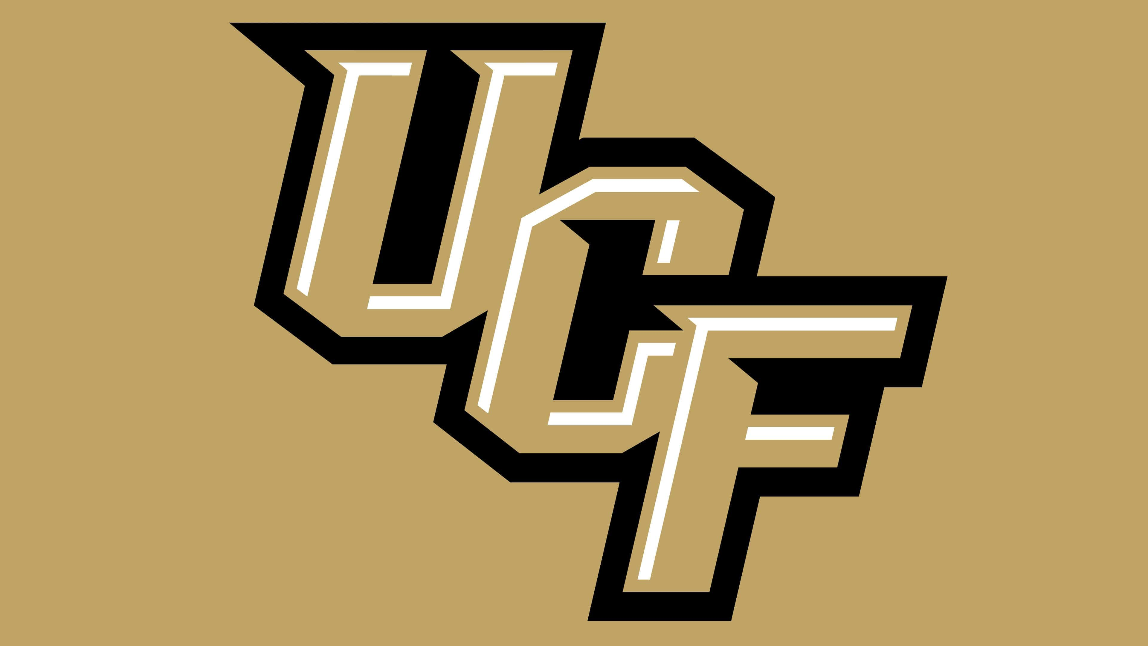
2017 – today
![]()
The management of sports teams decided to modernize the logo by simplifying it. Therefore, instead of dark gold (Pantone 872), light gold (Pantone 4515) appeared. The designers left everything else unchanged.