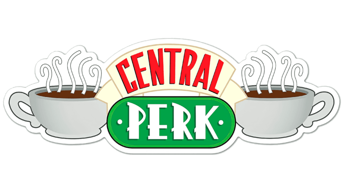
The Central Perk logo invites you to have a cup of coffee in a pleasant atmosphere with friends. Hot steam creates a feeling of comfort and warmth. “There will definitely be a companion in a cafe, no one will be alone,” the emblem guarantees.
Central Perk: Brand overview
| Founded: | 1994 – 2004 |
| Headquarters: | United States |
Meaning and History
The writers and director of the film sometimes decided to move the plot’s action to a nearby cafe to diversify the scenes in the Friends sitcom. In addition, several main characters worked in it for some time. For example, Rachel was a waitress there for many years in a row – from 1994 to 1997. But she was not interested in work: she waited out the time and just earned a living while looking for a job in the fashion industry. In the third season, Greene enters the fashion industry and quits her job as a waitress at Central Perk.
It also worked Joey, who appeared after that six seasons. He was also a waiter, but he did not know this profession at all. He just needed money to live on as his acting career went downhill. As a result, he stayed to work in a cafe to not pay for coffee. But at the end of the season, Joey Tribbiani got lucky: he was cast in the lead role in Mac & CHEESE, so he quietly quit without telling Rachel anything.
Buffay also occasionally performed at Central Perk, presenting their songs to a stunned audience. For example, the composition Smelly Cat was performed within its walls. At one point, Phoebe even replaced Stephanie Schiffer, a professional hired by Terry. This cafe is a very significant location in the series, and it has its logo – a sign that was almost constantly in the frame. It was placed on display glass.
The image on the logo is thematically related to the coffee served at Central Perk. In addition, it hinted: this is a cozy place for friends and interlocutors because two cups with a steaming drink are drawn on the sign. In the sitcom, they were brown with a white sheen in the middle. Each of them is outlined with a dark stripe so that the outlines of the dishes do not blur on the display glass due to light.
Inside the cups, you can see dark hot coffee, as evidenced by the steam emanating from them. It is presented in the form of separate white jets of various shapes – five above each. Between them, there is an informative text part of the logo – the cafe’s name, which occupies two lines. The first one says “Central.” The word is placed on a wide white ribbon with forked ends. The second part contains the rest – “Perk.” The lower zone is a green horizontal oval with two painted screws in the form of a plate fixed to the glass.
Central Perk: Interesting Facts
Central Perk from the “Friends” TV show is a well-known coffeehouse that has become a significant part of television history.
- Heart of “Friends”: Central Perk is a key location in the series. It is where the six friends gather and share many important moments.
- Inspired by Real Life: The concept of Central Perk was based on the coffeehouse scene in 1990s Manhattan, reflecting the vibrant coffee culture where young people hung out.
- Unique Design: The Central Perk set was carefully designed to feel welcoming and familiar, with its famous orange couch, green chairs, and brick walls adding to its charm.
- The Orange Couch: Thanks to the magic of television, this piece of furniture became an iconic symbol of “Friends.” It was always available for the characters to sit on.
- Gunther’s Character: James Michael Tyler plays Gunther, known for his bright blond hair and love for Rachel. His part expanded because he knew how to work an espresso machine, starting as an extra.
- Music and Performances: Beyond coffee, Central Perk is also known for its live performances, especially Phoebe Buffay’s songs like “Smelly Cat,” adding to the show’s humor.
- Replicas Worldwide: The fame of “Friends” has led to Central Perk replicas and themed cafes globally, where fans can enjoy the show’s atmosphere.
- Fan Experience: The Warner Bros. Studio Tour in Burbank, California, offers fans a chance to visit the Central Perk set, including the iconic couch, for a firsthand look into the “Friends” world.
- Special Events Venue: For “Friends” anniversaries, pop-up Central Perk coffeehouses have offered themed drinks and merchandise to celebrate the show’s milestones.
- Cultural Significance: Central Perk is a fictional location. It symbolizes the 1990s and the essence of sitcoms, influences coffeehouse culture, and reminds fans of the show’s warmth and friendship.
Central Perk is a beloved symbol of “Friends,” showcasing its lasting impact on culture and the special place it holds for fans. It embodies a welcoming space where everyone feels at home.
Font and Colors
official Central Perk logo, used from 1994 to 2004 (the time of the series’ release), used the same elements as the television sign. The difference between the two was that the emblem was two-dimensional. Cups placed on the sides were white with a gray shadow. More coffee was poured into the right one than into the left. This added a dynamics logo – the feeling that they are drinking from cups. The number and shape of the jets of steam emanating from the poured drink remained the same, as did the type of font chosen for the establishment’s name. The screw heads were given the appearance of two miniature dots.
For the word “Central,” the designers used an elongated sans-serif typeface. The letters are tall, narrow, without contours. On the contrary, the inscription “Perk” is made in wide characters with original serifs in the form of elongated strokes that make up the letters.
The color scheme of the emblem, although not rich, is not of the same type. It contains white, grey, beige, red, green, and dark brown.
Central Perk color codes
| Pigment Green | Hex color: | #00a447 |
|---|---|---|
| RGB: | 0 164 71 | |
| CMYK: | 100 0 57 36 | |
| Pantone: | PMS 354 C |
| Light Yellow | Hex color: | #ffffe0 |
|---|---|---|
| RGB: | 255 255 224 | |
| CMYK: | 0 0 12 0 | |
| Pantone: | PMS 7485 C |
| Ruddy | Hex color: | #ff1825 |
|---|---|---|
| RGB: | 255 24 37 | |
| CMYK: | 0 91 85 0 | |
| Pantone: | PMS Bright Red C |
| Liver | Hex color: | #65300f |
|---|---|---|
| RGB: | 101 48 15 | |
| CMYK: | 0 52 85 60 | |
| Pantone: | PMS 7526 C |
| Spanish Gray | Hex color: | #949796 |
|---|---|---|
| RGB: | 148 151 150 | |
| CMYK: | 2 0 1 41 | |
| Pantone: | PMS Cool Gray 7 C |
| Black | Hex color: | #040404 |
|---|---|---|
| RGB: | 4 4 4 | |
| CMYK: | 0 0 0 98 | |
| Pantone: | PMS Black 6 C |


