


![]() Channel 4 Logo PNG
Channel 4 Logo PNG
The Channel 4 logo is an original reflection of the idea of broadcasting. Channel 4 television waves are everywhere. The emblem shows reliability and constancy, excellent picture quality, and a stable, wide audience.
The history of Channel 4 began with debates long before its launch. After ITV started in 1955, plans for a second commercial channel circulated through the 1960s and 1970s. The 1977 Annan Report proposed a new model focused on minority audiences and independent production.
The Broadcasting Act 1980 created Channel 4 as a public corporation within the IBA. It launched on November 2, 1982. The first program was Countdown, produced by Yorkshire Television. Early reception was mixed, with low ratings and criticism from ITV and the press.
Its funding model was unusual. ITV companies financed Channel 4 and sold its advertising, allowing editorial independence but creating structural tension. Under Jeremy Isaacs, the channel supported independent film through Film on Four and developed content for underrepresented audiences.
The Broadcasting Act 1990 restructured the channel. In 1993, it became Channel Four Television Corporation. It gained control over its own advertising sales, increasing revenue but raising commercial pressure. During the 1990s and 2000s, competition from the BBC and ITV intensified as digital television emerged. Channel 4 expanded with E4 in 2001, More4 in 2005, and Film4 as a free channel in 2006.
On March 31, 2010, it achieved full UK coverage after the digital switchover in Wales. In the 2020s, debates over privatization emerged amid competition from Netflix, Amazon Prime Video, and Disney+, but plans were later dropped.
Meaning and History
![]()
The idea of creating another accessible TV channel has long existed in Britain. Its launch was delayed for several years until the government agreed to all measures to allow the emergence of a television station that would present new views and accents. After resolving the technical support problem, allocating separate frequencies, and releasing television devices with a specific reception grid, Channel 4 finally began broadcasting.
He gradually chose TV series and talk shows that were unfamiliar to the European community, but did not deviate from his chosen path. After 1993, when channel control shifted from Channel Four to Channel Four Television Corporation, broadcasting style underwent a dramatic change. The service aimed at the television market’s mass character and focused on innovation, education, personality, sports, and creativity.
As a result, her logo has gained incredible popularity and widespread recognition in the country. The TV company had five emblems – almost exactly repeating each other, and focused only on the number “4”.
What is Channel 4?
Channel 4 is a British television network owned by the media company Channel Four Television Corporation. It began broadcasting in 1982 and has since aired various programs, including sports coverage, feature and documentary films, news, series, talk shows, and other entertainment content. The channel is funded by advertising revenue and has been available for viewing throughout the UK and abroad since 2010.
1982 – 1996
![]()
Right after Channel 4 launched, it had a very striking logo. It consisted of many multi-colored geometric shapes that formed the number four on the screen. The movement of the animated blocks was accompanied by music specially written by composer David Dundas.
Robinson Lambie Nairn designed the logo. However, since there was no suitable computer in the UK at the time, the animation had to be done separately. Bo Gehring in Los Angeles performed it. Trapeziums, squares, and rectangles form a double leg, while the protruding part of the number “4” consists of single-wide stripes. The main colors were chosen: red, purple, blue, green, and yellow.
1996 – 1999
![]()
In 1996, the British TV service adopted an updated identity that it had developed itself. It was the same four, only slightly corrected. The new style, named Connections, featured several circles. In the central ring was the number “4”, the channel’s name. The structure of the figure was the same: different types of geometric shapes stacked together. Only the color has changed; the emblem has become black and white.
1999 – 2004
![]()
During this period, Spin’s square logo prevailed. The need for a new version arose because the television service began displaying its icon on screen so viewers could immediately identify the channel. She was on the right side of the screen. To make the number “4” look clear in any color, the management made it on a dark background and repainted it white.
2004 – 2015
![]()
At the end of 2004, Channel 4 again switched to an updated style developed by the 4Creative agency. This emblem’s peculiarity is that it is formed by negative space: there are no contours in it, only shadows. Shadows play a very important role, as they form the number “4” and make it three-dimensional, creating a 3D effect; as a result, white-on-white looks crisp and clear.
2015 – 2022
![]()
In the second half of 2015, the television company undertook a redesign, returning to the logo’s debut version. The only difference is the lack of bright colors, as the four are now dark blue.
2022 – today
![]()
At the heart of the channel’s emblem, the black numeral ‘four’ conveys professionalism and solidity, serving as a strong, unifying symbol for all the channel’s branches. This design uses single lines skillfully manipulated into various geometric shapes, each characterized by seamless transitions and uniform sides.
The logo’s design ensures ample spacing between the stripes, forming the number ‘4’ and conveying openness and accessibility while maintaining coherence. However, this space is considerably smaller than in the channel’s previous logo, reflecting a strategic shift towards a more compact, streamlined look.
This fresh identity was brought to life by the collaborative efforts of two renowned agencies: 4creative and Pentagram. This new design was officially launched to coincide with the channel’s 40th anniversary, marking a milestone in its history and ushering in a new era for the brand. Notably, the logo was designed with versatility in mind, adapting seamlessly across traditional linear and modern digital channels.
Each element of this updated logo, from the black ‘four’ that suggests authority and stability to the intricate geometric shapes that evoke a sense of modernity and innovation, and the thoughtful spacing between the stripes that strikes a balance between openness and cohesion, works together to create a symbol that perfectly encapsulates the channel’s brand identity.
As the channel evolves, this logo represents the brand’s enduring commitment to professionalism and high-quality content. It serves as a beacon connecting all its branches and platforms. Whether seen on a traditional TV screen or the display of a digital device, this emblem continues to stand as a symbol of the channel’s rich history and promising future.
2023 – today
![]()
In a strategic move that weaves nostalgia with continuity, the channel returned to its roots by restoring the original color that marked the beginning of its logo history. The color choice is a subtle yet vibrant salad green, a shade that leans towards the refreshing spectrum of mint. This nod to its original color palette rekindles fond memories of the channel’s early days and imbues the brand identity with renewed vitality.
Apart from this change in hue, the logo’s composition remains consistent with the black variant. The numeral ‘4’ meticulously maintains the same proportions and geometric configuration, ensuring the brand’s visual identity remains instantly recognizable despite the color shift.
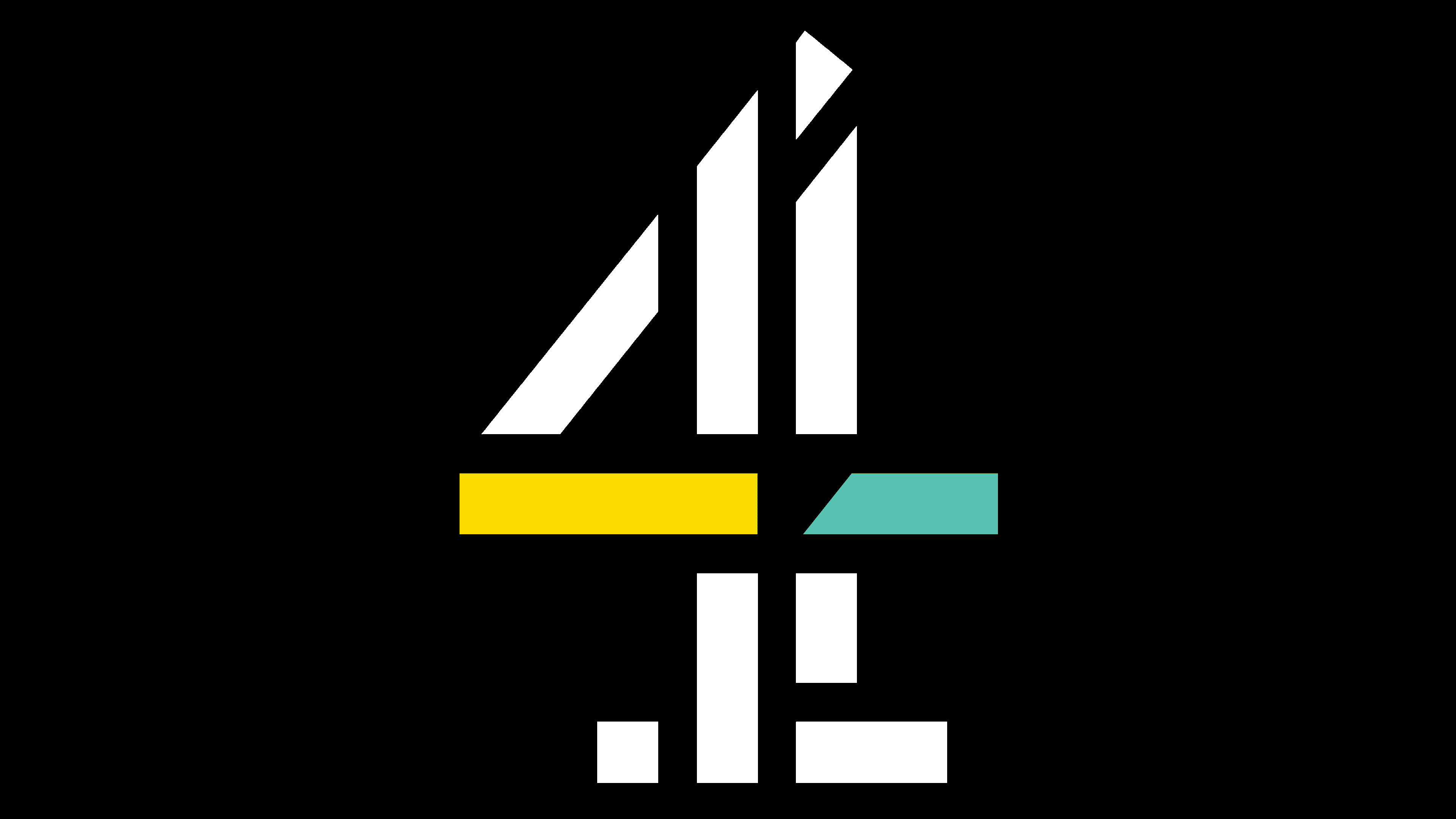
The ‘4’ is an intriguing assembly of geometric shapes: four rectangles, a single square, a triangle, a trapezoid, and two elongated elements that terminate in aointed tips. These shapes come together to form the distinct ‘4’, a symbol that is both visually appealing and rich with symbolic connotations. Each geometric shape in the logo contributes to its dynamism, giving it depth and dimension, while the pointed tips lend an edge of precision and direction.
The decision to maintain the ‘4’ structure, even as the logo’s color shifts back to its roots, speaks to the channel’s commitment to retaining its core identity as it evolves. The logo continues to embody the channel’s original spirit, marking a full circle in its visual journey. At the same time, the fresh mint shade underscores its enduring relevance and adaptability in the ever-changing media and entertainment landscape.
Font and Colors

All Channel 4 logo modifications focused on the “4” because it is part of the TV service’s name. The changes were minor, since both the figure’s structure and its on-screen presentation were preserved. The changes were mainly associated with technical improvements in the television broadcasting market. Of course, the concept was reflected as well, but in this case, it was secondary. The main thing was how the corporate icon appeared on modern TV screens.
The emblem’s usual inscription is absent: the text appears only on advertising media, screen savers, and official documents. An individual font, Channel 4, is used for each noted case.
The color palette varies and can be any color, depending on the screen background. However, black or dark blue, combined with white, is recognized as official. Initially, the logo was also colored green, blue, yellow, light purple, and red.