


![]() Charlotte Russe Logo PNG
Charlotte Russe Logo PNG
A bright youth style is evident in the sign’s visual elements. The Charlotte Russe logo represents clothes that fit perfectly. You can pick up kits at stores to create a comfortable, attractive wardrobe.
Charlotte Russe began with the Lawrence family in Brooklyn. Dan, Frank, and Larry Lawrence grew up working in their father’s clothing store and later moved to California in 1975. They founded Lawrence Merchandising Corp. and opened the first Charlotte Russe store in Carlsbad, named after a dessert from their childhood. On opening day, customers were served real Charlotte Russe.
From the start, the chain targeted young women interested in fashion. The brothers used strong window displays, busy retail locations, and recognizable packaging. By 1984, the company had six more stores in San Diego County and sales of $12 million. Later stores became larger, including a 20,000-square-foot location with video monitors and 65 mannequins.
In 1990, Charlotte Russe entered Arizona, and by 1991, sales reached about $50 million. A major change came in 1996, when Bernard Zeichner, formerly of Guess? and Contempo Casuals, became CEO. That year, he and Saunders Karp & Megrue bought the chain from the Lawrence brothers. At the time, it had 35 stores and about $70 million in revenue.
Expansion accelerated after Charlotte Russe bought 16 Rampage Clothing Co. stores in 1997 and went public in 1999. By April 2000, it operated 113 stores in 17 states and Puerto Rico, later expanding to 45 states while competing with Forever 21 and H&M. In 2019, the company filed for Chapter 11 bankruptcy protection, closed all 416 stores, and was later revived by YM Inc., which operated 196 stores by September 2023.
Meaning and History
![]()
Charlotte Russe isn’t just a dessert of cookies and Bavarian cream to admire outside the bakery window. It’s also a chain of stores that sells women’s clothing aimed at customers aged 15 to 30. It has two things in common with the dessert above. First, they share a common name: the brand’s creators wanted it to be associated with something desirable and sweet, which cannot be refused. Secondly, both dessert and Charlotte Russe stores embody the concept of “affordable luxury.” They look upscale, yet everyone can afford them.
A similar idea is reflected in the retail chain’s logo. On the one hand, it consists of only one inscription; on the other hand, it has an unusual design, expressed in bright pink colors and overlapping letters. This combination of the simple and the complex is meant to capture the attention of young customers without scaring them away with too much pomp.
Although the company itself was founded in 1975, the current version of the logo dates only from 2008. A chain of events preceded its creation. It all started when the fashion retailer filed for bankruptcy protection in 2019, unable to withstand competition from digital platforms. At the time, it had a network of five hundred outlets in 49 states. Unfortunately, the company couldn’t find a buyer, so it decided to self-liquidate on March 31.
Charlotte Russe sold off leftover merchandise, after which it closed most of its stores and laid off all of its employees. No one expected her to suddenly return in the first half of April with a redesigned pink logo. As it turned out, she managed to find a new owner, YM Inc. “Risen from the ashes,” the company has changed its visual identity and its overall approach to business. It decided to look for new customers online because that is where its target audience was.
What is Charlotte Russe?
Charlotte Russe is a clothing, footwear, and accessories brand for women. The first outlet opened in 1975 in Carlsbad, California. Over time, the chain expanded to nearly 50 states, but after it went bankrupt, its reach declined dramatically. It was pulled out of the debt hole by a new owner, YM Inc.
before 2010
![]()
Before joining Advent International, Charlotte Russe used a black lettering logo. Thanks to the handwritten font with thin letters, the wordmark featured the brand name and looked classy and elegant. The designers imitated calligraphic handwriting but added a few “imperfect” details to make the text unique. In particular, they moved the capital “C” and “R” slightly down, breaking the symmetry, and connected the two lowercase “t” with one horizontal line. There was a barely noticeable dot at the end of the phrase, which also created a certain visual imbalance.
2010 – today
![]()
The main symbol of the re-launched brand is the pink phrase “charlotte russe,” split into two lines and evoking the Barbie logo. The name of the chain of stores expresses energy: the letters are arranged chaotically and crawl on top of each other as if they are in motion. There is a strict order in the inscription because both words are aligned on the right edge and geometrically balanced.
Font and Colors of the Emblem
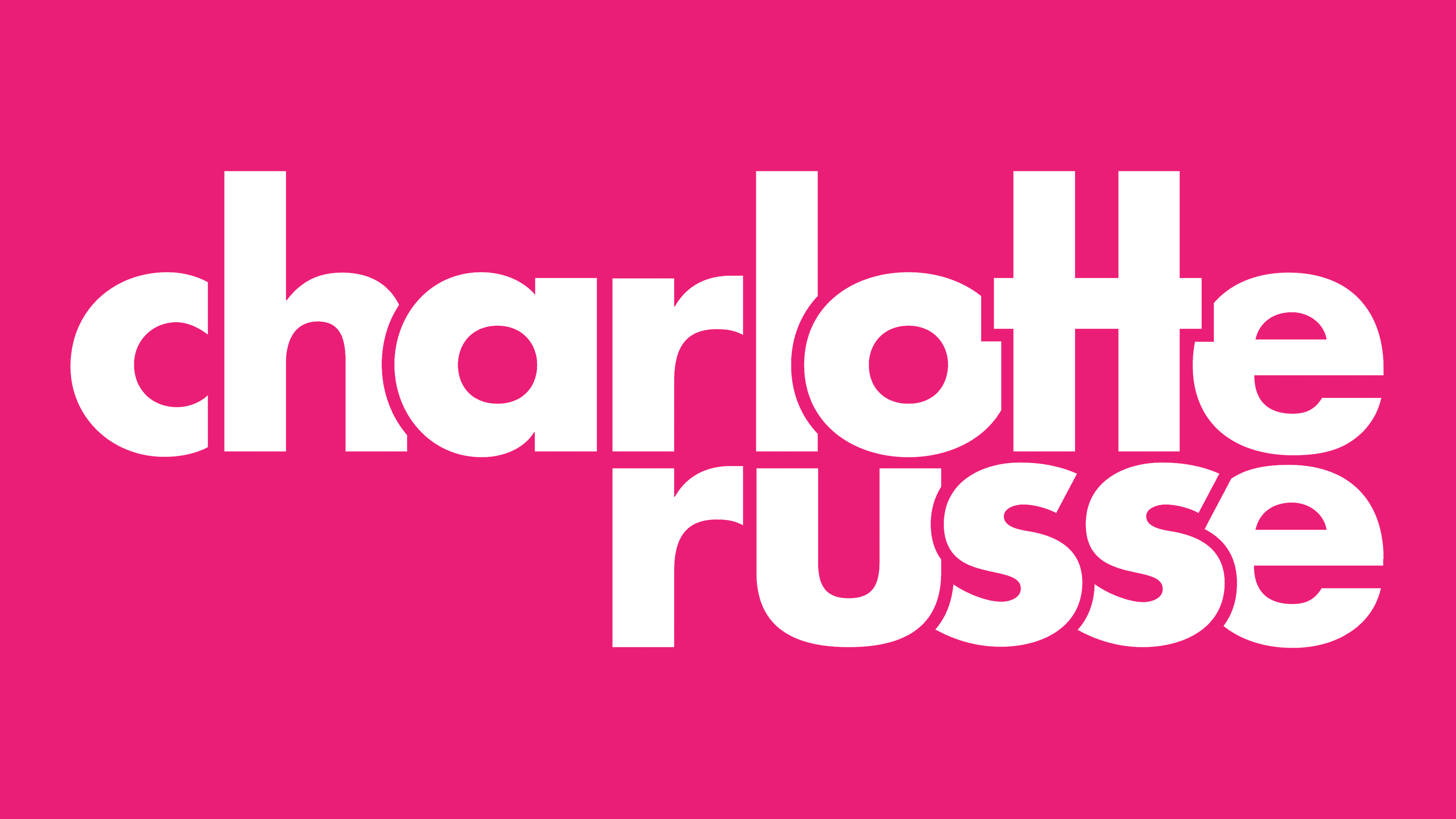
The sans-serif lowercase font used for the fashion retailer’s name is similar to the Joya Sans Bold published by Wiescher-Design in 2014. The letters partially merge in the logo (like two “tt’s” connected by a common horizontal stroke) or overlap. The wordmark is pink because it is a stereotypically feminine color. With it, the designers wanted to show that the brand is intended primarily for girls.