


![]() Chatroulette Logo PNG
Chatroulette Logo PNG
The Chatroulette logo resembles two people who have accidentally met face-to-face. Communication will help them get to know each other. The emblem represents the system the site offers: a roulette game in search of a suitable partner.
Andrey Ternovsky was a 17-year-old student at Moscow gymnasium No. 1519 when he built Chatroulette in November 2009. The idea came from daily Skype calls with friends that had become repetitive. Social networks required contact lists, while forums lacked live face-to-face interaction.
He created the first version in two days and two nights. On November 16, 2009, Chatroulette opened to the public. Ternovsky later wrote to The New York Times that he made the project for fun and had no business goals at the start.
The format was direct and unpredictable. A user switched on a webcam and was connected with a random stranger anywhere in the world. One click on “Next” brought a new person. There were no profiles or registration. The name combined “chat” with “roulette,” referring to chance.
By December 2009, the site had 50,000 daily visitors. In early 2010, daily traffic reached about 1.5 million users, driven largely by word of mouth in the United States and Europe. Google reportedly made contact, and Russian investors showed interest, but Ternovsky avoided major deals too quickly. Popularity also brought serious moderation problems, including explicit content. In 2011, he added automatic nudity detection, which he said filtered about 60% of inappropriate material. He later moved to Palo Alto, worked with two developers, faced server pressure, spam, and competition from Omegle. At the same time, traffic declined after the early 2010 peak.
Meaning and History
![]()
The appearance of Chatroulette was facilitated by Skype conversations, which, as usual, were conducted by the friends of the 17-year-old schoolboy Andrey Ternovskiy. To easily maintain audio and video communication with his buddies, he wrote the first version of what would become a million-dollar site. The programmer gave him the site’s name after watching The Deer Hunter, released in 1978 and associated with themes of Vietnam and Russian roulette. He wrote the code in two days on his old computer and ran the resource from an ordinary city apartment.
Initially, he had only 20 users, but the number soon grew to 500 per day. A month later, the number was already over 50,000. In March 2010, 1.5 million people utilized online chat services. The Chatroulette owner undertook no marketing strategies. People learned about the unusual web resource from acquaintances and strangers, i.e., it was a form of live word-of-mouth advertising.
Gradually, the number of portal users grew to a point where the system could no longer handle the load, and Andrey Ternovskiy had to rewrite the code urgently. He was assisted by Vlad Kostanyan, with whom he often collaborated on other projects. Despite the service’s expansion, the owner and creator still coded it himself. Then foreign resources reported on the unusual platform, and its popularity began to spread. In 2010, he was awarded the Webby Prize for his innovative idea, which confirmed his high achievements in the field of the Internet.
To avoid losing wide recognition, the head of the chat resource tried to keep the logo. In truth, Ternovskiy initially did not care at all about the visual identity because the primary motive for promoting the site was its content, not marketing. It was the reason for the interest of many foreign magazines. The portal’s functionality now accommodates foreign visitors and offers a selection of languages for communication. Chatroulette uses Adobe Flash to display video from users’ webcams. This allows video and audio streams to move directly between laptops and computers, bypassing the server lane.
What is Chatroulette?
Chatroulette is a web portal that allows users to communicate with strangers in real-time. Each site visitor can connect with a random interlocutor for a Skype conversation. The creator of the web resource is Moscow schoolboy Andrey Ternovskiy. The service was launched in 2009.
Old
![]()
The logo comprises three areas that share an equal conceptual focus. The first is the chat portal’s name. It is in lowercase bold and composed of two parts: “chat” in blue gradient and “roulette” in pink. The color demarcation indicates that the resource is designed for communication between individuals of different sexes. The site motto is under the second half of the name: “New friends on shuffle.” The letters in the top line are geometric, with straight cuts, while the letters in the bottom line are rounded and thin.
The second most important element is the miniature icon to the left of the name. It represents the communication process between users and consists of two arrows that flow in sequence. Since they are missing half the tip, they resemble signal flags or speech bubbles. One arrow is blue; the other is pink. The third iconic part of the logo is the background. It is completely covered by round signs that repeat the outline of the main element, which is opposite the upper inscription. The entire rectangular composition is painted in several shades of navy blue, conveyed as a gradient.
New
![]()
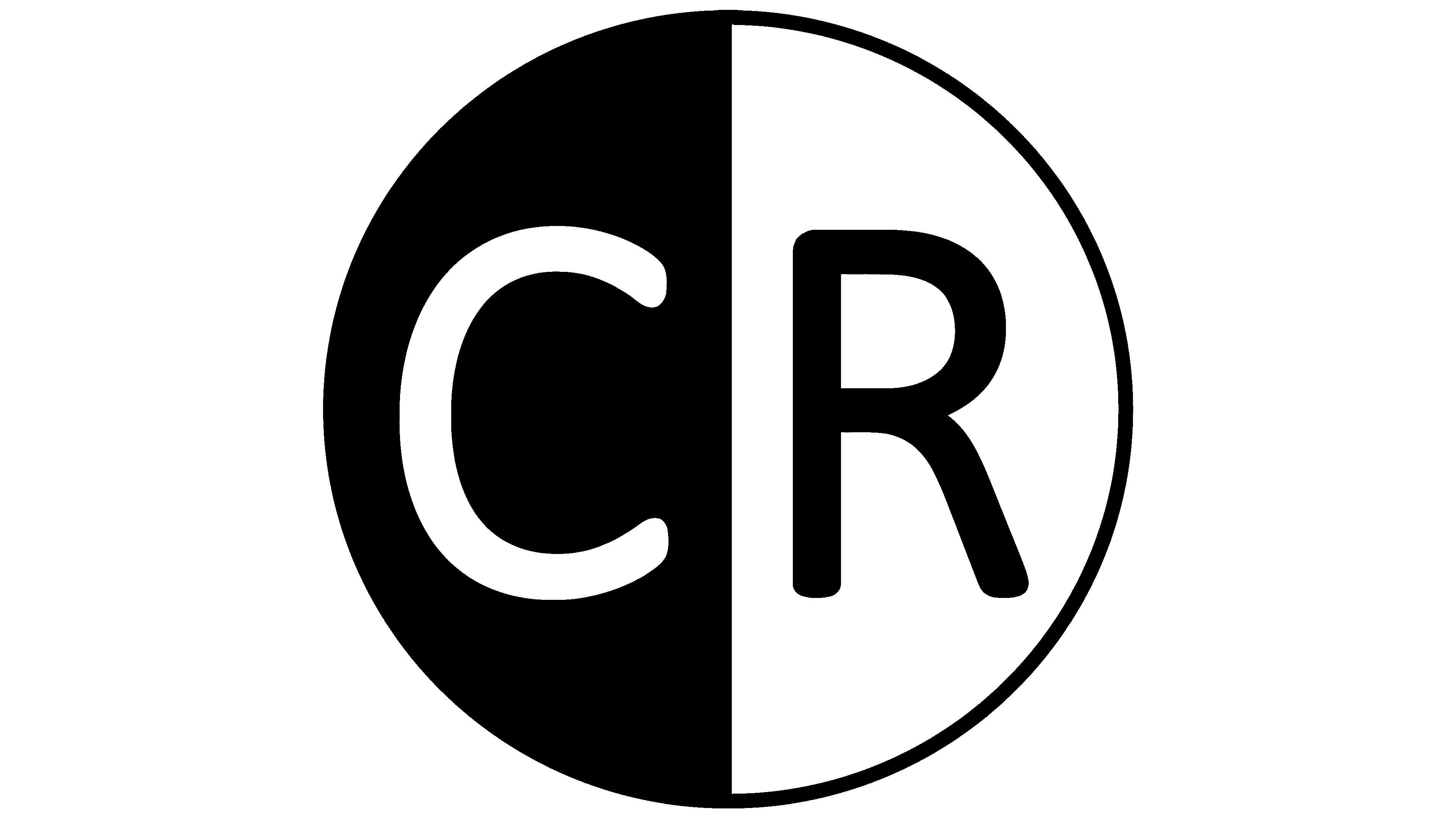
In this version of the Chatroulette emblem, the designers removed the gender principle and focused on the “bad-good,” that is, the contrast between good and bad. Monochrome dominates everything: the text, the icon, the background. The logo has undergone drastic changes, so there is no trace of the previous version remaining.
The key detail is a circle divided into two parts: the right side is white with a black letter, while the left side is black with a white symbol. In particular, these are the “C” and “R,” with which the words “Chat” and “Roulette” begin. Below is the full name of the web resource. It is written in fine black type with a wide inter-character space. The “tt” next to each other is connected by a rung, suggesting that people with the same interests talk to each other.
Font and Colors
The evolution of the Chatroulette logo is a story of the search for individuality. An early version was colored in the standard “gender” shades. The later version expanded the web resource’s conceptual vision and also offered a “friend-or-foe” color separation.
The old logo used a font reminiscent of Ryo Gothic PlusN Heavy with minimal changes. The lettering is in a font similar to Yuzu Medium from the Indian Type Foundry, as seen in the new logo. They have identical rounded ends to the letters and smooth lines. Initially, the signature palette was standard, comprising blue and pink. Then, monochrome colors, black and white, were introduced to provide the necessary contrast.