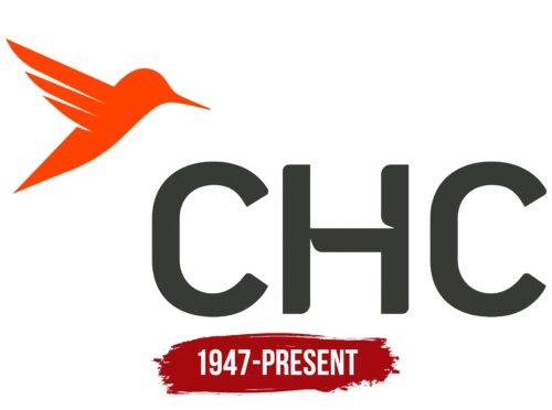
The CHC Helicopter logo is an eloquent reflection of the synergy between romance and industry. The logo makes it clear to customers and competitors alike: this company recognizes the beauty in the mechanical and the mechanical in the beautiful. It is striking and, at the same time, convincing of a thoroughly professional approach that appeals to a wide range of customers, from flight romantics to the strictly pragmatic.
CHC Helicopter: Brand overview
CHC Helicopter, located in the heart of Texas, occupies an important position in the helicopter services industry. Since its founding in 1947, CHC has offered unrivaled helicopter transportation solutions, ensuring safety, reliability, and efficiency to its customers around the world.
CHC Helicopter’s origins began in the picturesque city of Vancouver, British Columbia, Canada, where it was founded in 1947 by Carl Agar, an experienced bush pilot from Northern Canada. Recognizing the enormous potential of helicopter transport, Agar initially focused the company on providing services in logging, aerial construction, and surveying.
In the 1960s, CHC Helicopter refocused on the lucrative oil and gas industry. Providing transportation services to offshore rigs scattered in the harsh environments of the North Sea, Gulf of Mexico, and Australia, CHC Helicopter’s successes were significant.
CHC Helicopter proudly carries the mantle of a global luminary in helicopter transportation. The company’s influence extends to 30 countries around the world, and its robust fleet of more than 200 state-of-the-art aircraft.
Meaning and History
What is CHC Helicopter?
CHC Helicopter was born in Texas and began operations in 1947. Over the years, the company has become a global leader in helicopter services. This growth was marked by milestones such as entering international markets in the 1980s and further diversifying services in the following decades. By the 21st century, the company had established itself as a trusted name, providing critical services such as search and rescue, emergency medical services, and helicopter transportation for the oil and gas sector. The company’s approach is always driven by a desire to innovate. In 2004, the company demonstrated this by introducing night vision technology into its operations, marking a watershed moment and further cementing its position as an industry leader.
1947 – today
The air transportation company’s emblem combines flight and romance. Surprisingly, the working atmosphere is well captured in the CHC Helicopter emblem, which features a soaring hummingbird. The bright red bird hovers over the acronym formed from the phrase “Canadian Holding Company.” The letters are dark gray in color, capitalized, with rounded ends. The letter “H” is made of fragments of a helicopter propeller, which emphasizes the professional activity of the carrier. The hummingbird wing consists of three stripes of different lengths, reminiscent of speed lines.
The choice of the hummingbird as the central figure represents agility and speed, qualities that go well with the dynamic and fast-paced nature of aviation. The inclusion of helicopter propeller elements in the “H” symbol allows the company’s specialization to be intelligently integrated into the visual representation. The combination of red and dark gray colors gives the logo additional visual appeal: red symbolizes passion and energy, while gray is a neutral but professional background.


