The logo of China Southern Airlines reflects its status as one of the largest carriers in Asia and its mission to connect the southern region of China with the rest of the world. The design embodies the airline’s ambition to act as a bridge, enhancing international relations and promoting global accessibility. By reflecting southern China’s rich cultural heritage and vibrant future, the logo emphasizes the airline’s crucial role in this dynamic region’s economic development and cultural exchange.
China Southern: Brand overview
One of the biggest airlines in the world and China, China Southern Airlines was founded in 1988. After the Chinese Civil Aviation Administration was reorganized, several provincial airlines, notably Guangzhou Airlines, China Northern Airlines, and Xinjiang Airlines, merged, and the firm was founded.
Guangzhou, the provincial capital of Guangdong in southern China, was the original home of the airline’s corporate headquarters. As the nation’s “southern gateway” and a hub for rapid economic growth, this area served as the airline’s primary operating base.
Early on, the company concentrated on expanding its domestic route network, linking the quickly expanding Guangdong Province hubs with major Chinese cities, including Beijing, Shanghai, Chengdu, and Urumqi. The airline operated Boeing 737 and 757 aircraft in addition to Soviet-built Tu-154 and Il-76 aircraft.
The airline started aggressive international expansion in the 1990s, with frequent service to Bangkok, Singapore, Macau, Hong Kong, and other Southeast Asian destinations. In 1997, it launched its first long-haul trip from Guangzhou to Los Angeles, beginning to develop its route network in the US and Europe.
The airline kept up its tremendous expansion in the 2000s, emerging as one of the primary winners from the nation’s expanding air travel market and flourishing economy. The airline placed major orders for contemporary aircraft such as the Airbus A320, A330, and Boeing 777, greatly expanding its fleet.
The company was the first airline from China to join the respected global aviation alliance SkyTeam in 2007. Joining the alliance bolstered the airline’s market position in the global aviation industry by providing customers with access to a vast route network and partner services around the globe.
In the 2010s, the airline opened numerous new locations in Asia, Australia, Europe, and North America as part of its aggressive route network expansion. The airline made major expenditures in modernizing its fleet, growing to become one of the world’s biggest operators of Airbus A380 and Boeing 787 Dreamliners.
The airline achieved a significant historic milestone in 2017, carrying 100 million passengers in a single year. This record validated the airline’s position as one of the biggest and fastest-growing companies in the global aviation business.
In 2018, the company declared that it would be leaving the SkyTeam alliance to concentrate on creating its alliances and strategy. This action showed the airline’s increasing self-assurance and desire to solidify its standing as a stand-alone international carrier.
As part of its ongoing route network expansion, the airline opened additional European destinations in 2019, including Rome, Helsinki, and Manchester. To provide customers with an even greater selection of routes and services, the airline entered into codeshare arrangements with several significant international airlines, including British Airways, Finnair, and Emirates.
2020 saw the airline exhibit tenacity and flexibility in the face of extraordinary obstacles brought on by the worldwide epidemic. The airline was crucial in providing transportation inside China and in getting medical supplies and personnel to the areas of the nation that were most severely affected.
The company prioritized bolstering its position in the Chinese domestic market in 2021 since these routes showed quicker recovery rates than those on international flights. The airline has aggressively boosted the number of flights it operates between the nation’s major cities, providing travelers with easy access and first-rate service.
In 2021, the airline bought multiple Airbus A321neo and Boeing 737 MAX aircraft for its ongoing fleet modernization efforts. These fuel-efficient, contemporary aircraft will improve the airline’s environmental sustainability and operational efficiency while providing passengers with more comfortable travel arrangements.
One of the airline’s major recent development areas has been using digital innovations and technologies to enhance customer service. The airline is always improving its mobile apps and websites to provide travelers with easy ways to purchase tickets, check-in for flights, handle bookings, and get the most recent flight information.
The company marked its 30th anniversary in 2022, solidifying its position as one of the top companies in the domestic and international passenger and cargo aviation markets. The airline is still implementing its sustainable development plan, giving special consideration to corporate governance, social responsibility, and environmental issues.
Meaning and History
What is China Southern?
It is one of the largest airlines in China, headquartered in Guangzhou. It operates domestic and international flights connecting China to destinations in Asia, Europe, North America, Oceania, and Africa. Known for its services, it offers various classes of service, including economy, premium, business, and first class. The airline focuses on comfortable travel and is a member of SkyTeam, which expands its global connectivity and offers passengers a seamless travel experience through partnerships with other international carriers. The company is known for its large fleet, which caters to the needs of its customers.
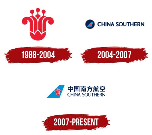
1988 – 2004
China Southern, established in 1988 and actively developed until 2004, chose the Bombax ceiba flower as its logo, a symbol particularly significant to its region. This flower symbolizes Guangzhou, the city where the airline is based. A distinctive feature of the flower is its inner structure, which resembles cotton. These fibers are used to create threads woven into fabrics for various forms of local textile production.
The Bombax ceiba flowers serve a practical use in the daily life of the province’s residents: they are used to make aromatic tea. They are added to various dishes, making the plant especially valuable in the region’s culture. The choice of this logo is deliberate, as the Bombax flower instantly evokes associations with the southern part of China among the residents, highlighting the airline’s regional identity. The effective use of such a symbol in the logo has allowed the airline to be recognizable and memorable without additional textual elements.
2004 – 2007
The airline’s aircraft livery prominently features a flower image set within a dark blue circle on the plane’s tail. This striking image enhances the aircraft’s appearance and symbolizes freedom and the opportunity to travel. The plane, appearing to sail through the sky, embodies the pursuit of long distances and discoveries, directly relating to the airline’s primary passenger transport activity.
The azure color of the aircraft’s tailfin evokes the image of a clear, radiant sky, further enhancing the impression of flight freedom. The large dark blue letters of the company name blend harmoniously with the overall color scheme of the design, emphasizing and making it more expressive. The font adds visual stability and underscores the company’s confident market position.
2007 – today
The brand logo was meticulously designed to reflect China’s uniqueness and cultural features. Large ideographs in the logo capture attention and establish a clear connection with China. These ideographs are aesthetically pleasing and deeply symbolic, bridging traditional culture and the company’s modern identity.
Adding the English name “Southern China” to the ideographs strengthens the link to this geographic region, highlighting the airline’s international status and accessibility to passengers worldwide. The flower in the logo identifies Guangzhou, the company’s base and a cultural hub in southern China. This design element emphasizes Guangzhou’s importance and role in the company’s strategy and identity.
Removing the dark blue circle from the aircraft’s tail has visually freed this part of the livery, adding a sense of lightness and freedom to the design. The airplane’s tail section with the new logo represents the company’s leadership, confident management, and market leader aspirations.


