


 Cinemex Logo PNG
The Cinemex logo is an enticing visual representation of the brand’s commitment to delivering an immersive, magical cinematic experience.
The silver-gray sphere, originally wrapped in celluloid and boasting a rainbow palette, symbolizes cinema’s global nature and the transformative power of film. Although the recent logo has shifted from a three-dimensional to a flat gradient design, the sphere retains its significance. It reflects Cinemex’s continued dedication to the art and spectacle of filmmaking.
The sphere’s new, flat gradient look enhances its contemporary appeal, signaling the brand’s adaptation to modern aesthetics and its commitment to staying relevant in an evolving industry.
The 2009 logotype, featuring slightly italicized, light-gray sans-serif lettering, exudes elegance and friendliness. Its soft lines and rounded angles create a welcoming ambiance, mirroring Cinemex’s aim to make cinema universally accessible and enjoyable.
The tagline “La Magia Del Cine,” meaning “The Magic of Cinema,” further solidifies the brand’s identity. Rendered in a cursive typeface and placed beneath the main inscription, it adds a touch of whimsy and wonder, encapsulating the transformative, enchanting power of cinema that Cinemex seeks to provide to its audiences.
The Cinemex emblem communicates the brand’s core values of inclusivity, magic, and continuous evolution, symbolizing its commitment to celebrating the wonder of cinema and providing an unparalleled movie-watching experience.
In the tumultuous year of 1995, the curtain rose on Mexican cinema. A trio, Adolfo Fastlicht, Matthew Heyman, and Miguel Angel Davila, nurtured a shared dream to reinvent the cinematic experience. The result was Cinemex, a cinema chain that would become a beloved destination for moviegoers.
Cinemex’s story began within the hallowed halls of Stanford Graduate School of Business. The founders, Fastlicht, Heyman, and Davila, put together a business plan that would win over their professors and the school’s annual business plan competition. They returned to Mexico armed with this plan and a spark of ambition.
Back home, they breathed life into Cinemex, opening their first multiplex in Mexico City. They focused not merely on screening films but on providing a comprehensive cinematic experience. Comfortable seating, state-of-the-art screens, high-quality sound systems, and a wide array of concession options became hallmarks of the Cinemex experience.
As Cinemex grew, it embraced innovation, always striving to deliver a superior movie-going experience. It introduced new concepts, such as Cinemex Platino, its luxury cinema, featuring reclining seats and gourmet dining options, adding a touch of luxury to the regular cinema outing.
Yet, the brand was not just about innovation and luxury; it was about the magic of cinema, the joy of shared experiences, and a commitment to its audience. Cinemex aimed to make every visit memorable, make each moviegoer feel special, and ensure everyone could enjoy the magic of movies.
On its journey, Cinemex navigated the changing landscape of cinema and entertainment. With each turn, it showed resilience and adaptability, continually improving its services and expanding its reach. By September 2021, Cinemex had grown from a single multiplex to one of Mexico’s largest cinema chains, a testament to its vision, passion, and dedication to the cinematic experience.
Cinemex’s story is one of dreams, determination, and a deep love for cinema. It’s the story of a brand synonymous with moviegoing in Mexico, one that continues to bring the magic of cinema to life, one frame at a time.
Meaning and History
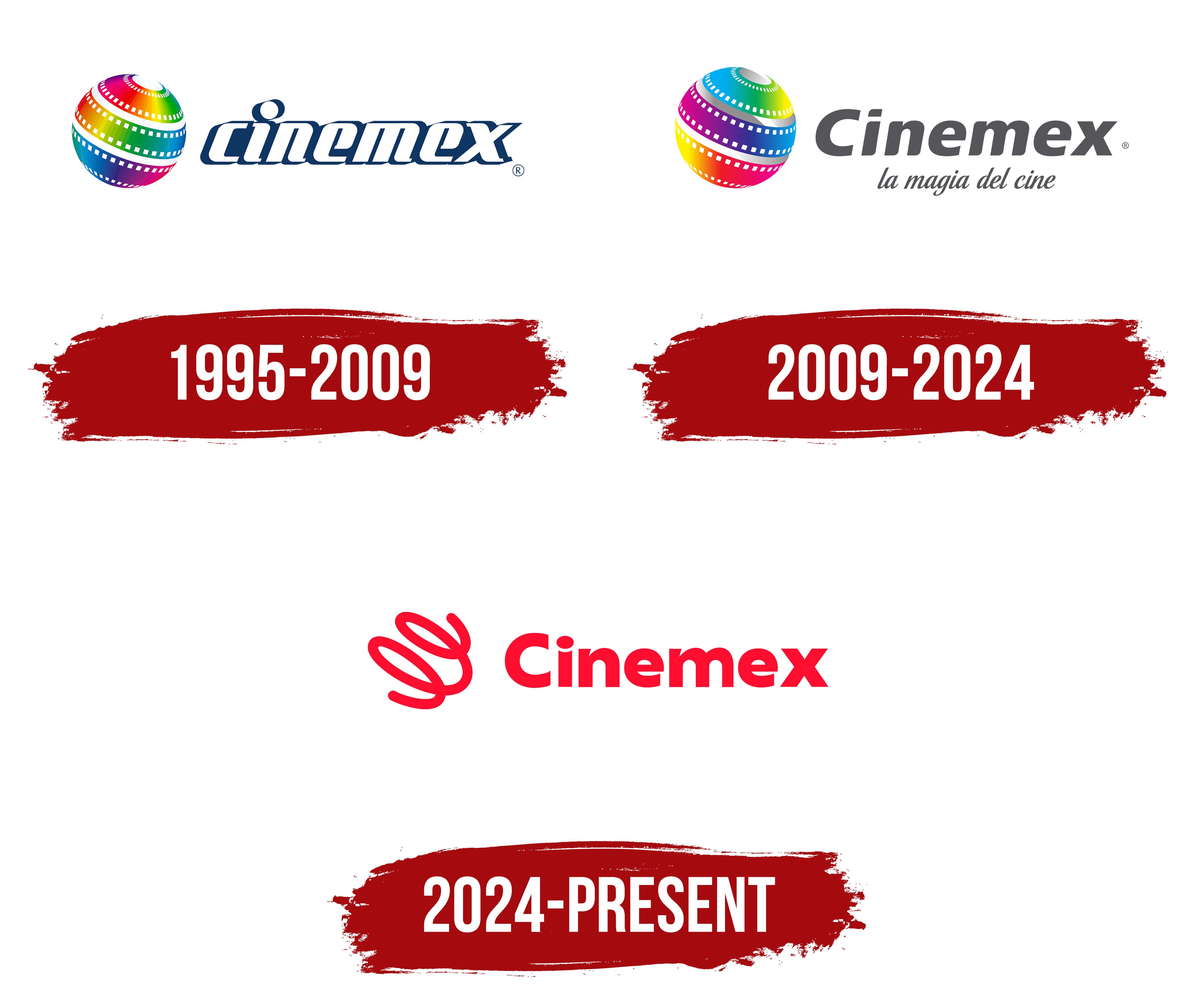
Cinemex’s brand identity centers on delivering top-quality movie experiences, innovation, and customer satisfaction. Cinemex aims to create a welcoming, immersive environment where movie lovers can enjoy the latest films in state-of-the-art theaters.
Cinemex’s logo embodies its brand identity. It typically features the company name in bold, capitalized lettering, often paired with an eye-catching icon or emblem. The logo’s sleek, contemporary design reflects Cinemex’s commitment to staying current with industry trends and offering patrons a modern cinematic experience.
Cinemex’s brand identity is also reflected in its focus on customer service and technological advancement. The company constantly explores new technologies, such as online ticketing systems and mobile apps, to enhance the convenience and accessibility of its services. This emphasis on innovation and customer-centric approaches sets Cinemex apart in the industry.
Cinemex’s brand identity is further enhanced by its commitment to supporting Mexican cinema and fostering national pride. The company actively promotes and screens a range of Mexican films, celebrating the country’s rich cinematic heritage. This dedication to local content shapes Cinemex’s unique identity and strengthens its connection with Mexican audiences.
Cinemex is a brand synonymous with high-quality movie experiences, innovation, and a commitment to Mexican cinema. Its brand identity is reflected in its sleek logo, focus on customer service and technology, and support for local films. Cinemex remains a beloved destination for movie enthusiasts, offering an exceptional cinematic experience across Mexico.
What is Cinemex?
Cinemex is a prominent Mexican cinema chain that offers a premier movie-going experience nationwide. With a rich history dating back to 1995, Cinemex has become a leading brand in Mexico’s entertainment industry.
1995 – 2009
Cinemex began with Adolfo Fastlicht, Miguel Ángel Dávila, and Matthew Heyman’s ambition to change the moviegoing experience. The founders focused on theater quality, viewing conditions, and customer service. They established the company in Mexico in 1994 and opened its first theater on August 2, 1995, at the Pabellón Altavista shopping center in Mexico City. The Cinemex name brought the chain’s theaters together under a single brand.
Mexican designer Francisco Teuscher, known as Franz Teuscher, developed the original visual identity with the Design Center team. The emblem featured strips of film wrapped into a sphere. Multicolored bands ran diagonally around it, with white rectangular holes along their edges representing film perforations and connecting the image to the theater business.
In the 1995 version, the bands combined red, orange, yellow, green, light blue, and purple. Gradients, highlights, and shadows gave the surface a rounded appearance. White gaps separated the strips, and a small oval opening appeared near the top of the sphere. The light-colored perforations helped distinguish the colored bands as they curved around the shape.
To the right of the emblem, the name “cinemex” appeared in lowercase letters with a pronounced forward slant. A thick dark blue outline surrounded the white letterforms, joining adjacent letters in places to create a continuous band. Elongated shapes, tight spacing, and angled terminals gave the wordmark a compact appearance. The round dot above the “i,” with its white center and blue border, matched the letter treatment.
2009 – 2024
The integration of Cinemex and the newly acquired MMCinemas chain prompted a 2009 logo update. The revised wordmark was scheduled to roll out gradually across all Cinemex locations. The filmstrip sphere provided continuity with the earlier emblem and remained a shared symbol for the chain’s theaters.
Most of the changes involved the lettering. Gray letters replaced the white letters with blue outlines, and the initial lowercase “c” became an uppercase “C.” The remaining letters in “Cinemex” stayed lowercase. The bold sans-serif type retained its forward slant, but the letterforms became rounder, with gaps separating them. The three-dimensional sphere, complete with gradients and white perforations, remained beside the name. Its colors were rearranged. Light blue and green occupied the upper portion, purple and blue bands crossed the middle, and yellow, orange, and red tones were concentrated at the bottom.
The tagline “la magia del cine,” meaning “the magic of cinema,” was added beneath the chain’s name. It conveyed cinema’s enchantment and promised a memorable moviegoing experience. Cinemex had used the phrase in audience communications before the 2009 update. In the logo, it appeared in gray italic serif type. Small letters with thin strokes distinguished the tagline from the heavy wordmark, while the shared gray color tied the two lines together.
After the 2024 rebrand, the 2009 logo continued to appear on some popcorn containers until existing packaging supplies ran out. The earlier branding also remained on some older promotional materials, box office screens, and signs, which were replaced in stages.
2024 – today

A spiral called Loop replaced the familiar sphere in the Cinemex logo unveiled on December 11, 2024. Marketing and Commercial Director José Antonio del Razo Torres described the change as a transition from the former Cinemex “world” to a Cinemex “universe.” Management wanted to reach audiences across generations and respond to changing expectations of the moviegoing experience. Development of the identity took over a year and involved the internal marketing team.
The perforated filmstrip gave way to a continuous thick line with rounded ends. Loop’s two elongated loops tilt and intersect before extending into an open arc at the bottom. In the red version, the spiral sits to the left of the name. On red backgrounds, both the emblem and the lettering appear in white.
The Cinemex wordmark retained its uppercase “C,” while the letters became upright. Their shapes changed as well. Thick strokes combine with rounded counters and flat terminals. A curved gap separates the “i” dot from its stem. The tagline beneath the name was removed from the primary logo, leaving open space around the spiral and the chain’s name.
Loop was developed with animation and several color combinations in mind. Its treatment could vary by theater format and medium while retaining the same overall shape. The Cinemex Market version received a neon-sign effect inspired by Asian food markets. Cinemex Platino retained the red associated with the chain throughout its history.