As the Circle K logo shows, each of the company’s stores serves all surrounding homes. The emblem preaches convenience, proximity to home, and saving time. Well, communication with a friend and sellers makes mini-markets friendly at home.
Circle K: Brand overview
| Founded: | 1951 |
| Founder: | Fred Hervey |
| Headquarters: | Tempe, Arizona, United States, U.S. and Canada |
| Website: | circlek.com |
Circle K Stores Inc. owns more than 15,000 locations worldwide, making it one of the largest companies in the mini-mart market. Its outlets are located in North America, Europe, New Zealand, and some countries in Africa and Asia. And the retail network is constantly expanding through new acquisitions and franchise programs in the U.S. (since 1999) and in Canada (since 2018). Its biggest growth spurt came in 2015, when Couche-Tard, which owns Circle K, merged several retailers under the global brand. The convenience store operator plans to turn all of the brands it will buy into Circle K in the future.
The origin of the company’s logo is related to its prehistory. The letter “K” was taken from the name of three Kay’s Drive-In Grocery outlets located in El Paso. It just so happened that in 1951 Fred Hervey bought them from Kay Misenheimer and then joined them with some stores from neighboring states creating the basis for the future international chain. Six years later, he renamed his business Circle K Food Stores and at the same time began using the logo as a “K” in a red circle.
Meaning and History
The brand’s visual identity did not change for a long time, even when the mini-mart chain declared bankruptcy (in 1990). It moved from one owner to another – from an investment group to an independent oil refiner, then from an oil refiner to an energy corporation. Until it ended up in the hands of the Canadian mini-mart operator Alimentation Couche-Tard. He bought Circle K in 2003 and only 12 years later decided to rebrand it, which among other things, meant renewing the logo.
Since Circle K had to unite several brands at once (including Mac’s, Kangaroo Express, and Statoil), the designers tried to connect the distinctive features of their emblems into one logo. Statoil’s orange blob turned into a horizontal stripe, and Mac’s and Kangaroo Express’ red was used for a rectangular base. Work to distribute the new brand began in January 2016, first in the U.S., then in Europe, and by mid-2017. – In all of Canada, except Quebec, where Couche-Tard is headquartered.
What is Circle K?
Circle K is a global brand of Alimentation Couche-Tard, under which four brands merged in 2015: Mac’s (Canada), Kangaroo Express (USA), Statoil (Norway and Sweden), Circle K (the USA and Canada). This is an international chain of convenience stores selling everyday goods.
1951 – 1978
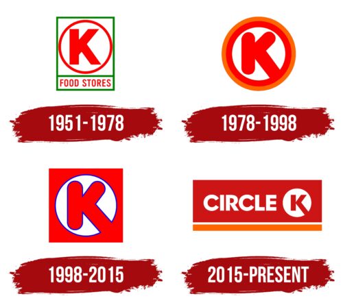
In 1951, Fred Hervey became the owner of three outlets called Kay’s Drive-In Grocery. That same year he renamed them Kay’s Drive-In Food Service. The chain gradually expanded and went from Texas to Arizona in 1957. Hervey thought this was a great reason to rebrand, especially since he wanted the new identity to reflect Western states’ historical and cultural heritage. As a result, the company got the name Circle K Food Stores and a corresponding logo, where the main element was a red, bold “K” in a ring of a similar color. It was placed in a white rectangle with a green outline, and at the bottom was another quadrangle, but narrower and more elongated horizontally. The lower geometric figure served as the background for the red inscription “FOOD STORES.”
1978 – 1998
In 1975, Circle K opened its 1,000th store. The network received a new logo with less detail than the previous one. The designers removed everything but the “K” in the red ring and added only one additional element – an orange ring that was used as an outer border. The corners of the letter were rounded. The lower right diagonal was lengthened so much that it merged with the red part of the frame and, together with the second diagonal stroke, resembled a checkmark inverted by 90 degrees. This undoubtedly positive association came about by accident. The creators of the emblem wanted the elongated “K” leg to resemble an upward pointing arrow and symbolize growth, energy, progress, and at the same time, represent the company’s services.
1998 – 2015
Another renewal of the Circle K logo came in 1998 when the Tosco Oil Corporation had already owned the brand for two years. The red “K” ended up in a white circle with a dark blue border, which was also the letter itself. The two multicolored rings disappeared – a square appeared instead. It was red, so the bottom diagonal stroke of the “K” merged with it.
2015 – today
Alimentation Couche-Tard, which has owned Circle K since 2003, announced its rebranding on September 22, 2015. It planned to merge several store chains under one brand name. But before that, experts conducted market research in Canada, the U.S., and several European countries to see how consumers would react to the upcoming change. In the end, it was decided to keep Circle K because the brand proved to be the most recognizable, and its new logo received the highest marks.
The graphic looks much more complex than just the “K” in the ring. Of course, the developers kept the red letter in the white circle and even gave it back the corners like on the first emblem. But now, the white word “Circle” is to the left of the iconic element, and a large red rectangle is used as the base. At the bottom is a long horizontal stripe of orange. The authors of this design are Studio Tobias Røder from Denmark.
Font and Colors
The main symbol of Circle K, for a reason, resembles a sign for branding cattle. We should not forget that this company is based in Texas, and its creator Fred Hervey originally sought association with American West. However, the modern version of the logo has a deeper meaning. Two circles, one as a background for the “K” and one underlying the “C,” connect the lettering and the graphic sign, symbolizing unity, continuity, community, and dynamics. At that, the stretched diagonal of “K” looks like an arrow as always and symbolizes the growth of the mini-market chain, its focus on customers, and progress.
Old versions of the logo used a font for the “K” resembling Frankfurter SH. In 2015, the designers trimmed the edges of the “K” and made the main strokes thinner to make them seem more elegant. And then modeled it after the “CIRCLE” lettering, designing his own set of glyphs around a bold, low-contrast sans-serif. The closest analog in style is Hurme Geometric Sans 4 Black by Hurme Design. Still, it differs in some nuances, especially noticeable in the capital “R.” By the way, all the characters in the name of the brand are specially transferred to the upper case – so the creators of the word mark wanted to show its stability and solidity.
The designers paid equal attention to the color scheme. Dark red, for example, is a tribute to the old emblems of Mac’s, Kangaroo Express, and Couche-Tard (the brands now united under one name). It is also associated with the sale of consumer goods. The orange stripe references Statoil, the distinctive color of the new Circle K brand. And the combination of red and orange recalls the spiritualizing sunrise.
Circle K color codes
| Venetian Red | Hex color: | #cd1515 |
|---|---|---|
| RGB: | 205 21 21 | |
| CMYK: | 0 90 90 20 | |
| Pantone: | PMS Bright Red C |
| Orange | Hex color: | #ff6600 |
|---|---|---|
| RGB: | 255 102 0 | |
| CMYK: | 0 60 100 0 | |
| Pantone: | PMS Bright Orange C |
