The Cirrus logo is rightfully considered one of the most recognizable worldwide due to its simplicity and expressiveness. The updated version reflects the company’s global nature and reliability, using a minimalist design with a concise color palette. The balance of brightness and restraint makes the emblem attractive and modern, while the clear geometric elements emphasize the brand’s status and stability.
Cirrus: Brand overview
Founded: | 1982 |
Founder: | Mastercard Inc. |
Headquarters: | New York, U.S. |
Website: | brand.mastercard.com |
Meaning and History
What is Cirrus?
This is a global interbank network within an ATM system. It allows users to access their money at millions of ATMs worldwide, regardless of which bank issued their card. This network simplifies cash withdrawals or balance checks for residents and visitors, bridging the gap between financial institutions. It is especially useful for travelers, as it provides a reliable way to obtain local currency without carrying large amounts of cash or traveler’s checks.
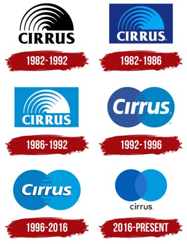
1982 – 1992
Monochrome and minimalism became the defining features of the first logo. The absence of various colors and shades might initially seem like a limitation for creating a bright and memorable design. However, the interbank network developed an original and distinctive identity that stood out for its expressiveness.
The logo was based on two elements: text and a graphic image. Each had its placement area, functioning as an independent part of the composition. The black color created a visual connection, uniting them into a harmonious tandem.
The name of the banking software was positioned at the bottom, directly below the graphic element. Uppercase letters made the text block the central focus, highlighting the company’s scale and potential. The brand selected an elegant font for the text, with flourishes and rounded shapes that conveyed sophistication. Each letter appeared as a work of art, reflecting the wide range of possibilities available to clients of this international system.
The semicircle, serving as the company’s emblem, is associated with the image of the sun. The element is perceived as a symbol of energy and vitality. The image placed above the system’s name had aesthetic completeness. It radiated movement and dynamism, complemented by a triangle toward which the lines of the semicircle converged. This enhanced the composition and added depth to the perception. The proportionality of the graphic and text blocks emphasized their balance, creating a sense of unity and wholeness.
1982 – 1986
From 1982 to 1986, a colored version of the black-and-white logo existed alongside the black-and-white logo. This variant reflected the trends in banking institutions and medical organizations’ use of blue tones in their branding. Cirrus, a global payment system, adopted a similar color scheme to align with this context.
The logo consisted of three main elements. The rectangle served as a frame, creating visual boundaries for the composition. Inside the figure, the space was filled with a rich blue color, providing a background for the other elements. At the top of the rectangle was the recognizable semicircle, the key symbol of the system. Below it was the name, rendered in a formal style.
The text block stood out with its impressive size, symbolizing the system’s extensive geographical reach. The association with the international scope of the payment software confirmed the brand’s ambition. This highlighted its rapid growth and expansion on the global stage. The semicircle, executed in light blue, evoked the sky, adding a sense of lightness and airiness to the composition. The system’s name was written in bold typeface, with each letter appearing prominently. The white color of the text emphasized its elegance and enhanced the impression of strength and reliability.
1986 – 1992
Another version of the logo showcased a harmonious and balanced design that appeared less formal and more refined. The design emphasized confidence in stability, creating an impression of a friendly, customer-focused style. The soft color palette added a sense of accessibility and reliability, reminding users of the global payment system’s benefits, including low interest rates and unique financial opportunities.
The background was rendered in a gentle light blue, providing a calm and pleasant foundation for the visual elements. A white hue highlighted the central components—the semicircle symbol and the company name—making them stand out and appear expressive. The font was preserved in this version, continuing to convey vibrancy and distinctiveness. The large uppercase letters emphasized the importance of the text block, strengthening the visual structure.
The semicircle consisted of six lines converging at a single point. This graphic solution created a three-dimensional effect, adding depth and volume to the logo, making it dynamic and modern. This version’s informational and presentational qualities met the standards of an international payment system.
1992 – 1996
The new logo reflects the symbolism embedded in the imagery and text block. All elements in the identity illustrate the expansion of the banking system’s territorial reach. The new version incorporates updated motifs, representing the global scale of operations.
The background enhances the perception of geometric shapes and the text block. The color added clarity and emphasis to the meaningful details. At the center of the composition are two overlapping circles, forming the key element of the identity. The geometric shapes are large, occupying most of the emblem’s area. On the left is a circle in a rich dark blue color, and on the right is an equally sized circle in a light blue shade. The overlap of these elements creates a layering effect, with detailed horizontal lines drawn in the intersection area.
The name “Cirrus” is highlighted in white and precisely centered within the figures along the horizontal line. The text block is italicized and features a unique font with elegant serifs, emphasizing the company’s high status and seriousness. The emblem’s multifaceted design and refinement are its key strengths, highlighting the modernity and elegance of the visual representation.
1996 – 2016
In mid-1996, the global international banking system introduced an updated version of its identity to the audience. The new logo featured a stylish, vibrant, and modern appearance. This redesigned emblem combined the best elements developed over previous years with current design standards.
The logo included several conceptually significant elements, each carrying a specific meaning. As before, the foundation consisted of two circles. However, their color palette became softer in the new version due to fewer contrasting shades. Two shades of blue harmoniously filled the geometric shapes, giving them a sense of lightness and delicacy. The overlapping area of the circles now contained half as many horizontal lines as the previous version of the logo. This change added refinement to the image, removed excessive detail, and created an effect of aesthetic simplicity and accessibility.
The name of the payment software was rendered in white, remaining an unchanged part of the design. Italicized lettering added dynamism and vibrancy to the text. The smaller font size made the text easier to perceive, giving the entire logo a visually airy and refined look. The new version appeared elegant, light, and balanced, thanks to these updates.
2016 – today
The global payment system’s logo underwent significant changes throughout its existence, adopting a new appearance. It became more informative and concise while retaining three key elements: two geometric circles and a text block. These components convey maximum information while remaining visually balanced.
The foundation consists of two overlapping circles, creating a striking image. On the right is a circle in a rich, dark color, and on the left is a figure in a lighter shade. The lighter circle is placed on top of the darker one. The composition emphasizes the importance of connections and integration, which are fundamental to the system’s operations. The text block with the company name is positioned outside the geometric shapes, adding dynamism and structure to the design.
The company name, rendered in black, is notable for its clarity. The letters on a white background appear refined and elegant. Despite its small size, the text remains expressive.
The updated logo embodies a harmonious blend of styles and themes. It reminds users that Cirrus software provides peace of mind and confidence, spans 93 countries, and makes financial processes accessible and reliable.