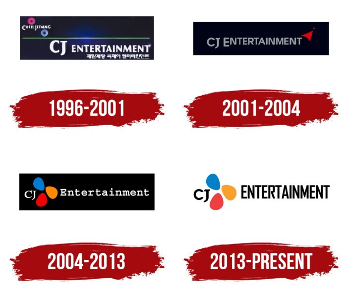
A large media company that produces entertainment content makes films, conducts music projects, and deals with computer games cannot cover all areas of its activity in one emblem. Therefore, the CJ Entertainment logo is more abstract than concrete. The logo symbolizes diversity, a good mood, and a creative approach to business.
CJ Entertainment: Brand overview
| Founded: | 1995 |
| Founder: | CJ Group |
| Headquarters: | Seoul, South Korea |
Meaning and History
It is a significant player in the South Korean cinema market, whose roots go back to 1995 when Cheil Jedang decided to invest in DreamWorks SKG. At the same time, in parallel, he launched the Multimedia Division service, and in the fall, he turned it into CJ Entertainment, receiving a debut film rental contract. A few years later, to consolidate the achieved positions, the founder opened the first multiplexes in South Korea. This happened in 1998.
All the steps taken led the company to its heyday and its greatest role in the South Korean film industry. Most film studios closed during the Asian crisis (it happened just in 1997-1998). On the contrary, CJ Entertainment benefited significantly from this, since by the end of the millennium, Korean films were in great demand. The result of the rapid rise was the emergence of the corporation of the same name, officially established in 2000.
This was followed by a series of significant associations with small media structures, which formed CJ E&M, which focused on entertainment and media. In 2018, another merger of CJ Entertainment took place. After him, the company began to work under the control of CJ ENM. Along with its development, identity has also evolved. But at the same time, she remained within the usual framework – with the same style, design, and concept. Even the colorfulness of the logos was preserved. There are four of them in total.
What is CJ Entertainment?
CJ Entertainment is a media company based in South Korea specializing in film production and distribution. It originated in 1996 based in the Multimedia Division. Its creator is Cheil Jedang, and the current owner is CJ Group. The head office of the studio is located in Seoul.
1996 – 2001
Before the millennium, the film company used a logo with a classic design adapted to the screen format. Therefore, its basis was a horizontal rectangle, divided in the center by a thin green stripe. At the top was the phrase “Cheil Jedang,” the first letters of which went beyond the bottom of the line. It was complemented by two wide rings – light blue and red. Under the line was the name of the media service, made in a capital font with silver-white characters. The text below was typed in Korean. The background of everything was a dark blue color, moving in a gradient from blue (in the middle) to almost black (at the edges).
2001 – 2004
The designers kept the screen shape and the media company’s name and removed everything else. The edge of the rectangle was distinctly black. It was followed by a dark blue background, where the metallic inscription “CJ Entertainment” was emblazoned. The letters were glossy, with a blackout stripe in the center. They were all in upper case. There was a graphic icon in red at the end (next to the “T”). It was a triangle going up with a dot.
2004 – 2013
The visual identity update brought about major changes. The rectangle is filled with black. The color of the lettering has been changed to white. The graphic element has moved inside the text, taking up space between the two parts of the title. At the same time, the designers redrew it: instead of one triangle, three petals appeared in red, orange, and blue. Due to the light gradient, they seemed glossy and voluminous.
2013 – today
Now it may seem that the CJ Entertainment logo looks different from before, but it is not. It uses similar motifs, colors, and glyphs. The inscription is stylized as the debut version – it has almost the same grotesque with even letters, whose outer corners are diagonally cut and rounded. Even though all the characters are capital, “C” and “E” are much larger than the others. “J” is shifted down and goes beyond the bottom of the line. At “A,” the crossbar does not close with the left leg, leaving a small gap. The multi-colored petals are arranged the same as in the previous emblem. The difference between them is only in the absence of a glossy sheen and a three-dimensional effect. The background rectangle is absent in this case, but the length and height of the inscription imply its presence.
Font and Colors
The visual identity of the South Korean film company has continuously evolved, keeping the key style, so each new version of the logo is a bit like the last one. Their key characteristics are:
- A rectangular background (dark or light).
- A bright detail (two rings, one triangle, or three oval petals).
- An inscription (service name).
Like the current one, the debut logo is made grotesquely. The second uses a typeface similar to the Alethia Pro Book but with wider, squatter letters. The third emblem is an inscription set in antiqua, reminiscent of Lagu Serif Extra Bold by Alessio Laiso Type or Relato Bold by Emtype Foundry. Each of them borrowed a certain element.
The corporate palette is consistently bright. It is dominated by red, green, orange, and blue in several shades (from blue to blue-black). Also available in white and metallic silver.
CJ Entertainment color codes
| Star Command Blue | Hex color: | #0080c6 |
|---|---|---|
| RGB: | 0 128 198 | |
| CMYK: | 100 35 0 22 | |
| Pantone: | PMS 7461 C |
| Orange Peel | Hex color: | #f9a12c |
|---|---|---|
| RGB: | 249 161 44 | |
| CMYK: | 0 35 82 2 | |
| Pantone: | PMS 1375 C |
| Imperial Red | Hex color: | #ef4041 |
|---|---|---|
| RGB: | 239 64 65 | |
| CMYK: | 0 73 73 6 | |
| Pantone: | PMS Warm Red C |
| Black | Hex color: | #000000 |
|---|---|---|
| RGB: | 0 0 0 | |
| CMYK: | 0 0 0 100 | |
| Pantone: | PMS Process Black C |

