


![]() Clarkson Golden Knights Logo PNG
Clarkson Golden Knights Logo PNG
The logo of Clarkson Golden Knights, the sports department of Clarkson University in Potsdam, effectively conveys the team’s characteristics and supports the chosen name. The knightly theme symbolizes the nobility, determination, perseverance, and persistence of each faculty member.
Clarkson University’s athletic program is closely tied to hockey and dates back to the school’s founding in 1896 as Clarkson College of Technology. The chant “Let’s Go Tech!” reflects that legacy and remains part of game culture.
Men’s hockey began in 1921 with a 6:4 win over Alexandria Bay. In 1937–1938, Clarkson posted a 13:1:1 record and was recognized as a national champion. The program paused during World War II but resumed after 1945. In 1950, Clarkson became a founding member of the Tri-State League and won its first season.
In 1956, the team completed a perfect season but declined to accept an NCAA Tournament bid due to eligibility rules affecting senior players. Clarkson joined ECAC Hockey in 1962, starting rivalries with regional programs.
The 1969–1970 season ended with an NCAA final appearance after a win over Michigan, but Clarkson lost 6:4 to Cornell, which finished 29:0:0. It remains one of the program’s key finals.
Among notable players, Craig Conroy led ECAC in scoring from 1990 to 1994, later played over 1,000 NHL games with the Calgary Flames, and had his number retired in 2012.
Women’s hockey, re-established in 2003, won NCAA titles in 2014 against Minnesota, in 2017 against Wisconsin, and in 2018 against Colgate. Clarkson became the only program outside the WCHA with three titles in that period.
Since 1991, both teams have played at Cheel Arena, a 3,000-seat venue named after Helen Snell Cheel.
Meaning and History
![]()
The emblem itself depicts a knight, the educational institution’s mascot, who takes the stage during hockey matches. The Clarkson Golden Knights department is named after this medieval character. The nickname was first used in October 1950 and officially approved a month later. This is even reflected in the logo: the word “Clarkson” is centered on a large elongated rectangle, and “Golden Knights” is just below, on a ribbon with curled edges.
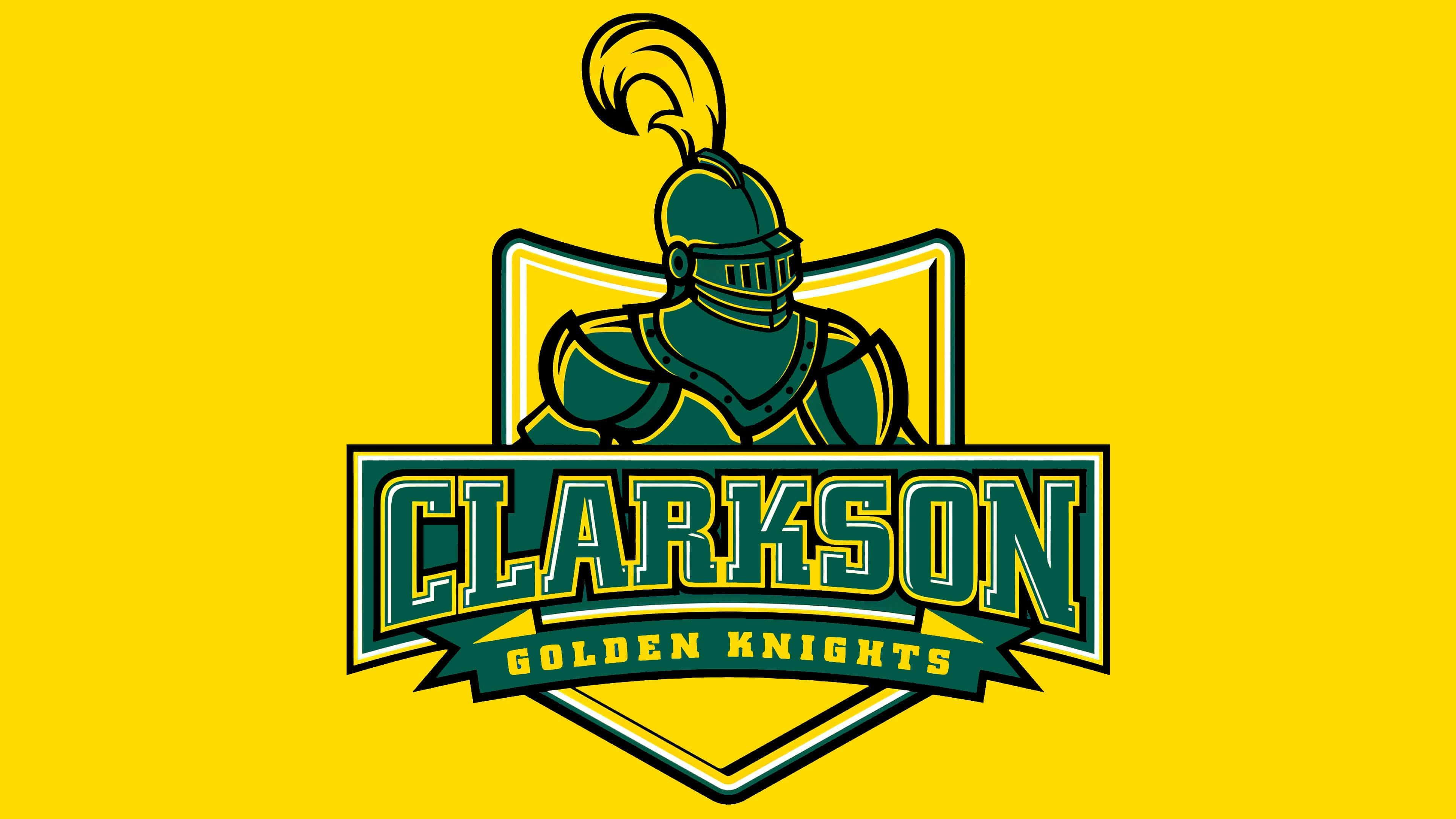
The overall background is a large yellow shield with a concave top and pointed base. It fits into the knightly theme and balances the figure in terms of proportionality. The plume on the helmet, rising above the shield, is painted in the same golden shade as are the numerous contours and shadows. Additional white and black lines add volume to the emblem. The main color of the armor is gray-green.
What is Clarkson Golden Knights?
Clarkson Golden Knights is the name of 20 teams representing the sports department of Clarkson University in Potsdam, New York. They primarily compete in NCAA Division III, but the hockey teams play at the Division I level as members of ECAC Hockey. Student-athletes are also part of the Liberty League.
2004 – today
![]()