The story goes that the Clemson Tigers logo came about after designers received a plaster cast of a tiger’s paw from the museum. The trail of a predator creates a sense of danger so that rival sports teams are always in suspense. But at the same time, because of the orange color and blurry contours, the graphic sign looks positive.
Clemson Tigers: Brand overview
| Founded: | 1896 |
| Headquarters: | Clemson, South Carolina, U.S. |
| Website: | clemsontigers.com |
Meaning and History
The Tigers nickname and mascot was invented by football coach Walter Merritt Riggs, who in 1896 took a job at Clemson Agricultural College of South Carolina (one of the old names of Clemson University). At that moment, he admired the Princeton Tigers, which explains the final choice of the animal.
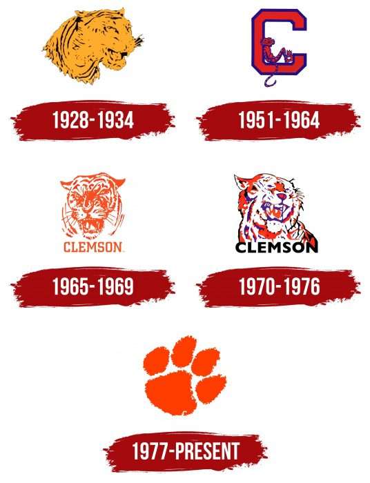
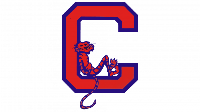
The sports department has always had tiger logos. Most often, artists focused on the head of a snarling predator and in different colors. She managed to visit yellow-black (in 1928-1934), orange-white (in 1965-1969), and full-color, interspersed with black, orange, white, and blue (in the early 1970s). There was also a period when the tiger was depicted in cartoon style, sitting inside the letter “C” (1951-1964).
Everything changed in the 1970s: after the reshuffle of coaches, the management concluded that it was time to renew the image. Henderson Advertising was involved in the process. Its president Jimmy Henderson personally visited the university, got acquainted with the tiger emblems of other educational institutions, and turned to the Chicago Museum of National History with a request to provide him with a plaster print of a Bengal tiger paw. After that, he photographed the trail, turning it around 10 degrees.
Helen Weaver developed the logo. The final point was put by designer John George Antonio, who created the drawing based on the existing concept. This is how Clemson Tigers got its original brand name in the form of an imprint.
1928 – 1934
One of the earliest Clemson Tigers logos lived up to the moniker of the varsity teams. It contained the light orange head of a roaring tiger, unfolded in the half-full face and facing to the right. To simulate the color of the animal, the artists used long black lines. The illustration looked unrealistic because it lacked detail. A blurry nose, indistinct eyes, and a schematically depicted mouth turned the sport’s emblem into a large orange blot.
1951 – 1964
In 1951, the designers radically changed the style of the logo, turning the formidable snarling predator into a funny cartoon character. The smiling tiger sat inside a large “C” with a long tail dangling to one side in this version. To make it comfortable, the anthropomorphic animal folded its front paws on its chest and bent its hind legs at the knees. As for “C,” this letter represented the name of Clemson University and was written in bold, angular type with truncated sides.
The orange has taken on a dark, almost red hue. He painted the main part of the drawing, including the tiger itself. The palette was complemented by a purple color that accentuated the details. Artists used it for a wide outline around the “C” and numerous stripes on the animal’s body.
1965 – 1969
In 1965, the Clemson Tigers reintroduced the angry snarling tiger logo. His head was turned in full face and consisted of orange lines on a white background. With the help of solid spots and strokes, the designers created a real illustration, where the eyes, ears, frowning eyebrows, wrinkled nose, mustache, and a gaping mouth with teeth are visible. The fur was also drawn, although not in such detail: the developers focused on the mimicry of the predator, wanting to convey its aggressive mood.
Under the head of the tiger was the word “CLEMSON.” It used the same orange hue as the graphic part of the logo. And thanks to the rectangular serif typeface, the lettering looked impressive.
1970 – 1976
In the early 1970s, the varsity teams have updated the logo again. The redrawn version lost its realism because the artists changed the rotation of the head, reduced the detail, and combined several colors. The base of the painting was white, the outlines were black, and the eyes and shadows were purple. Orange color has been used for large spots that spread to the top of the nose, tongue, neck, and half of the ear.
The name of the university has also been modified. The designers made it black and chose a bold sans serif for the lettering. The simple and understandable word “CLEMSON” looked contrasting against the background of an abstract pattern.
1977 – today
The most famous Clemson Tigers logo is called Tiger Paw. It was developed by Henderson Advertising, contacted by Robert C. Edwards. The head of the educational institution set a difficult task for the specialists: he wanted the new symbol to emphasize the prestigious image of the university and distinguish it from dozens of other US colleges with similar “feline” emblems.
Jimmy Henderson was the first to suggest using the paw print as a logo. He visited the museum, where the print he needed was kept, photographed it, and depicted it at an angle. Helen Weaver was responsible for developing the original idea and took over the bulk of the work. And John George Antonio embodied all ideas on paper.
Font and Colors
Despite the absence of inscriptions in the official logo of the Clemson Tigers (we are talking about the emblem with the image of a paw print, created in 1977), sports teams have their corporate font. It is called Paw Hammer and features large rectangular serifs that point in different directions, which makes the letters look asymmetrical.
The tiger paw print is in Clemson Orange (#F56600). But in the team identities, there are one more main color – purple Regalia (#522D80). The brand’s secondary palette includes white and black.
Clemson Tigers color codes
| Spanish Orange | Hex color: | #f56600 |
|---|---|---|
| RGB: | 245 102 0 | |
| CMYK: | 0 568 100 4 | |
| Pantone: | PMS Bright Orange C |
| Indigo | Hex color: | #4d1979 |
|---|---|---|
| RGB: | 77 25 121 | |
| CMYK: | 36 79 0 53 | |
| Pantone: | PMS 2607 C |


