


![]() Cleveland Browns Logo PNG
Cleveland Browns Logo PNG
The emblem of the football club, founded in 1948, demonstrates a commitment to its history. Over more than half a century, the Cleveland Browns logo has changed only in minor details, reflecting the modern evolution, and the name has become a tribute to the team’s first coach.
The Cleveland Browns were formed in 1944 when sports editor Arch Ward initiated a new league and selected Cleveland businessman Arthur B. McBride as one of eight owners. McBride asked journalist John Dietrich to find a coach, and he proposed Paul Brown. In 1945, Brown joined the club as head coach and shareholder.
The naming process stretched through 1945. Fans supported “Browns,” though Brown initially declined. McBride launched a contest with a $1,000 war bond prize, and in June, the name “Panthers” was selected. It lasted only two months because Brown rejected it after a team with that name failed earlier. McBride then accepted public preference and restored “Browns”, later linking it to boxer Joe Louis, while Brown confirmed the name came from him.
Ownership changed in 1953, when McBride sold the team for $600,000 to a Cleveland group that included Ellis Ryan, then the Cleveland Indians’ general manager. In 1961, control passed to Art Modell, with Bob Gries holding a 40 percent stake. Through the following decades, the franchise remained under Modell’s direction.
In 1995, Modell announced plans to relocate the team to Baltimore. Legal disputes forced a compromise. He retained player contracts but established a new franchise, later known as the Baltimore Ravens, while Cleveland kept the name, history, logos, and training facilities in trust.
In February 1996, the NFL suspended the original franchise. The Browns resumed play in 1999 under Al Lerner. After his death, Randy Lerner took over, and on August 2, 2012, he sold the team to Jimmy Haslam for $1 billion.
Meaning and History
![]()
Over more than 70 years, the Cleveland Browns have had seven logos, not counting one that was unused. Their evolution can be divided into two periods: before and after 1969. The first period is the so-called Brownie Elf era, which artist Dick Dugan depicted in cartoon style and “awarded” a football.
The second period is the longest. It began in 1970, when the team first used an orange helmet as its emblem. This version was changed several times: developers pursued a modern design so that the drawn sports attributes more closely reflected reality.
What is Cleveland Browns?
The Cleveland Browns joined the AFC North in 2002. They have been competing in the National Football League since 1950; before that, they participated in the All-America Football Conference. The club’s history took a brief hiatus when Arthur Bertram Modell decided to move the club’s members to Baltimore while leaving all the “Browns” legacy in Cleveland. The original franchise was restored in 1999.
1948 – 1958
![]()
The Cleveland Browns’ debut logo features the original character, Brownie Elf. Its name is a play on words: “Brownie” is consonant with the team’s nickname, “Browns.” The image’s authorship belongs to artist Dick Dugan, who became a sports cartoonist for the Cleveland Plain Dealer.
The elf stands with a football in his left hand. On his head is a crown, a symbol of power. The figure is turned to the left. All elements have a dark outline with ragged edges. The design of this logo reflects the classic animation style.
1959 – 1969
![]()
In 1959, Brownie Elf changed:
- He was turned to the right.
- The royal crown was replaced with a cap.
- The football was in his right hand.
His clothes became black and orange, and his hands and face were white. Shadows characteristic of animated images were removed. The character is depicted schematically, without detailed elaboration, and outlined in black.
1965 (unused)
![]()
When Art Modell bought the franchise, he deemed the Cleveland Browns’ emblem too childish and discarded it. In the mid-1960s, a new logo was created: a dark orange helmet with a white stripe on top and a black outline.
This sports form is depicted in profile. It has a gray face shield and is adorned with the intersecting letters “CB” in brown, outlined in white, symbolizing the city and its nickname, the Cleveland Browns. The font does not contain serifs. This version of the Cleveland Browns emblem was never used in games.
1970 – 1985
![]()
After the AFL-NFL merger in 1969, the football club left the cartoonish Brownie Elf behind. In 1970, they used a logo similar to the unused 1956 version. Only minor changes were made:
- Three gray dots were removed.
- The inner black outline was widened.
- The face mask became white.
They removed the “CB” inscription because the Cleveland Browns stopped decorating helmets with the team’s brand and decided to make it their trademark.
1986 – 1991
![]()
In the new Cleveland Browns logo, designers discarded the usual side view in favor of a ¾ view. The change in perspective enabled a detailed 3D rendering of the face mask. Dark lines running along the white fittings emphasize the three-dimensionality. The top part of the helmet has a double white-gray stripe. The orange color became one shade darker.
1992 – 2005
![]()
In 1992, another modification of the Cleveland Browns logo was approved. Designers made the face mask’s shape more modern. The colors remained the same, only becoming more muted. A new element appeared at the bottom, a round white protrusion.
2006 – 2014
![]()
In 2006, the Cleveland Browns abandoned their boring color scheme and returned to orange. The only change to this logo is that the face mask is now gray. The shapes, ratios, and thickness of the stripes remained the same.
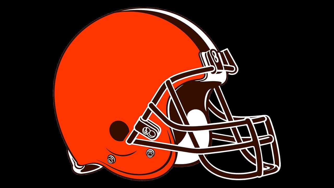
2015 – 2023
![]()
The current logo is the result of a long evolution of the helmet, first presented in 1970. Its creators tried to preserve the main elements, such as the two black-and-white stripes at the top. In addition, they adhered to the original palette, in which the bright orange color always predominated.
The current brand name was adopted in 2015. It features the same helmet that has become an integral part of the players’ equipment and a key part of the Cleveland Browns’ visual identity.
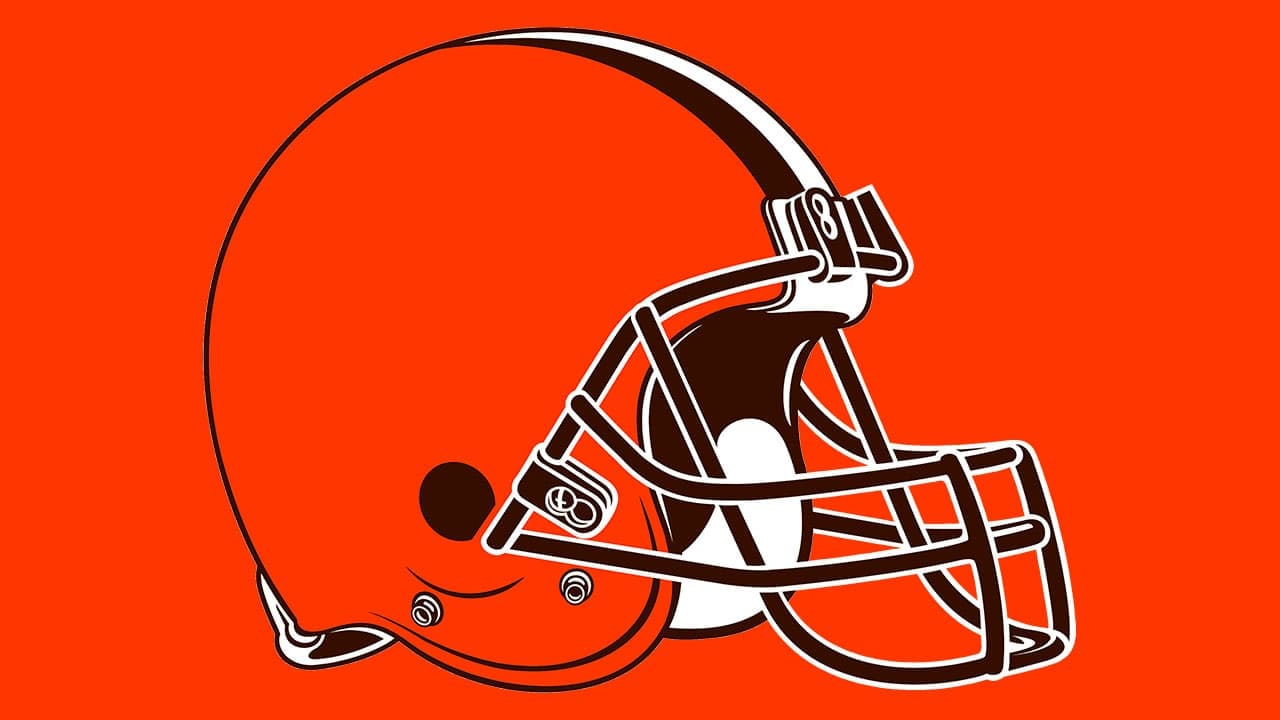
2024 – today
![]()
Font and Colors
For all NFL teams, the helmet is an important part of the game. But for the Cleveland Browns, it means much more, as it has been featured on emblems since 1970. The drawn helmet looks almost like it does in reality if you close your eyes, achieving the most authentic style. Artists paid attention to the details: the exact shape of the headgear, the number and location of the bars in the protective mask, and the fastenings, so everything is as close to reality as possible.
There is no inscription on the helmet or around it. And that’s because the owners of the Cleveland Browns consider it unnecessary to mention the team’s name; in their view, the logo is sufficiently recognizable on its own and doesn’t require textual additions.
This is indeed the case if you pay attention to the color combination. The iconic orange helmet with dark brown and white details is currently associated with only one NFL football club. At least until it changes or completely repaints its iconic logo.