The ClickFunnels logo visually represents the creative process central to the service’s work. It symbolizes the platform’s primary focus—building successful customer interactions. The elements of the emblem are harmoniously connected, forming a mechanism that demonstrates how the service helps users sell more.
This mechanism operates through a deep study of customer behavior and preferences. The company assists in creating content that precisely meets the audience’s needs, improving customer engagement, and increasing sales. The visual symbol conveys the idea of a systematic approach, where each element contributes to the outcome, making the service a powerful business tool.
ClickFunnels: Brand overview
The ClickFunnels story began in 2014 when Todd Dixon and Russell Brunson joined forces to create a platform to simplify the design of sales funnels for business owners. By this time, Russell had extensive experience in internet marketing and recognized the need for this kind of solution.
The initial version of the platform was developed over about a year, with Brunson investing nearly a million dollars of his own money to advance the project. During this time, the development team focused on creating a user-friendly interface and essential features to enable even non-technical users to build effective sales funnels.
ClickFunnels officially launched in September 2014, using an innovative pricing model with a 14-day free trial. This approach allowed the platform to quickly attract its first users and collect valuable feedback for future development.
In 2015, the company experienced rapid growth. It launched an affiliate marketing program that became one of the most successful in the industry. That same year, the platform expanded by introducing Actionetics, an email marketing and automation tool.
Reaching 10,000 active users was a major milestone in 2016. The company held its first-ever Funnel Hacking Live conference, attracting hundreds of marketers and business owners. This event became one of the largest annual gatherings in the online marketing industry.
Russell Brunson published his book DotCom Secrets in 2017, which quickly became a bestseller and drew even more attention to the brand. The same year, the company introduced Backpack, an affiliate management tool integrated directly into the service.
By 2018, the company’s annual revenue had surpassed $100 million. The company launched a certification program for sales funnel specialists to build a professional community around the product. In 2019, a new version, ClickFunnels 2.0, was released, offering users an improved interface and additional features. The company also began developing educational programs to support business owners.
In 2020, the platform continued to grow by introducing new funnel templates and refining existing tools. The team expanded its global reach by launching regionalized versions.
In 2021, a major technological upgrade provided users with additional features and improved performance. That same year, the platform introduced its payment system to simplify user payment processing.
In 2022, efforts were directed toward e-commerce solutions, adding features to support marketplace and platform integration. The company also expanded its reach within the small and medium-sized business sector.
Over the years, the platform has consistently improved its product, adding new features and refining existing ones. An entire ecosystem has been built around the brand, including conferences, certification programs, educational materials, and an engaged user community. Since its launch, the platform has supported the creation of over a million sales funnels and has been instrumental in the success of many online business owners. The company remains a major presence in the online marketing industry, continually innovating and adapting to market needs.
Meaning and History
What is ClickFunnels?
This is a powerful tool for creating sales funnels that transform website visitors into paying customers. With an easy-to-use drag-and-drop interface, the platform enables business owners to design complex marketing funnels without coding knowledge. It guides potential customers through a well-planned journey from initial interest to purchase, combining landing pages, email automation, payment processing, and membership sites into one integrated system.
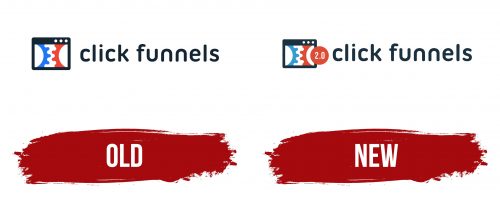
Old
A rectangle styled as a computer application screen is the first element that catches the eye. This choice signals the viewer that they are looking at an online resource. Inside this screen are two rotating gears that evoke associations with a functioning mechanism and bring the idea into a digital context. The logo visually reflects the service’s functionality, specializing in creating sales funnels.
The two colors of the gears—red and blue—represent the two key directions of the service: website development and creating marketing funnels. The rotation of these elements in the logo also encodes the capability to integrate various marketing applications directly onto web pages. Like a builder, the user can assemble the necessary tools, adapting them to their needs.
The white space running through the center of the emblem resembles a descending flow passing through a funnel, transformed by the teeth of the gears. This image symbolizes how the system can process a large amount of information, guiding clients to purchase through well-thought-out stages of interaction.
The service’s name is in a flexible, modern font, highlighting the simplicity and intuitive nature of working with the program. The minimalist glyphs show that mastering ClickFunnels is easy, and the service helps lighten the marketer’s workload by optimizing the process of creating and managing marketing funnels.
New
The new ClickFunnels logo appears quite simple, but it contains many symbolic details that reflect the essence of the brand and its functionality. At the center of the visual symbol is a browser screen with three small circles at the top, resembling standard window control buttons. This emphasizes the brand’s digital nature and connection to internet technologies.
Inside the screen are two gears, one blue and one red, divided in half as if in the interaction process. These gears represent the complex mechanisms and processes happening “behind the scenes” of the brand’s operations, which help users build and automate sales funnels. The gears hint at the system’s smooth operation, where all elements must work together to achieve a result.
The emblem prioritizes a red circle with the inscription “2.0,” which is partially on the red gear and partially extends beyond it. This circle suggests a system update and highlights that the service has reached a new level—the second version of the platform offers improved features and innovations for users. The fact that this circle “breaks” the boundaries of the gear symbolizes forward movement and development. The red color of the circle reinforces the emphasis on innovation and progress.
Blue is traditionally associated with technology and stability, while red represents energy, passion, and the drive to action. The logo’s white background creates a sense of lightness and simplicity, hinting that the platform is intuitive and does not require complex actions.
The font of the “click funnels” text is in lowercase letters, making it visually friendlier. The letters have smooth, rounded shapes, adding softness and lightness. The connection of “f” with the following letters in the word “funnels” is visually interesting. It emphasizes continuity and sequence, aligning with sales funnels, where all actions should smoothly flow into one another.
The name “ClickFunnels” consists of two parts. “Click” refers to the digital world and online actions, as all work with the platform occurs online. “Funnels” is the platform’s main function, creating sales funnels that help companies attract customers and increase conversions. The name conveys the essence of what the brand does without requiring further explanation.
