![]() Cloud 9 Logo PNG
Cloud 9 Logo PNG
Luck is encrypted in the symbols of the emblem. On this happy stream, the team flies to victories. Cloud 9 logo lifts the veil of luck: it is associated with players’ reaction speed and mental abilities.
Cloud9 is a private esports organization from Santa Monica, California. Its story began in spring 2013, after the former Orbit Gaming League of Legends roster left Quantic Gaming. Quantic was founded in 2010 by Quebec entrepreneur Simon Boudreau and had funded StarCraft II players, but later withdrew support from its League of Legends roster.
The players first regrouped as Team NomNom, then became Cloud9. Jack Etienne, who had earlier worked around Team SoloMid, bought the team for $15,000 and built the company with his wife, Paullie Etienne. The early roster included Zachary “Sneaky” Scuderi, Daerek “LemonNation” Hart, Hai Du Lam, William “Meteos” Hartman, and An “Balls” Van Le.
Cloud9’s first major rise came in the 2013 NA LCS. The team finished the regular season with a 25-3 record and went on to win the championship. In 2014, it won the spring split, placed second in the summer split, and reached the World Championship quarterfinals, turning the brand into one of the main names in North American esports.
From 2015, Cloud9 expanded beyond its original roster. It entered Counter-Strike: Global Offensive, Super Smash Bros. Melee, Hearthstone, Overwatch, Vainglory, Rainbow Six Siege, and PlayerUnknown’s Battlegrounds (PUBG). In 2018, the organization raised $50 million from investors and developed its infrastructure. The “CS:GO” division later won events, including BLAST Pro Series Los Angeles in 2019, while the League team returned to domestic titles. By 2023, Cloud9 had grown from one League roster into a multi-disciplinary esports brand.
Meaning and History
![]()
Jack Etienne chose a logo for the cyber community by accident. First, the owner commissioned the Cloud 9 logo from a specialized design studio. The developer made a suitable version, which was fully paid for. But at the same time, another person (an acquaintance of Etienne) said he had come up with a personalized sign for his team and would like to have it. And so it happened: the amateur version turned out to be better and more accurate than the professional one. Boudreault chose it for the main logo and has never changed it since.
What is Cloud 9?
Cloud 9 is a professional eSports organization that appeared in May 2013. It consists of former Orbit Gaming League of Legends players who signed a sponsorship contract with Quantic. The new roster includes five members of the old team. Jack Etienne formed it.
2013 – 2023
![]()
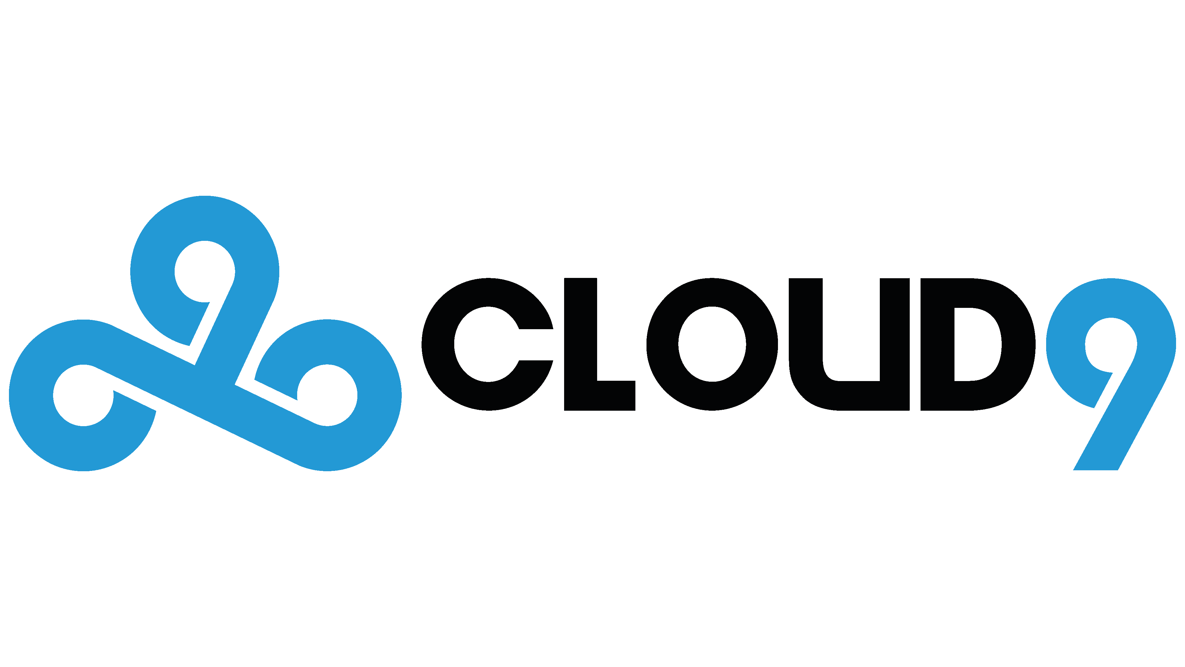
The Cloud9 logo has a simple yet memorable design. The central element consists of three interwoven “9” digits, forming a unique pattern. Each digit is left slightly open without completing a full circle, adding a sense of dynamism and lightness to the overall image. This ties into the team’s name, “Cloud,” which symbolizes movement, airiness, and freedom, as if everything is in constant flow and change.
The “9” digits are positioned to create a sense of movement in different directions: one moves to the left, another to the right, and the third is placed vertically. This can be interpreted as a symbol of the team’s desire to expand in various directions and continually evolve. The blue color in the emblem represents stability and confidence, which are important for a brand seeking to convey reliability to its fans. The light gradient within the digits adds depth and makes the visual symbol feel dynamic without excessive effects.
The “Cloud9” text below the main symbol is rendered in a sharp, angular font, contrasting with the smooth lines of the “9” s. The font emphasizes the team’s seriousness and professionalism despite the symbol’s fluidity and energy. If you remove the space between the letters “U” and “D,” they resemble the number “9,” adding an extra layer of symbolic depth to the logo.
The emblem strikes a perfect balance between simplicity and meaningful depth. It conveys movement, growth, and confidence, aligning with the team’s spirit and reflecting the atmosphere of esports.
2023 – today
![]()
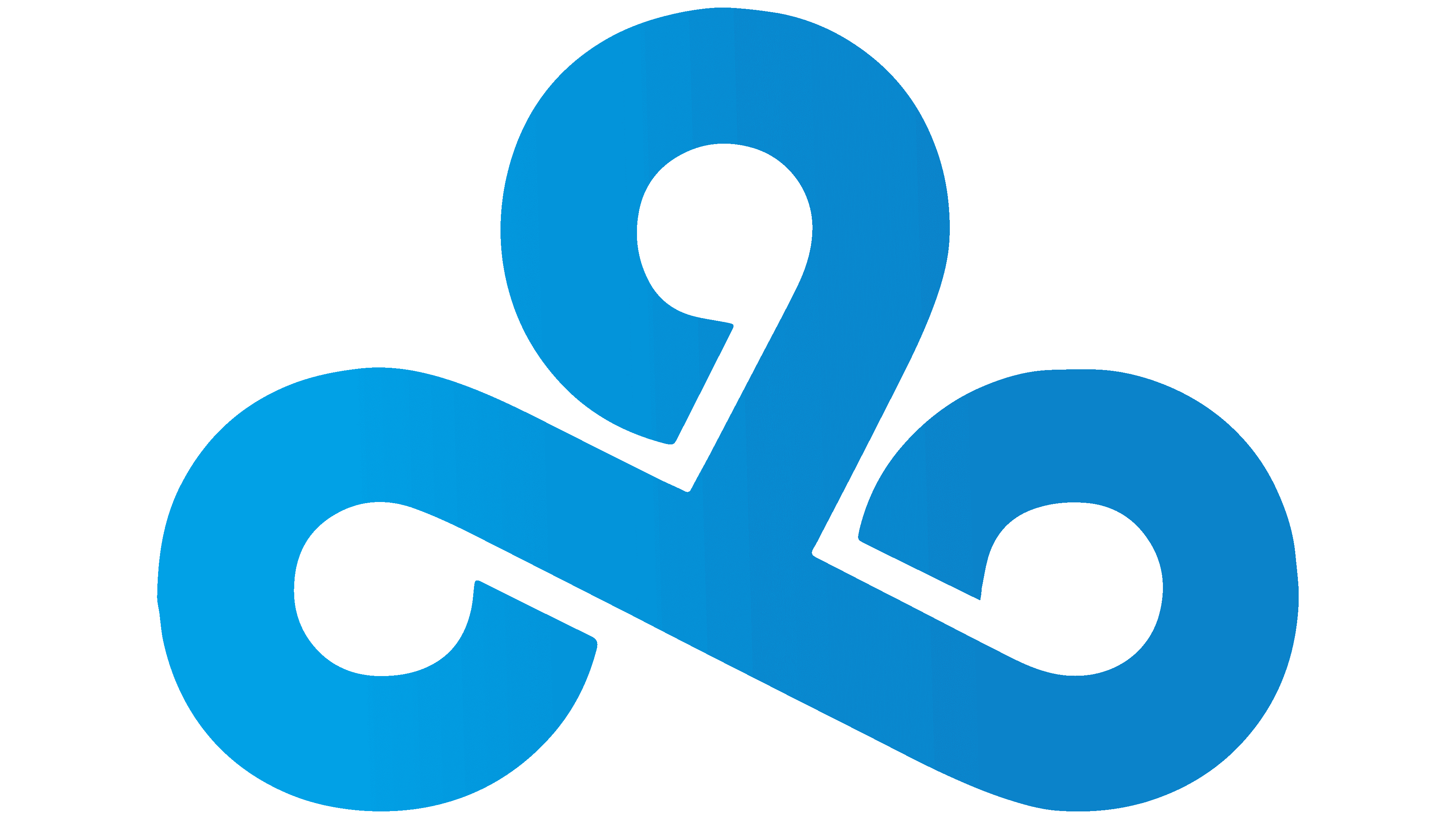
The updated Cloud9 logo is more minimalist but retains its recognizability. The main symbol is three interlocking “9” s that form a unique pattern. This element is associated with dynamism and movement, as if the team is always in a state of flow and constantly evolving. The symbol looks simple, but its shape conveys continuity and unity, accurately reflecting the team’s spirit.
The changes to the logo are minimal. Primarily, the solid light blue color is used as a symbol of calm, trust, and stability. This color emphasizes reliability and confidence, which are important for the team in esports. The blue color, as before, is associated with the sky and clouds, directly aligning with the brand’s name.
The font has remained the same, simple, without unnecessary details. However, the text has become slightly smaller than the symbol, emphasizing the importance of the visual element in the logo. The text “CLOUD9” looks neat and well-balanced, and its rounded forms remain friendly and easy to read.
The new style reflects the team’s desire to emphasize stability and confidence in its future. The emblem has become slightly simpler, highlighting the brand’s growth. The team is confident in its name and symbol.
Font and Colors
The typeface used for the word part of the Cloud 9 logo is called Devil Breeze Bold. It represents the category of smooth geometric grotesques. The letters are flat and wide, with a harmonious combination of straight lines and smooth curves, reminiscent of the Avant-Garde font.
The corporate palette includes two primary colors and one background color. It is blue in several shades (the number and numeric ornament are painted with it) and black (the inscription is made with it). All elements are on a white background.