 Coastal Carolina Chanticleers Logo PNG
Founded in 1995, the sports department of the University of Carolina now has the mascot Chanticleer. The logo of the Coastal Carolina Chanticleers symbolizes wit and resourcefulness and reflects its commitment to its history and confidence in victory.
Coastal Carolina Chanticleers: Brand overview
| Founded: | 1995 |
| Headquarters: | Conway, South Carolina, U.S. |
| Website: | goccusports.com |
The Coastal Carolina Chanticleers sports division, also known as the Vikes, is funded by Coastal Carolina University. It represents nineteen teams – as many sports as provided in NCAA Division I. Almost all are members of the Sun Belt Conference, except for women’s teams in lacrosse and beach volleyball, which are part of the Atlantic Sun Conference.
Until the 1960s, Chanticleers were called Trojans. When they merged with the University of South Carolina, it was decided to change the nickname to one more suitable for the university’s mascot (Gamecock). The option Chanticleers was chosen for its symbolism: it was the name of a witty and resourceful rooster from the poem “The Nun’s Priest’s Tale” by English poet Geoffrey Chaucer.
Meaning and History
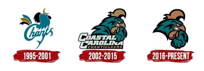
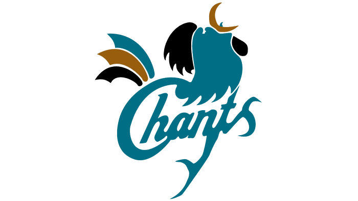
The image of a rooster is the connecting link of all the logos of this sports department. From 1995-2001, it was not depicted in full detail. It consisted of several colored elements separated by white outlines. It had a blue-green head, a black comb, and a bronze-colored beak combined with three feathers in the tail. At the same time, the initial letter of the word “Chants” (shortened version of Coastal Carolina Chanticleers) merged with the rooster’s head, and from the connection of the letters “nt,” a long bird’s foot stretched downward.
What is Coastal Carolina Chanticleers?
The Coastal Carolina Chanticleers is a sports department that is part of Coastal Carolina University and competes in the NCAA at the Division I level in almost all sports. It represents the Sun Belt conference, but the women’s lacrosse team is part of the ASUN conference.
1995 – 2001
2002 – 2015
2016 – today
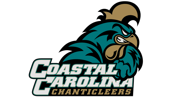
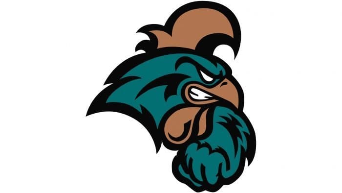
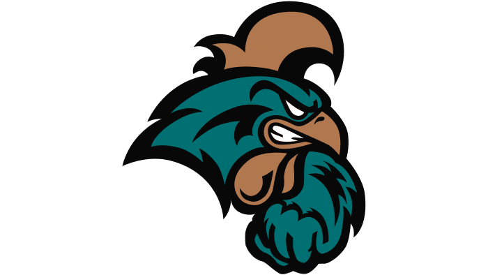
Then, the designers changed the concept and depicted a fighting rooster, confidently marching according to the position of its wings. The feathers are not detailed, but it’s evident they are present: this is indicated by sharp angles and black lines. The bird looks quite menacing. Its eyes glow white, and the comb is tilted forward. Another important detail is the teeth. Artists had to add them to give the mascot the most menacing look. From 2002 to 2015, the drawing was complemented by the inscription “Coastal Carolina Chanticleers,” which was divided into three lines and executed in italic font with serifs. In 2016, it was removed, leaving only the graphic part of the logo.
Coastal Carolina Chanticleers: Interesting Facts
The Coastal Carolina University (CCU) Chanticleers is a college sports team that plays in the big leagues, Division I and is part of the Sun Belt Conference. They’re known for their cool mascot and the school’s teal color.
- Mascot Story: Their mascot is a proud and fierce rooster from a story in “The Canterbury Tales” by Geoffrey Chaucer. It shows the school’s spirit and how they like to compete.
- Baseball Champions: In 2016, their baseball team won a major national championship, which made the school famous.
- Joining the Sun Belt Conference: In 2016, they also moved to the Sun Belt Conference. This was a step up and made their games more exciting and visible to more people.
- Teal Turf: Their football team plays on a teal-colored, unusual, cool field. It’s a fun part of their school spirit.
- Better Sports Places: They’ve been improving their sports venues, like making the stadium bigger so more fans can enjoy the games. This shows they care about sports.
- Lots of Sports: They have teams for over 18 sports, like basketball, soccer, and golf. They’ve won many championships and gone to big tournaments.
- Women’s Teams Rock Too: In sports like basketball and soccer, their women’s teams have also won titles and gone to big tournaments. They’re just as awesome.
- Helping the Community: The Chanticleers help out in Myrtle Beach with different projects. It helps them connect with people around the school.
- Smart Athletes: They ensure their athletes do well in school, not just sports. Many of them win awards for being smart.
- Mascot and School Colors: The Chanticleer, the School Mascot, and its teal and bronze colors are a big part of school spirit. They bring everyone together.
The Coastal Carolina Chanticleers are not just about winning games; they also care about school spirit, doing well in class, and helping around Myrtle Beach. They’re a really special part of the college sports world.
Font and Colors
Coastal Carolina Chanticleerss color codes
| Caribbean Current | Hex color: | #006f71 |
|---|---|---|
| RGB: | 0 111 113 | |
| CMYK: | 100 2 0 56 | |
| Pantone: | PMS 7718 C |
| Chamoisee | Hex color: | #a27752 |
|---|---|---|
| RGB: | 162 119 82 | |
| CMYK: | 0 27 49 36 | |
| Pantone: | PMS 4645 C |
| Black | Hex color: | #000000 |
|---|---|---|
| RGB: | 0 0 0 | |
| CMYK: | 0 0 0 100 | |
| Pantone: | PMS Process Black C |
